Home Work About Contact

Selected work

Blockradar

01/05

Shaping Blockradar V1

I came on as a freelance product designer when the product was still being defined, working with another designer, Faye, and reporting to the co-founder. We were a team of three on the design side of V1.

There was no existing product to redesign. We were figuring it out from scratch.

We designed the experience for environments, wallet creation, transaction data, security settings and backups. Faye and I did not really split the work as we were on calls constantly, and most decisions got made in the conversation rather than handed back and forth. He designed a lot of the reusable components that kept the system consistent.

Finding our way into the product

We started with the requirements. The co-founders would walk us through how a part of the product was expected to work, we’d ask questions, and get clarity, research and implement.

The process was fairly fluid, some decisions were straightforward, others only became clear once we started designing them. The first thing we mapped was onboarding: the flow from the point someone entered the product through the steps they had to complete before they reached their wallet.

Click throughGetting into the product1/5
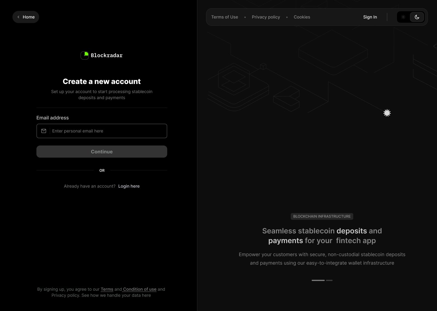
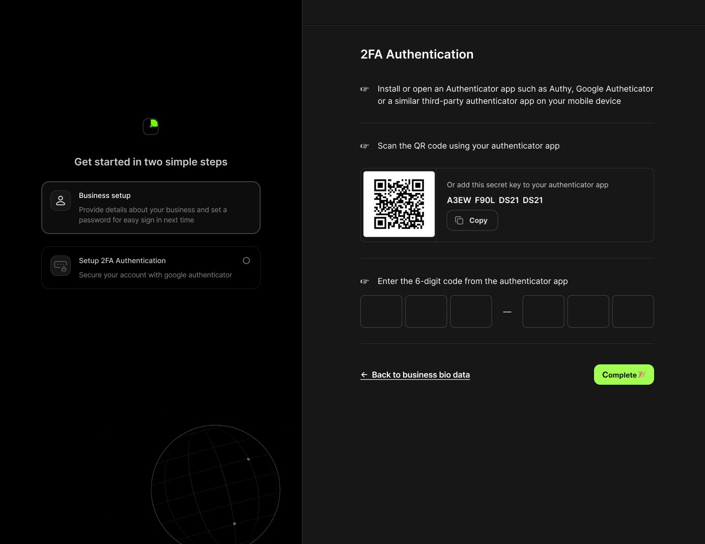
Email address and nothing else. The panel beside it says what the product does while you sign up. A four-digit code, a wrong-email link, and a thirty-second wait before the resend. Two simple steps listed on the left, the form on the right, and the password rules stated before you type. QR code, the secret key in copyable form for anyone who can’t scan, then the six-digit check. The account is ready, with the dashboard one button away.

As we worked through onboarding, it led us into the product itself.

Starting with the wallet

The master wallet was central to how Blockradar worked, so we needed to figure out what creating one looked like. Here we made it easy to create in one go.

Click throughCreating a master wallet1/6
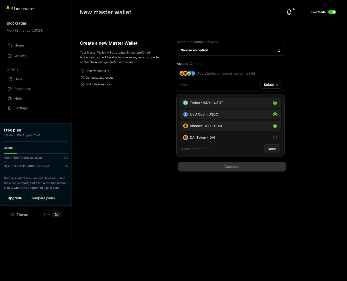
Nothing pre-filled, and Continue is disabled. Five chains, each with its token standard spelled out: TRC20, ERC20, BEP20. Multi-select with a running count. Nothing is preselected here either. Every field answered, four assets attached, and Continue is now enabled. The same verification step used by the backup flow. The confirmation returns the wallet ID and full address, with a copy control.

There was the question of Test and Live. A wallet created in Test shouldn’t be mistaken for one that can hold real funds. We carried the environment into the creation flow and made the consequence of the choice explicit.

That led to another question: what should happen when someone switches environments? We designed confirmation states and supporting copy around that decision, so users had a moment to verify what they were about to do.

What sits inside a wallet

A master wallet could have multiple child addresses.

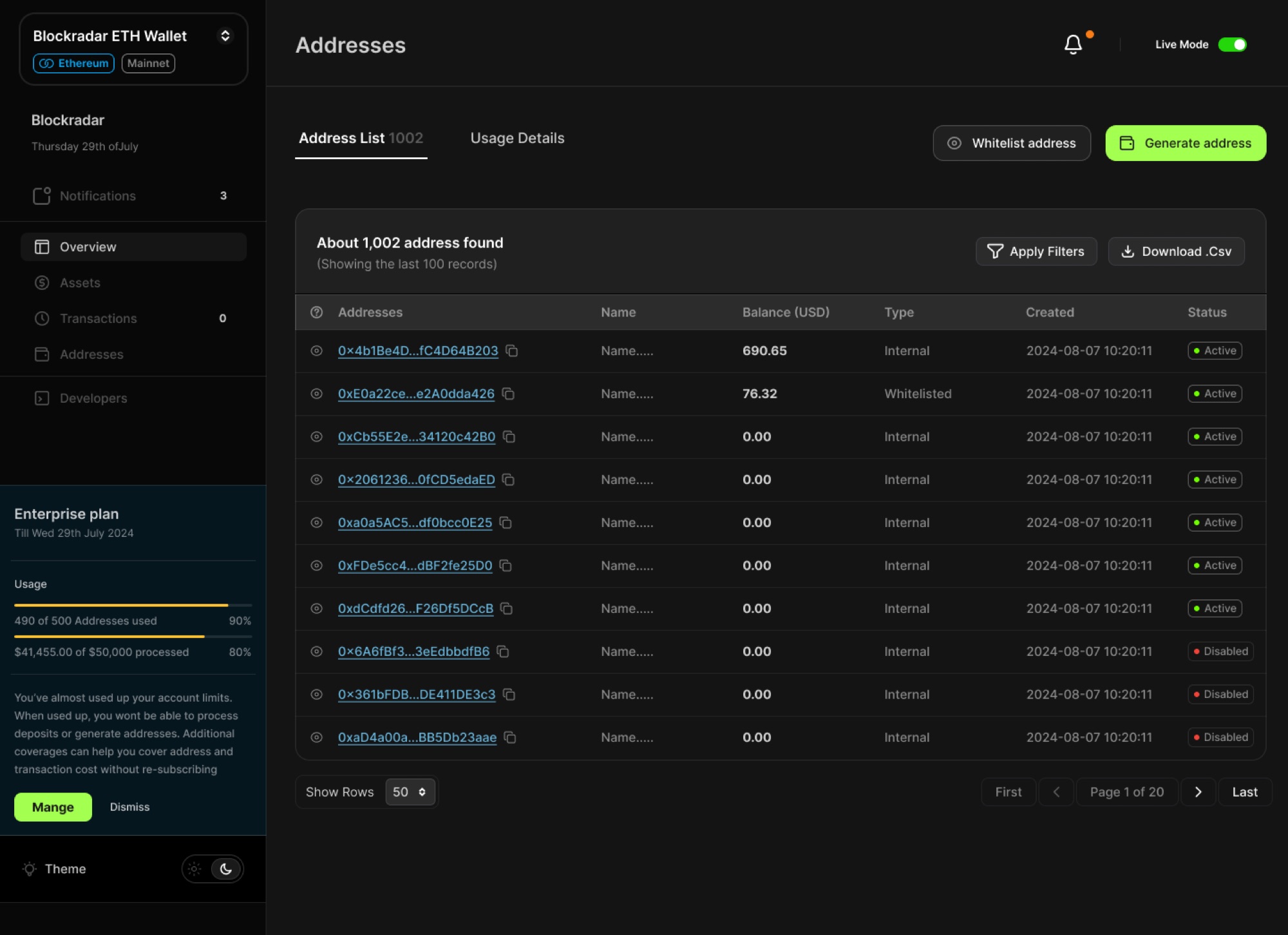
Child addresses under one master wallet. Balance, type and status up front, everything else on request.

A child address has a lot of information attached to it. We could have shown balances, activity, asset information, creation details, status and other blockchain-specific data all at once, but that would have made the table difficult to work with.

We chose to keep the first layer focused on what someone would need most often, while allowing the rest to be opened when necessary. That kept the main views readable without taking away the detail an operations team might need when investigating something. The same approach carried into transaction metadata.

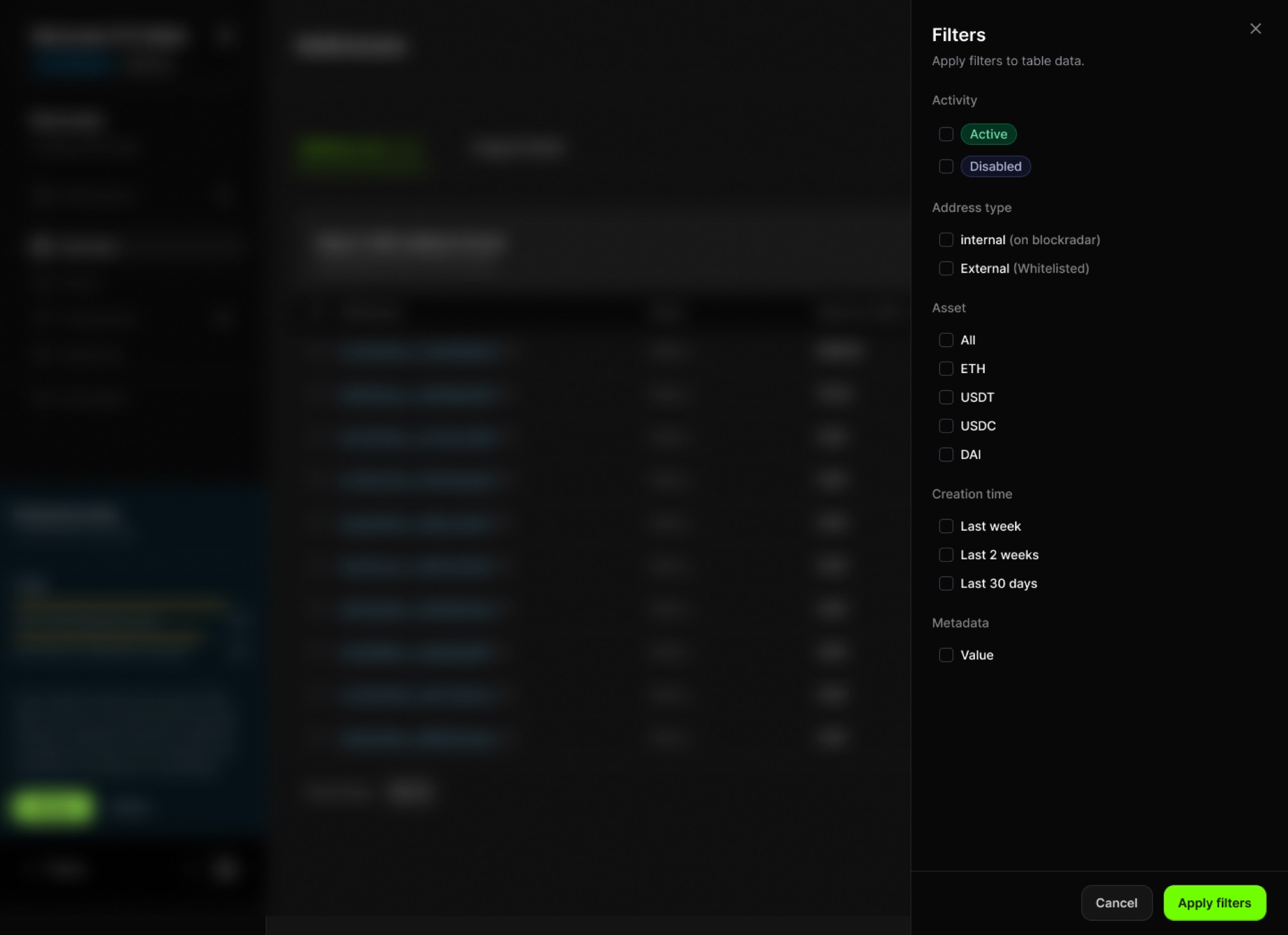
Filtering that table down: activity, type, asset, when it was created.

Then came transactions

Once we had the wallet and address structure in place, we moved into what happens after money starts moving.

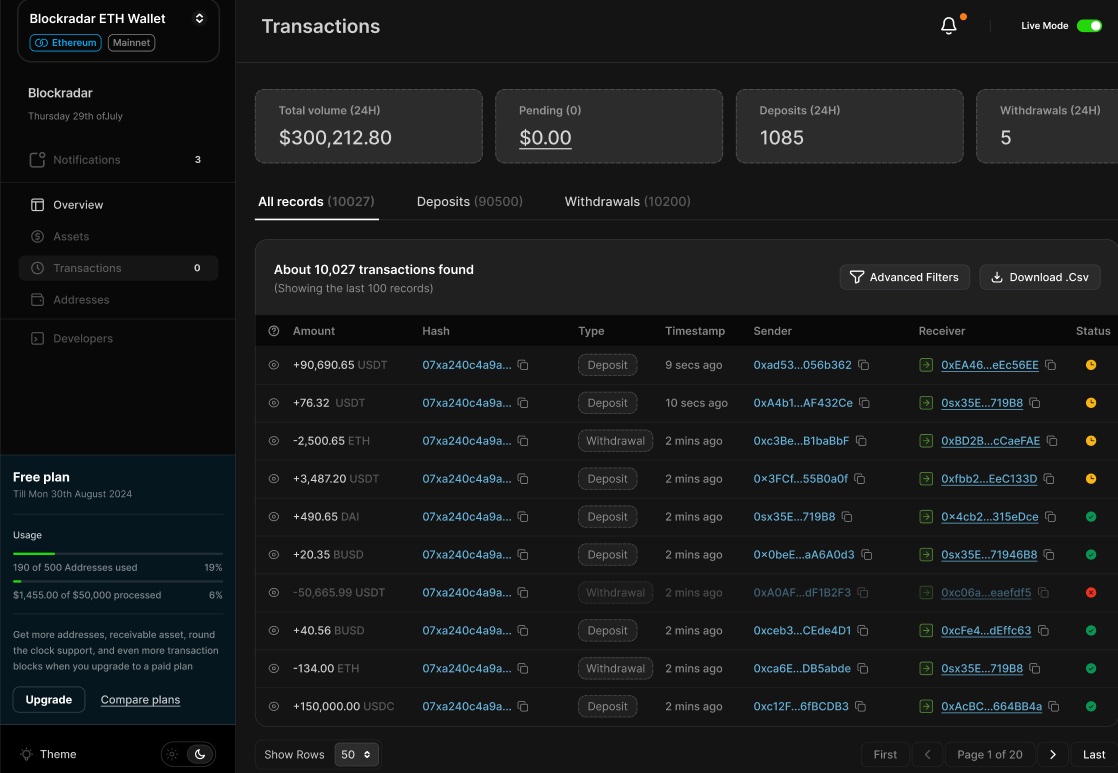
The requirements included a lot of transaction information. We didn’t want all of it competing for attention in the table, so the main view showed:

Type · Date · Sender · Recipient · Amount · Asset · Status

The transactions view: volume and counts at the top, then every record with type, timestamp, sender, receiver and status.

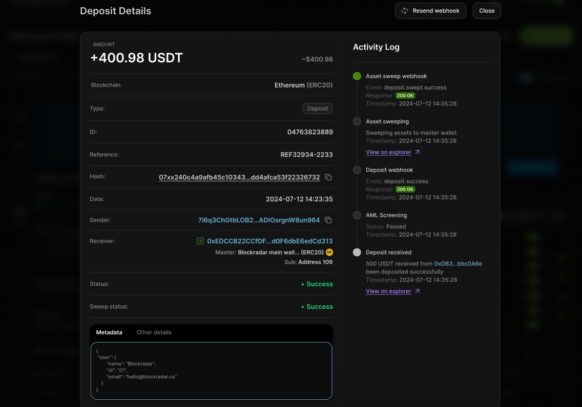
The rest was available when needed. We also designed the transaction detail view around the events that happen throughout its lifecycle. For example:

Deposit confirmed → Asset swept → Deposit webhook sent → Sweep webhook sent

A single deposit opened up, with the activity log running the full lifecycle on the right.

That became particularly useful for failed transactions. If a sweep failed, the failure reason appeared in the activity log and the relevant action could be taken from there. We didn’t want someone to discover the problem in one place and then have to hunt through another part of the product to fix it.

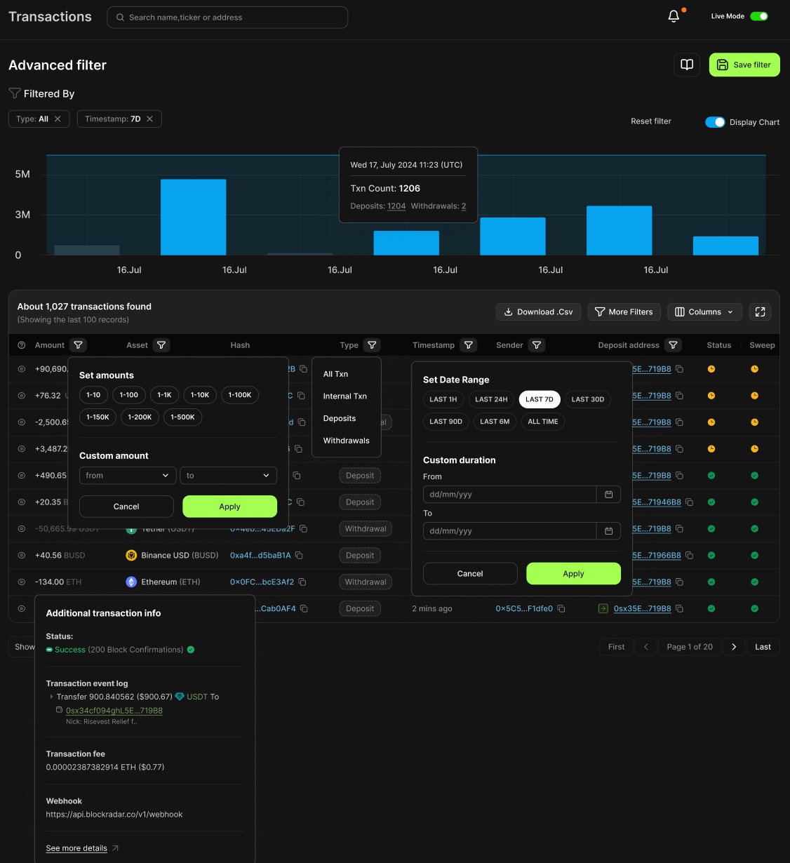
Advanced transaction filters

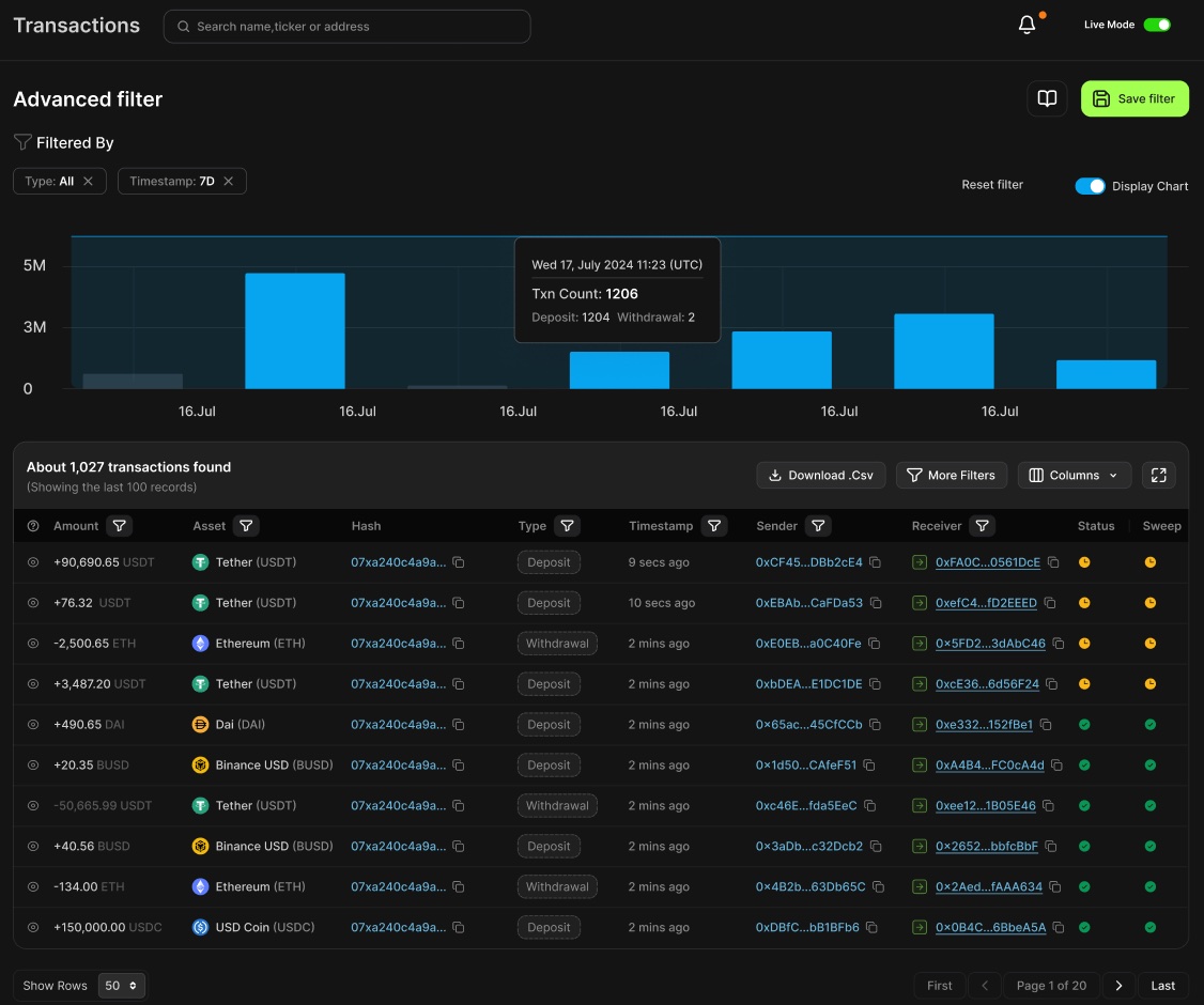
The table worked well for browsing, but we had to think about what happens when a business has thousands of records. We designed filters around the information someone would realistically use when investigating a transaction:

Reference · Hash · Recipient · Type · Status · Asset · Date

Advanced filter. The chart narrows with the table, and applied filters stay visible as removable chips.

Filters could be combined, and the applied filters stayed visible so it was always clear why the table had been narrowed.

The filter controls themselves: amount bands, transaction type, preset and custom date ranges.

Small decisions like this came up repeatedly: what is the user trying to find, and what is the quickest way to get them there?

Designing the failed states

Once the main flows were taking shape, we started working through the several edge cases we hadn’t previously considered.

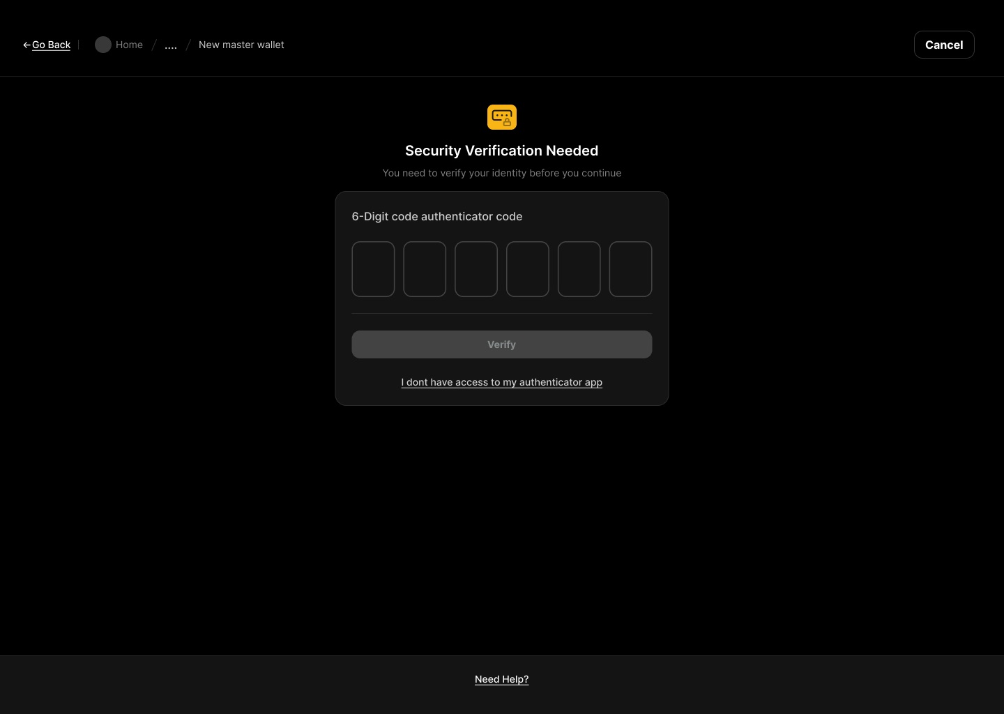
01Losing access to 2FA

If someone lost their authenticator, they couldn’t simply turn 2FA off. We worked through a recovery path:

Password → Email OTP → New authenticator → Confirmation

The verification gate, with the recovery link for someone without their authenticator under the Verify button.

The “forgot 2FA” route was also kept close to the verification step, so someone didn’t have to work out where to go after getting stuck.

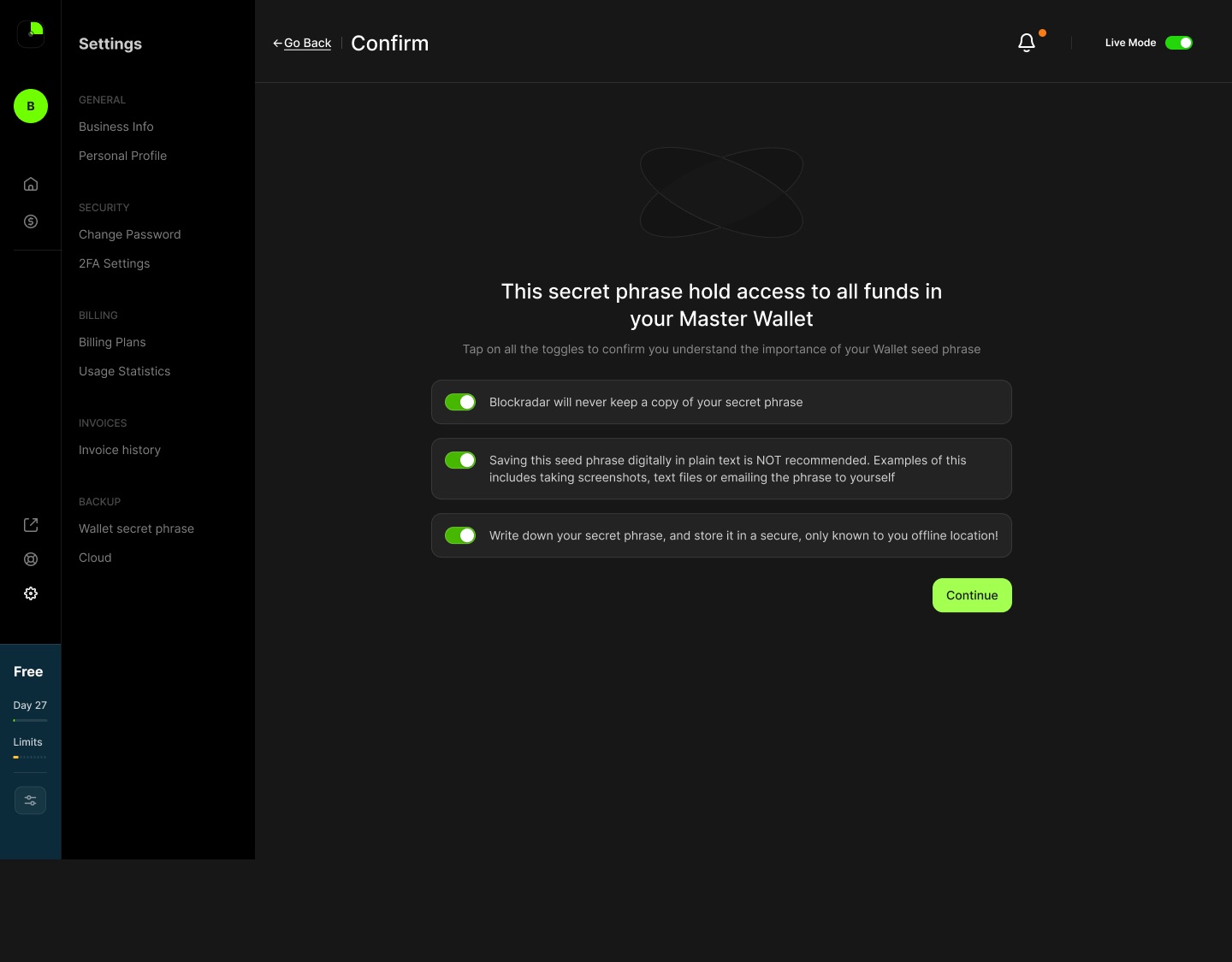
02Backing up a wallet

Backup was another flow where the edge cases mattered. The experience needed to make it clear that the information being downloaded was sensitive, while still getting the user through the process without unnecessary friction. We broke it into five steps, with the warning before the action.

Click throughBacking up a wallet1/5
The backup page opens on the warning, before you reach the action. Both factors on one screen: authenticator code and password. Three statements, each its own toggle. Continue stays disabled until all three are on. All three acknowledged, and Continue is enabled. The phrase behind its own warning, with cloud backup and file download.
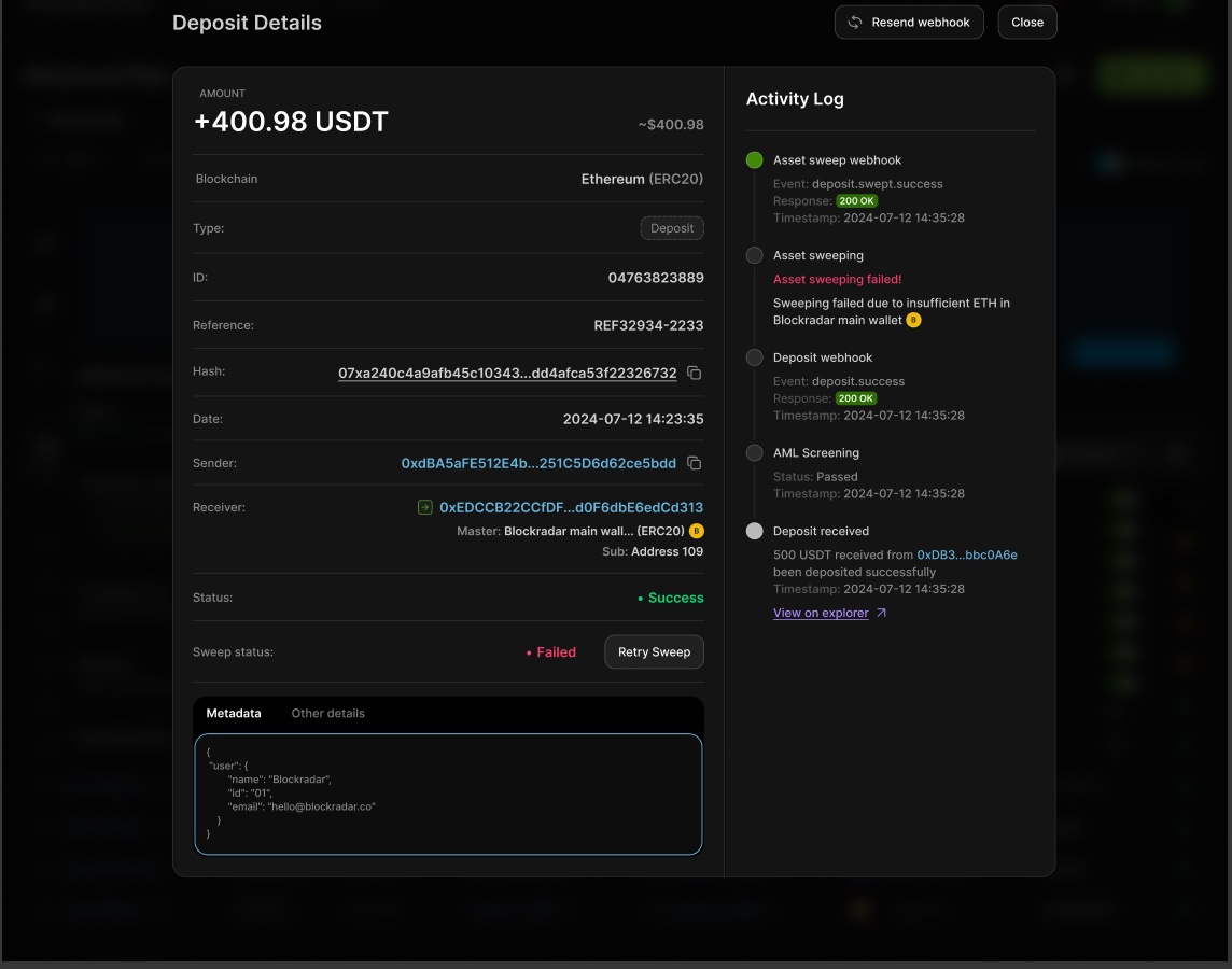
03Failed sweeps

A deposit could come in successfully and the sweep could still fail. Showing a failed status wasn’t enough on its own, so we surfaced the reason and put the retry action next to it.

The reason is stated in the log, with the retry next to the status.

Working through the details

A lot of the work happened in questions the requirements didn’t cover.

  • How should a wallet address be displayed without taking up half the screen?
  • When should we show the full transaction hash?
  • What information should appear before someone opens transaction details?
  • How should a user know which environment they’re currently in?
  • What happens when there are no wallets yet?
  • What should happen when a transaction is pending, fails, or needs another action?
  • Where should a user go when they’ve lost their authenticator?

These questions rarely had an obvious answer in the requirements. Faye and I worked through them together and brought the bigger decisions back to the co-founder. That back-and-forth shaped a lot of the final experience.

Some answers changed as we designed. We’d put something on screen, realise it didn’t quite work, and go back to the flow.

Bringing V1 together

By the end of the engagement we had worked through the core V1 experience across onboarding, wallets, child addresses, transactions, security, backups, usage and settings.

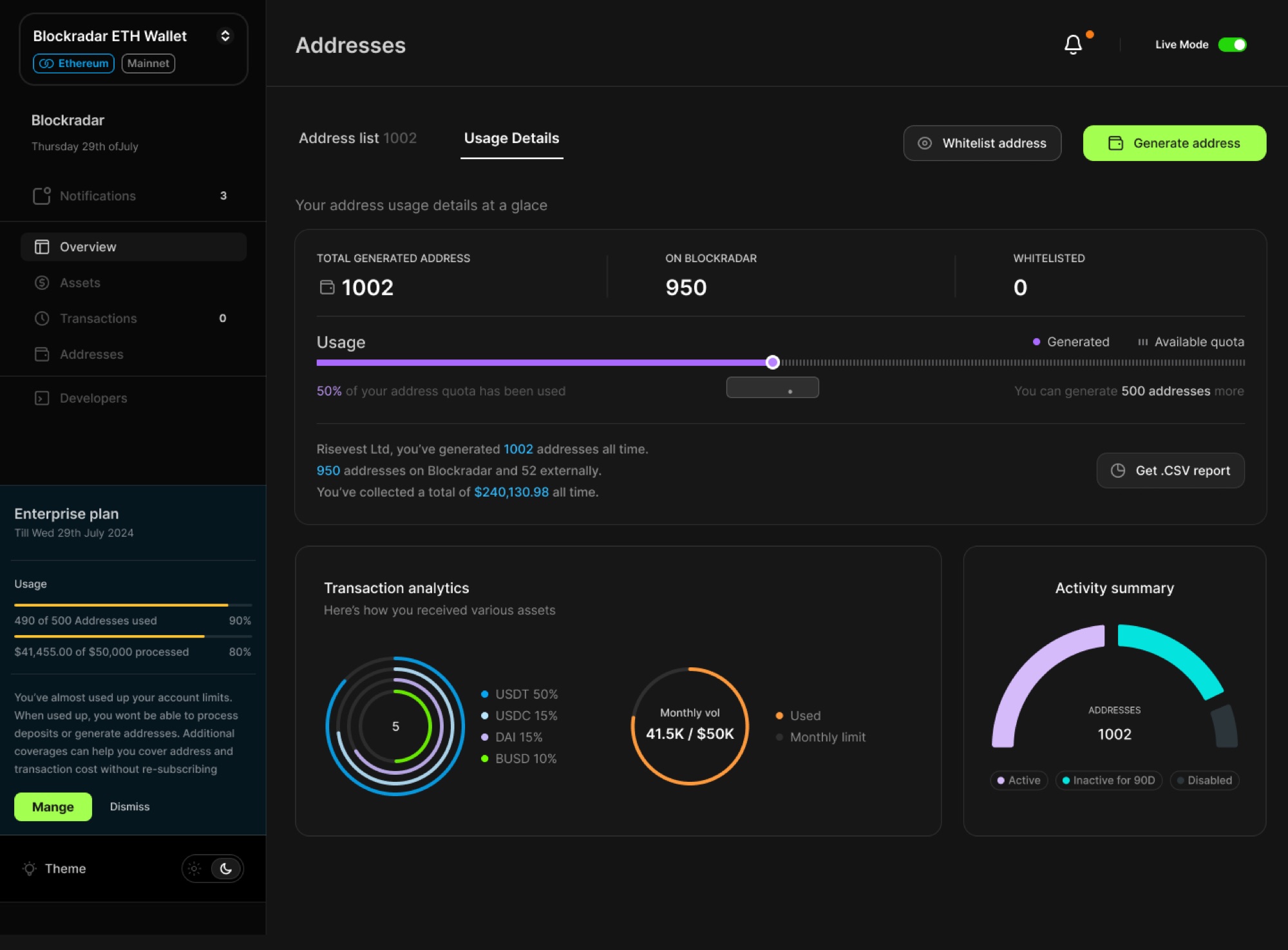
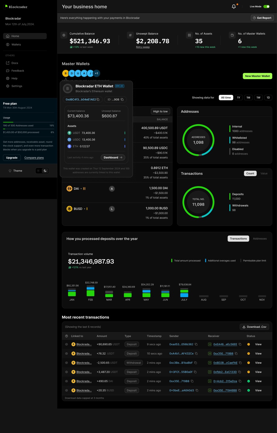
The dashboard everything reported into: balances across wallets, address and transaction counts, deposits over the year, and the latest activity.

The dashboard brought the main pieces together: wallet balances, address and transaction counts, deposits over the year, recent activity, and usage against plan limits.

Usage against plan limits: addresses generated and monthly transaction volume.

More importantly, we had a shared direction for how those pieces should work together. The work later became the starting point for a product that continued to expand well beyond the V1 we designed.

Blockradar has since grown considerably, including new products and significantly higher transaction volumes. In 2026 the company reported crossing $1B in transaction volume.

Design: Faye and me. Product direction: the Blockradar co-founder. Freelance engagement, 2024.

Aether Energy

02/05

Building Aether from 0→1

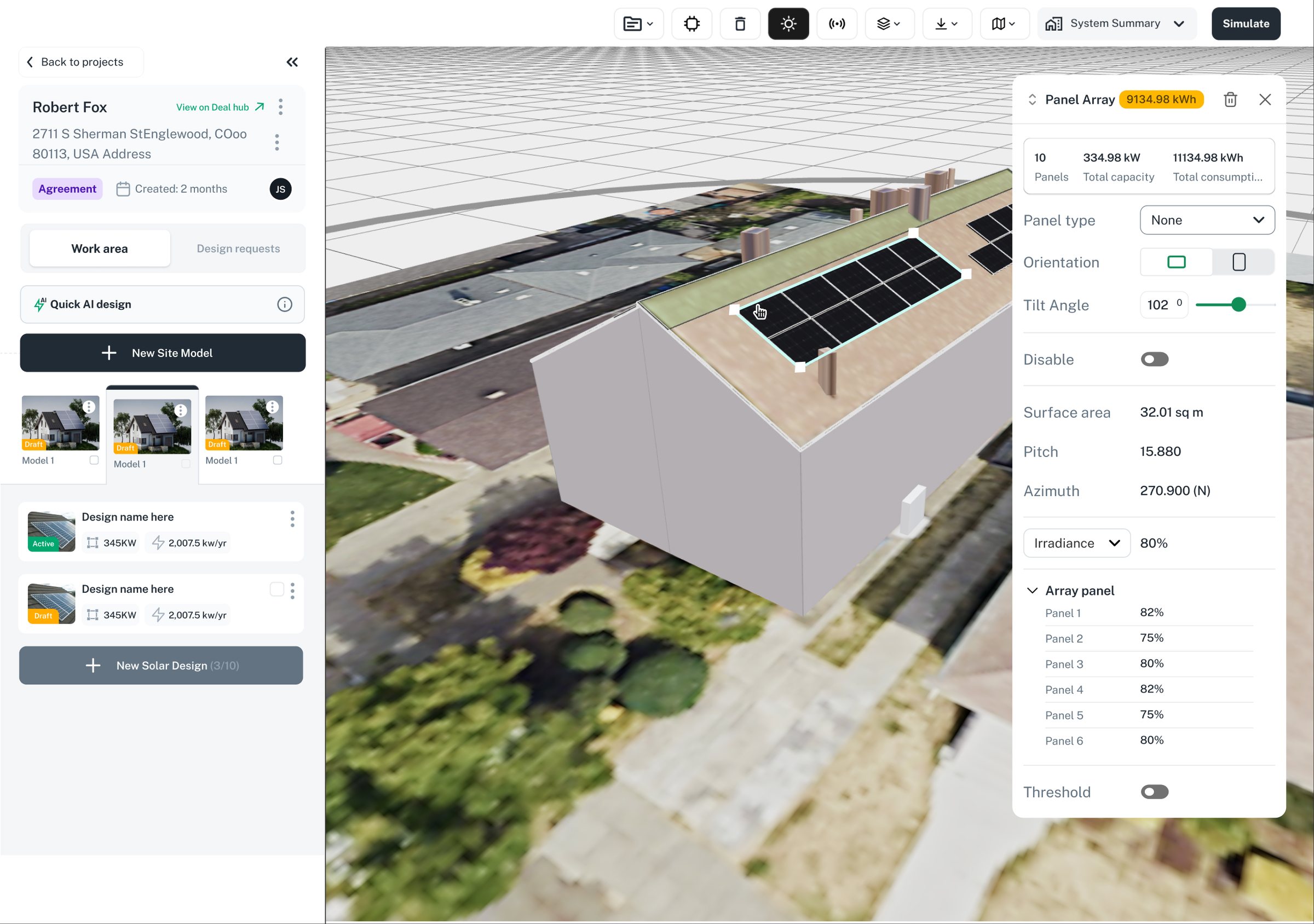
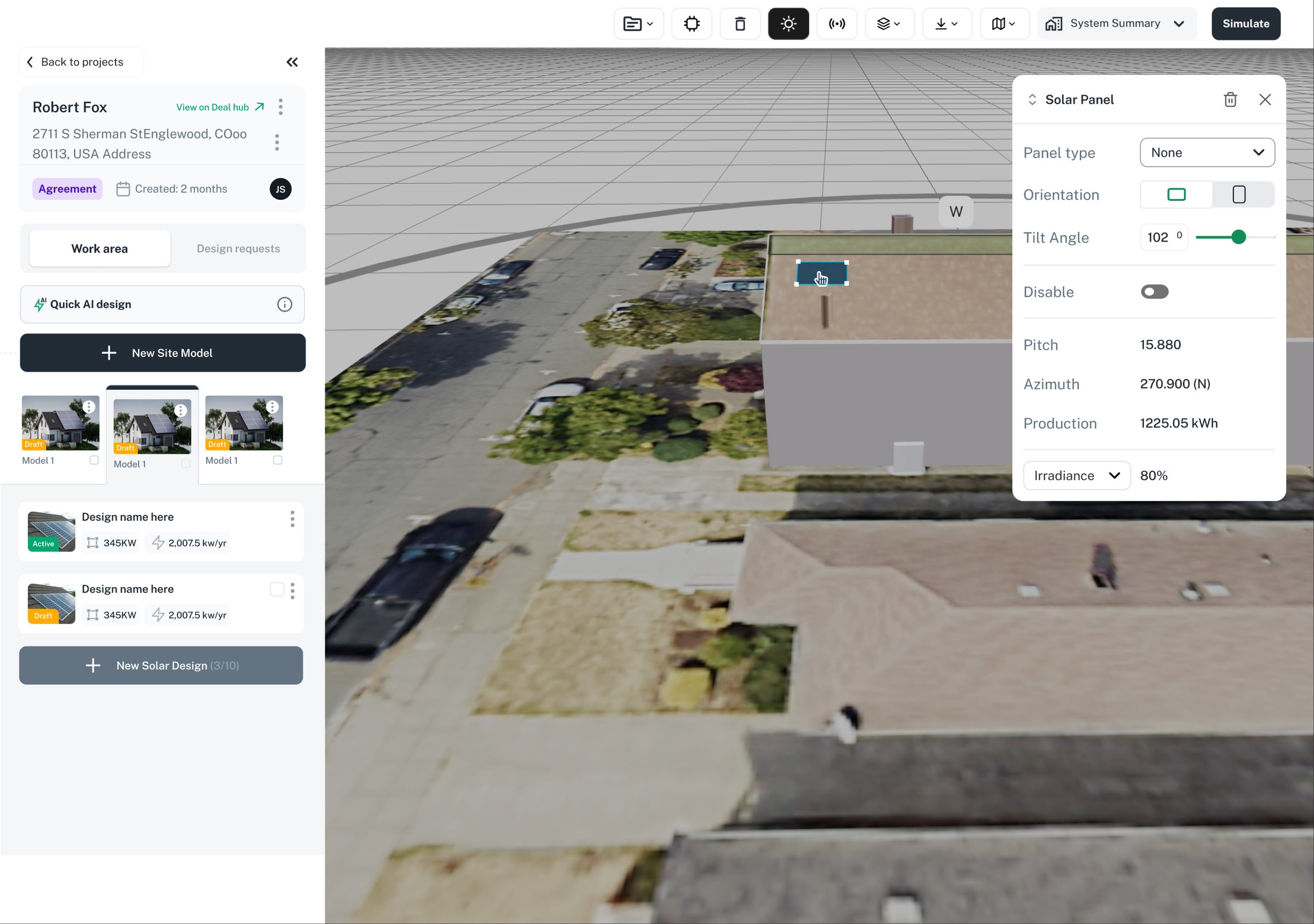
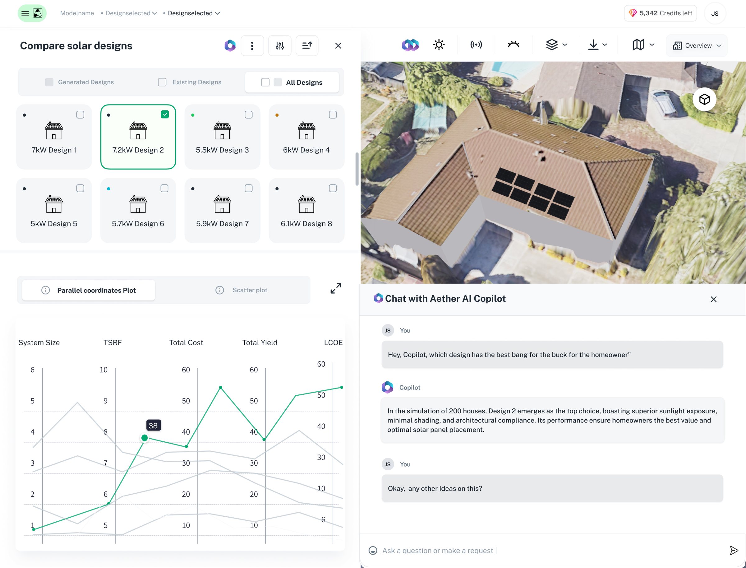
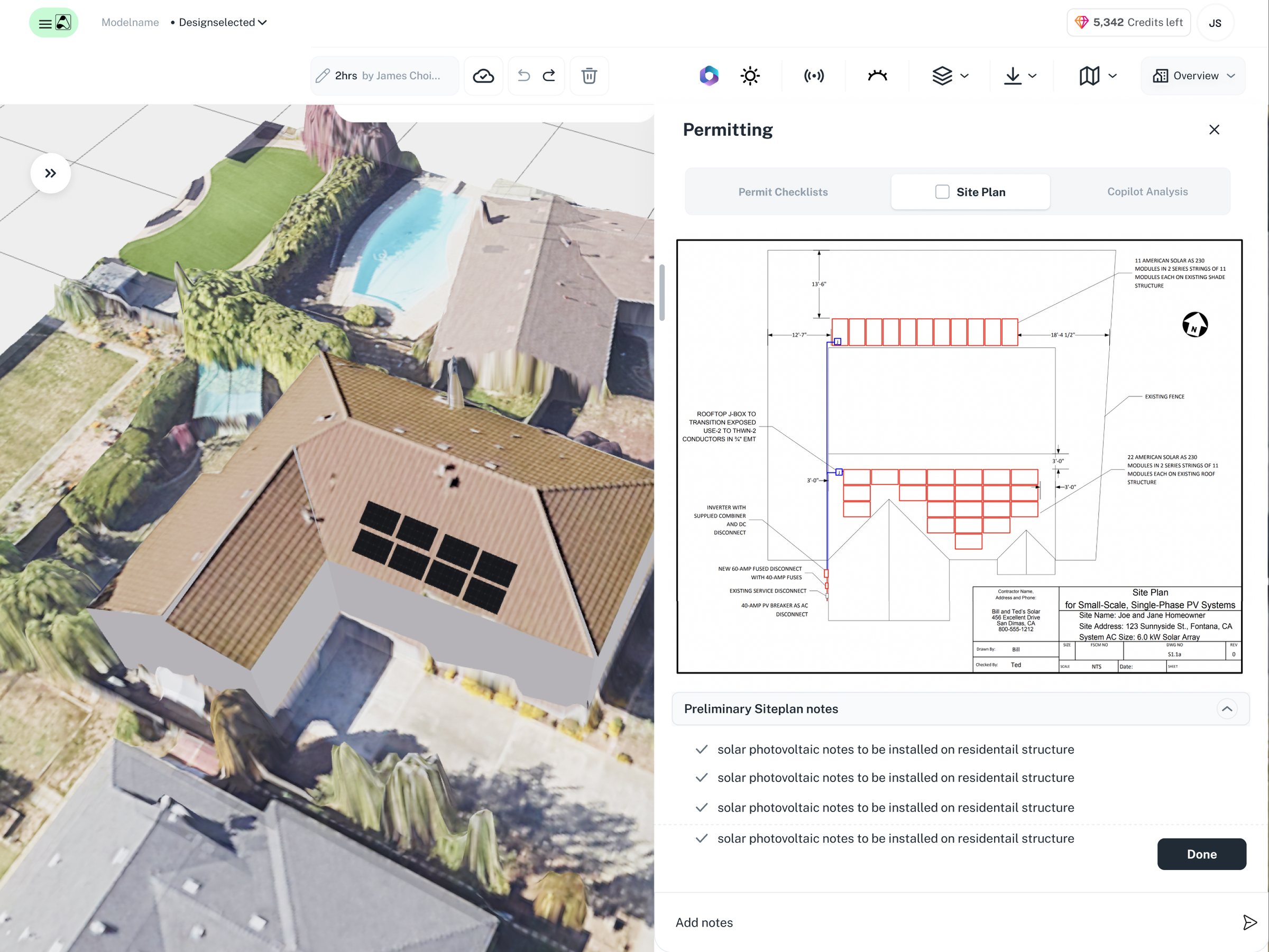
I joined Aether as its first employee and first design hire, working closely with the founding team to take the product from early ideas to a working platform.

I worked solo for around six months before I was joined by another designer, Godson, and I closely collaborated with him.

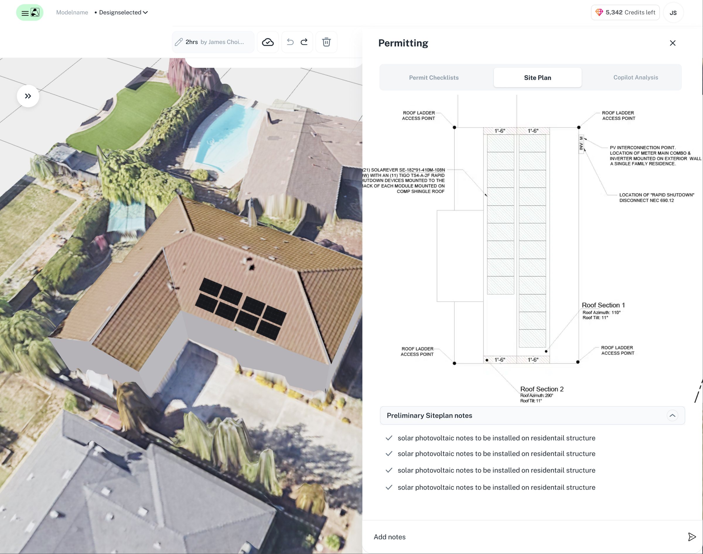
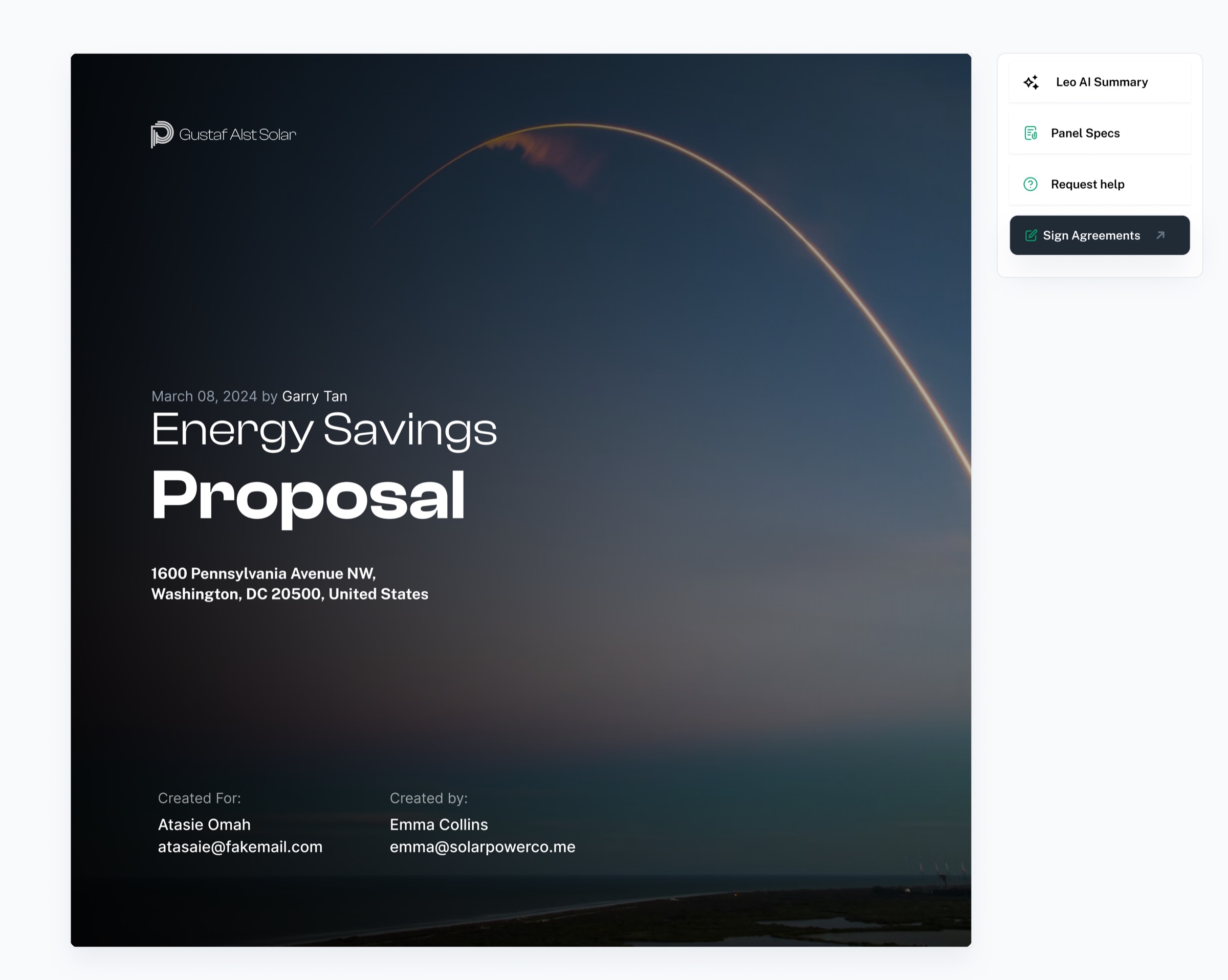
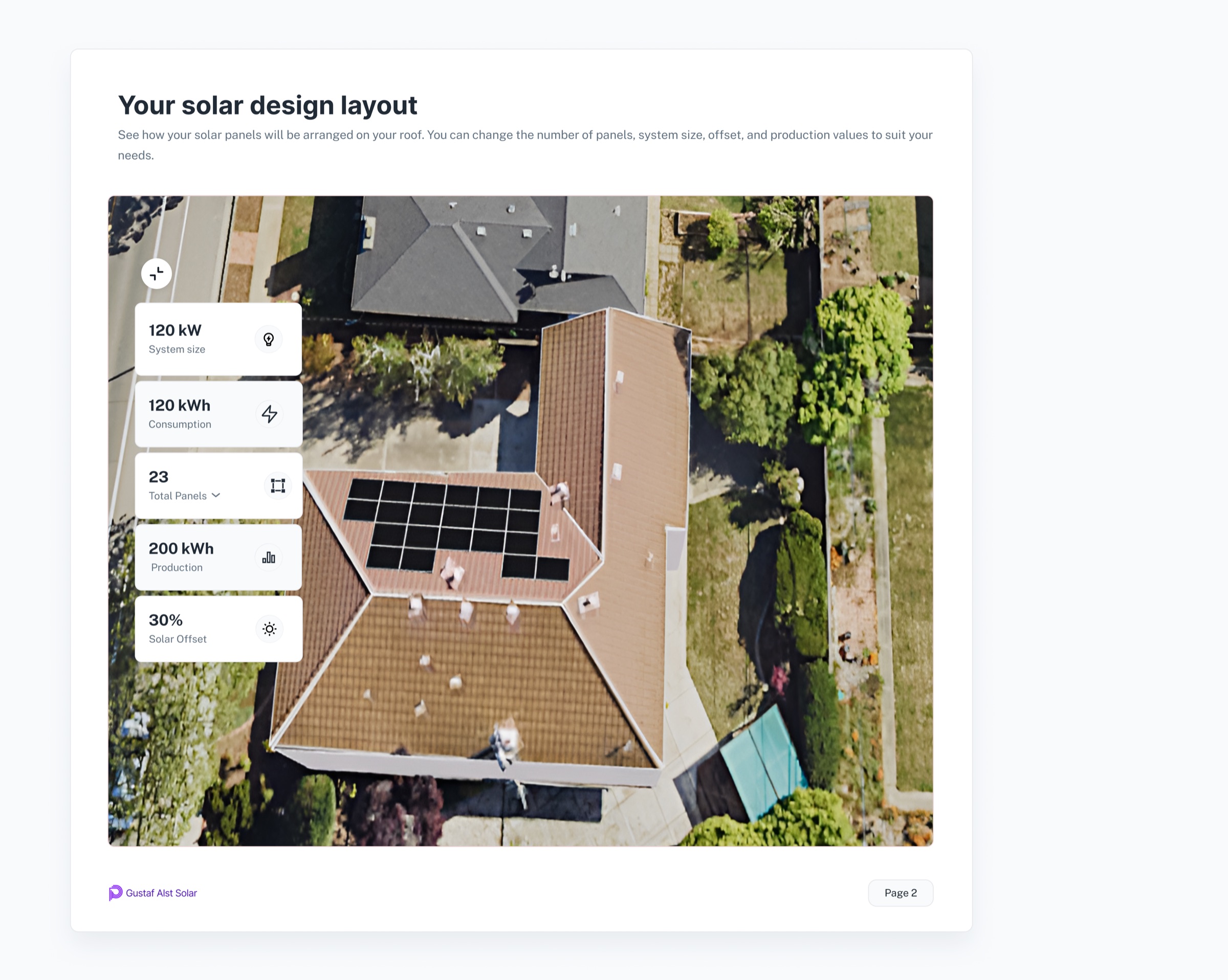
In one year, we designed and shipped five major parts of the product: Solar Proposals, CRM, Solar Design, Document Manager and the website.

We moved quickly because there was very little room not to. New features were being shaped, designed, tested and shipped continuously as we learned from customers and sales conversations.

That work helped Aether sign a $500K ARR deal with SalesRabbit, grow to nearly $1M ARR, and raise $2.5M in seed funding within the year.

My role covered product design across the platform, from figuring out early workflows and information architecture to designing the interfaces and building the marketing site in Framer.

The product has since evolved and Aether has rebranded as Feldy.ai to pivot solely into roofing. The work below is from the period when we were part of the team building the original platform.

Here’s what we worked on

Solar CRM

The deal before the proposal

The CRM was where the sales side of Aether came together.

Solar companies were running leads, deals, site information and follow-ups across separate tools and spreadsheets. We designed the CRM: the pipeline, the deal record, the views reps build for themselves, and the handoff into design and proposals.

Starting with the sales workflow

We started by mapping the sales process from a new lead through to a signed deal.

There were a lot of possible states and pieces of information, so the first challenge was deciding what needed to be visible at each stage and what could stay inside the deal.

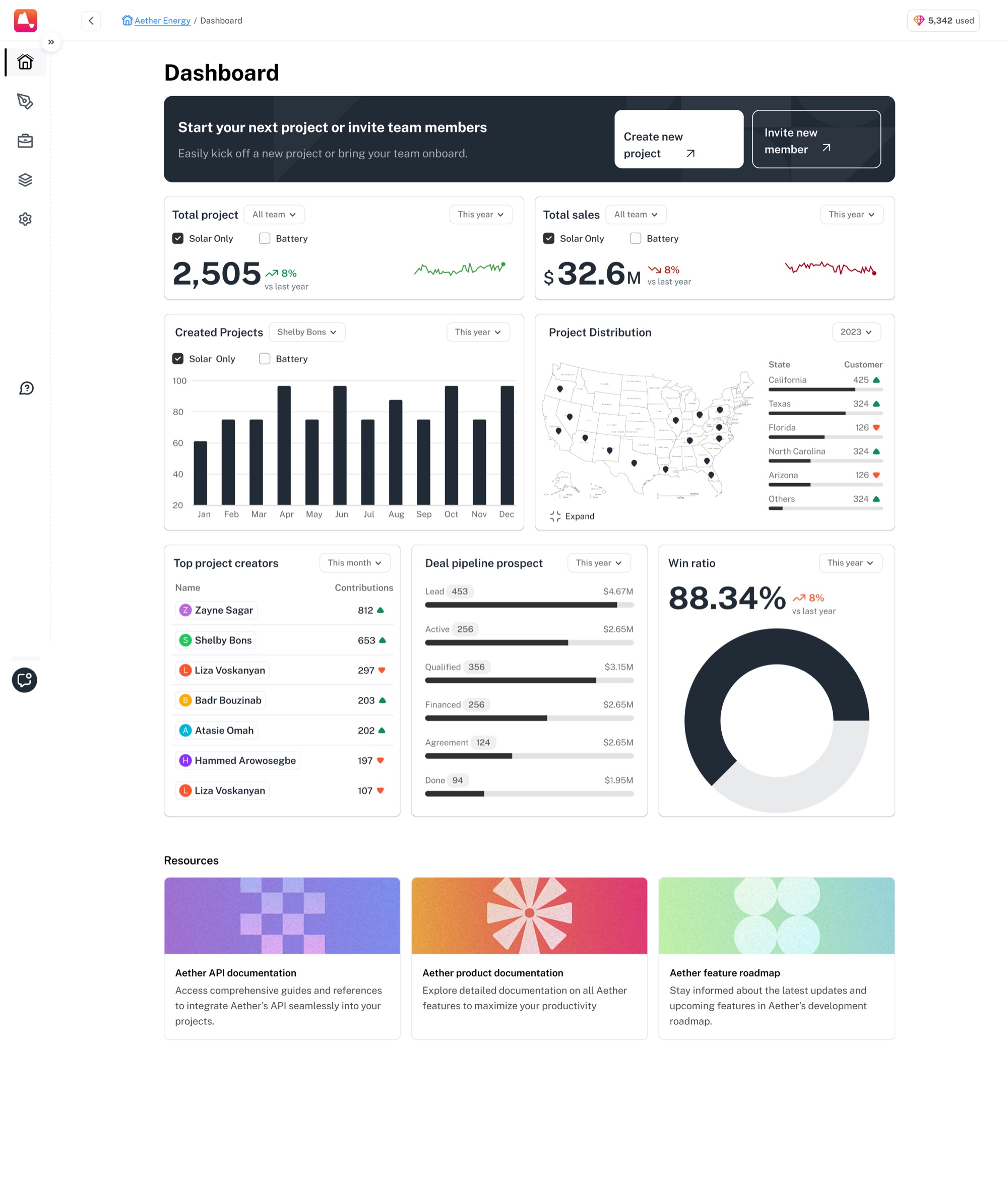
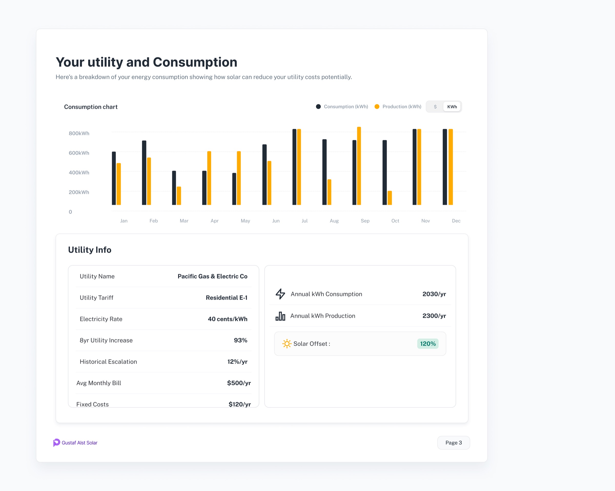
The CRM home: 2,505 projects and $32.6M in sales, created projects by month, installs plotted by state, top creators, the pipeline from lead to done, and an 88.34% win ratio.

The home screen carries what a sales lead checks first (projects, total sales value, installs by state and the win ratio), with the pipeline from lead to done underneath it.

That shaped the CRM around the sales pipeline rather than a collection of separate records.

Making the pipeline useful

The pipeline needed to answer a simple question quickly: what is happening with my deals?

We worked through the structure of the deal stages, what information belonged on each card and how much detail could be shown without making the pipeline difficult to scan.

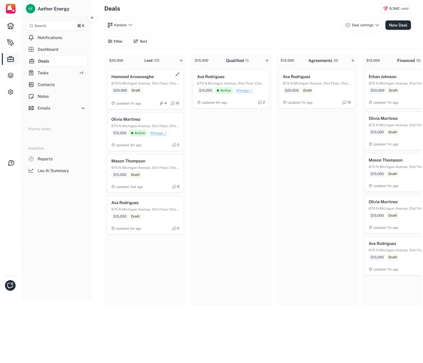
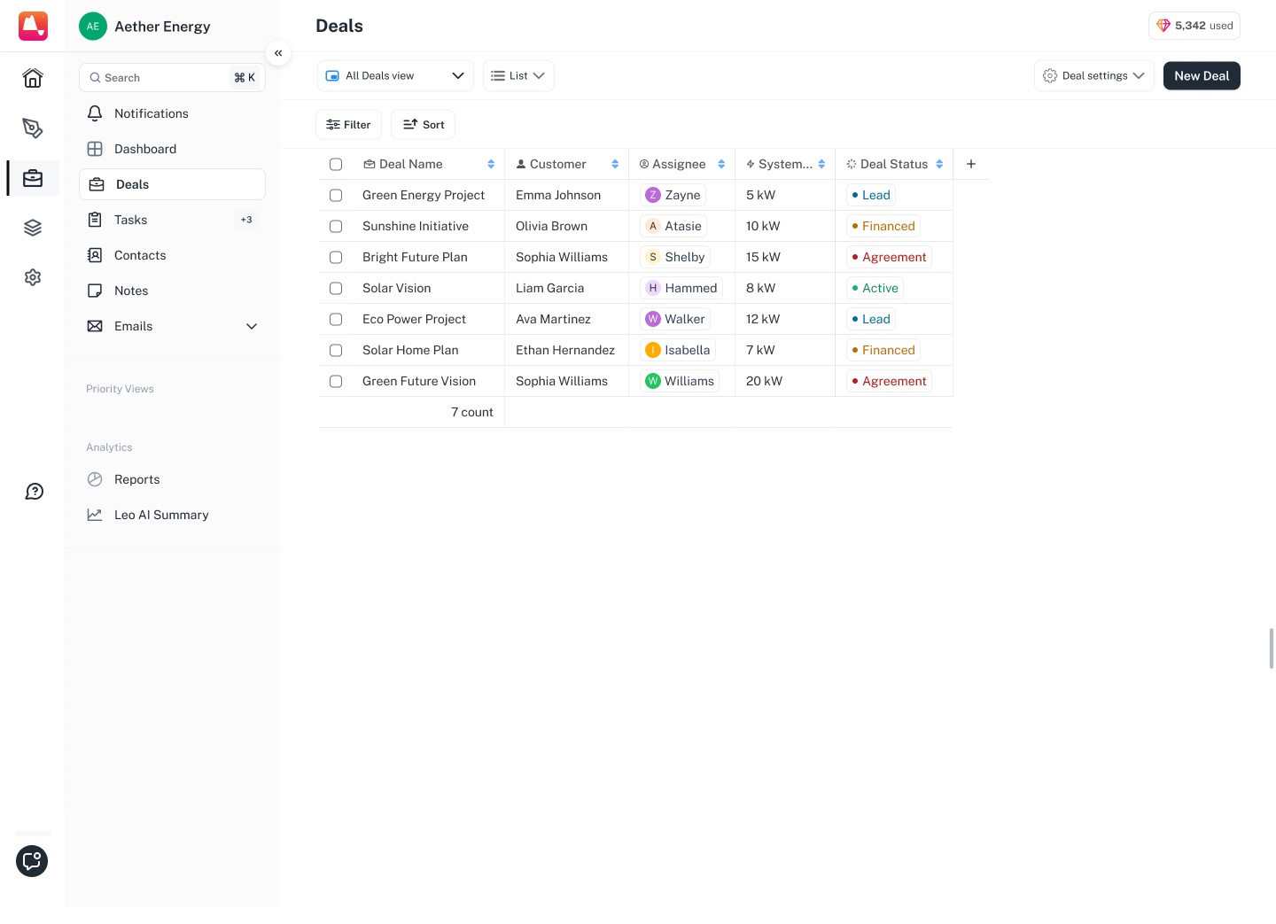
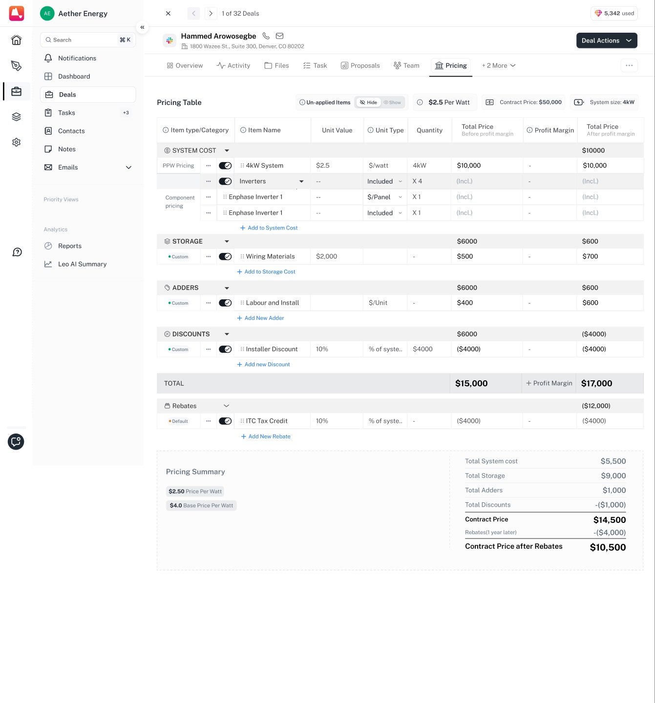
Deal Hub reads three ways: a board of stages with each column totalling its own value, a table, and a pricing view.

ScreensDeal Hub, three ways1/3
The same deals as a board, each column totalling its own value. Deals as a table, with columns the team defines and views they can save. Pricing: system cost, storage, adders, discounts and rebates, every line switchable and carrying its own margin.

Filters run on deal owner, status, sales rep, location and date, and a filter can be saved and reopened later. A table view is built column by column, renamed, and pinned to the top.

Click throughMoving a deal across the board1/4
The board at rest, every stage column carrying its own total. The card lifts off the column and follows the cursor. Everything under it stays where it was. Dragged over Qualified, which opens a gap to show where it would land. Dropped, and the totals on both columns settle to the new number.
Click throughFiltering the board, and keeping it1/9
Deals by stage — Lead, Qualified, Agreements, Financed — each column headed by its own value. Filters open beside the board, with the fields you can filter on listed down the left. Owners picked as chips, so more than one person can be in the same view. Status as the same coloured pills the cards use. Sales representative, with Me at the top of the list. Country, state, city, ZIP. Created, closed, last activity, updated — each with its own range. The filter is named, set to public or private, and pinned to the top. Saved searches come back as named views — High-Value Deals, Recently Added Leads, Deals in Negotiation.
Click through1/5
A new list with no deals in it, offering two options: import a CSV, or create the first deal. Seven deals as a table — name, customer, assignee, system size, status — with the count under the last row. Imagery source added as a column. Installation date added beside it, filled from the deal. Column labels are edited in place, in the header.
Click through1/6
The default view: everything, every column. A new view starts empty, with Add Columns as the only thing on it. The same deals, cut down to the columns this view uses. Pinned into Priority Views in the sidebar, beside the rest of the workspace. Unpinned again. The view still exists, it has just left the sidebar. Reopened and filtered to two rows.

Opening a deal then provided the deeper context without losing the connection to its position in the pipeline.

Bringing the deal together

A solar deal can involve much more than a contact and a dollar amount.

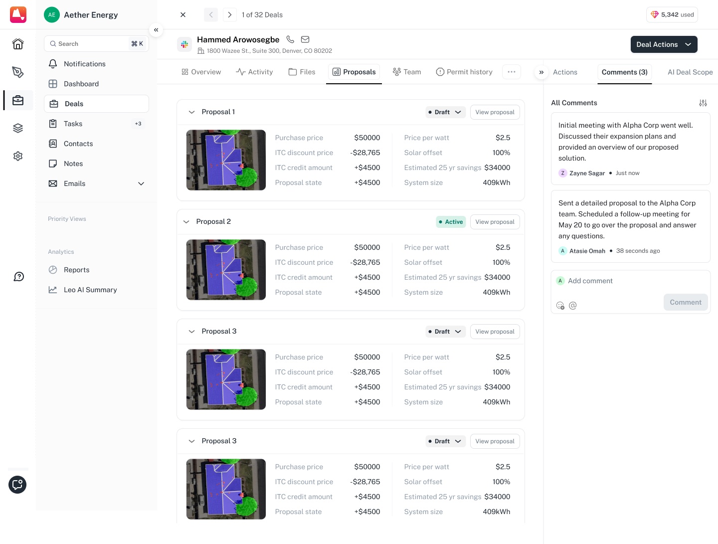
Customer information, site details, proposals, documents and activity all become relevant as the deal progresses. We worked on bringing those pieces together so sales reps could understand the state of a deal without jumping between disconnected parts of the product.

ScreensThe deal record1/7
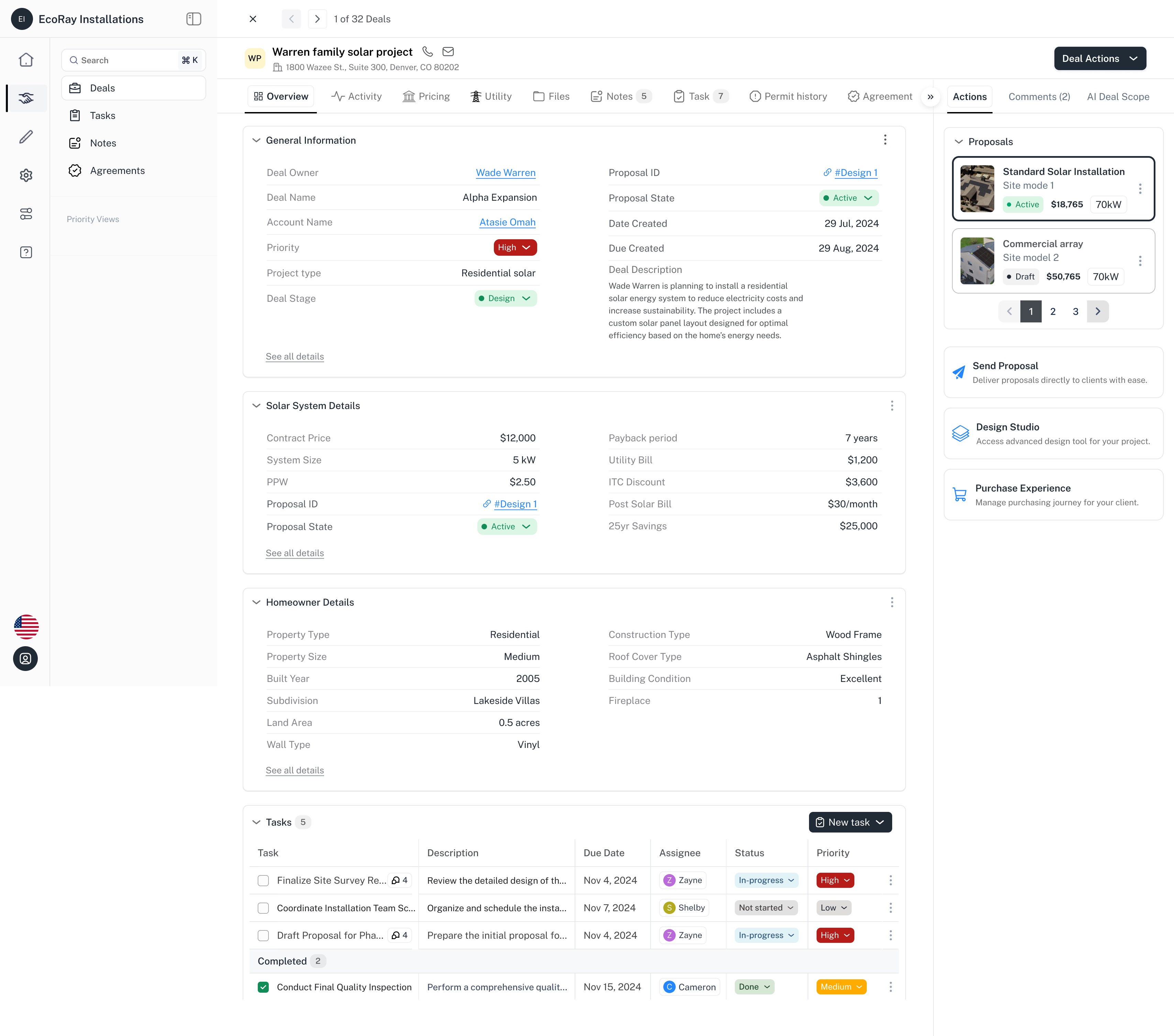
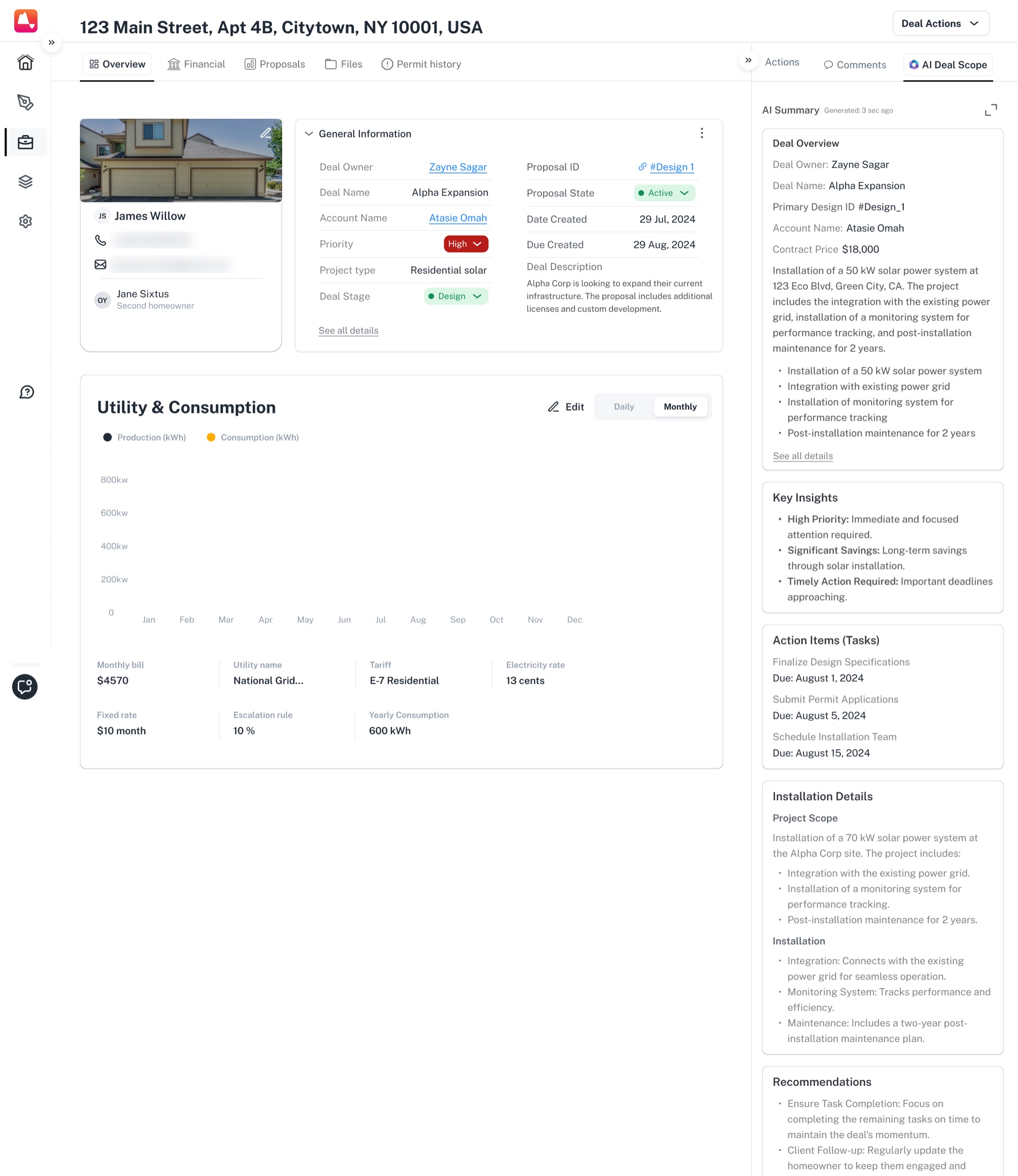
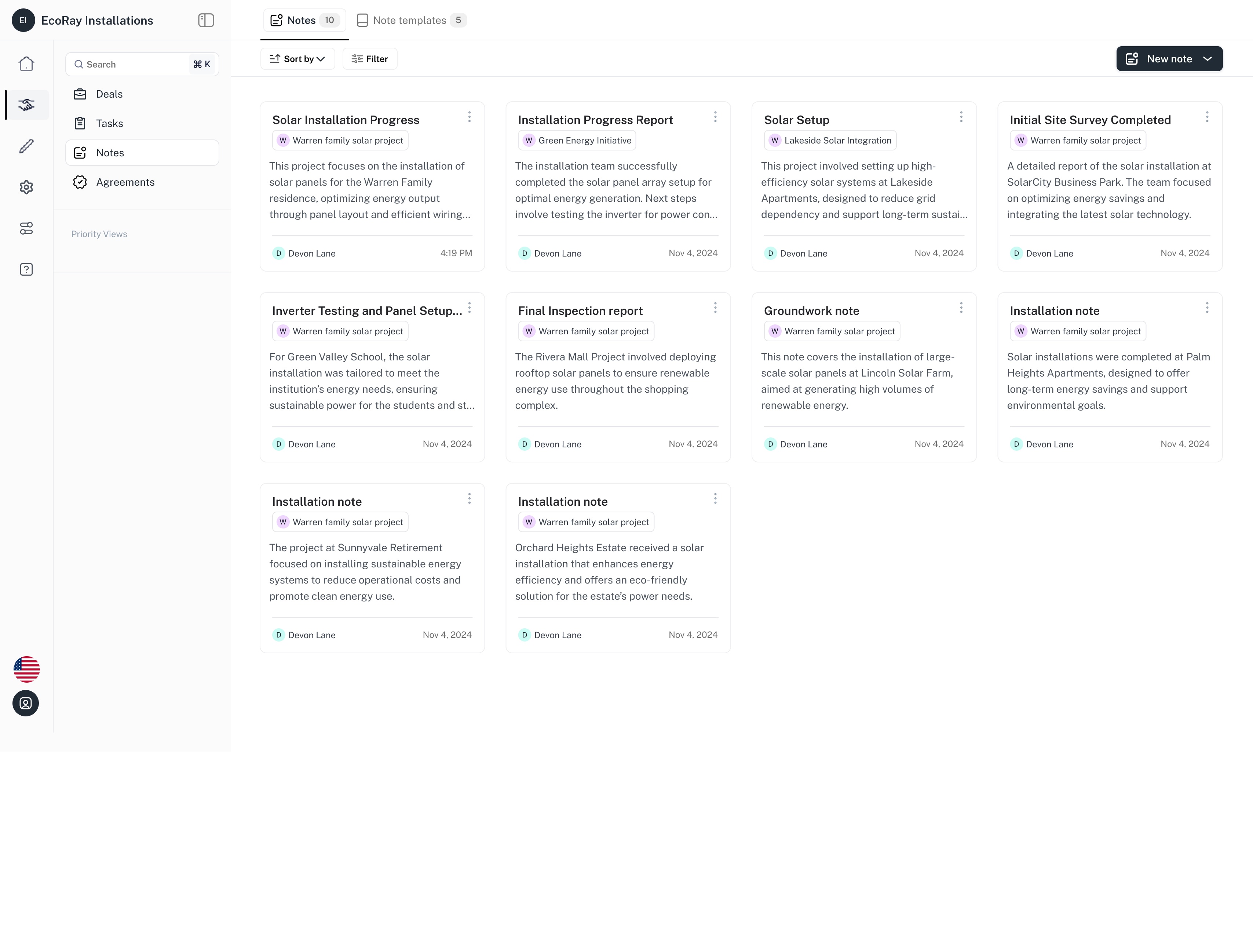
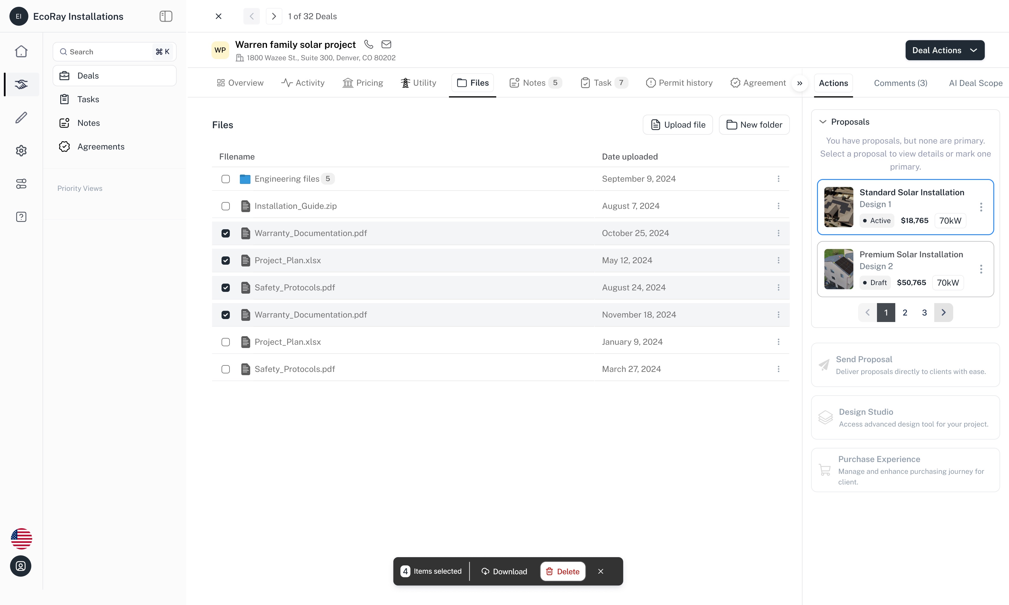
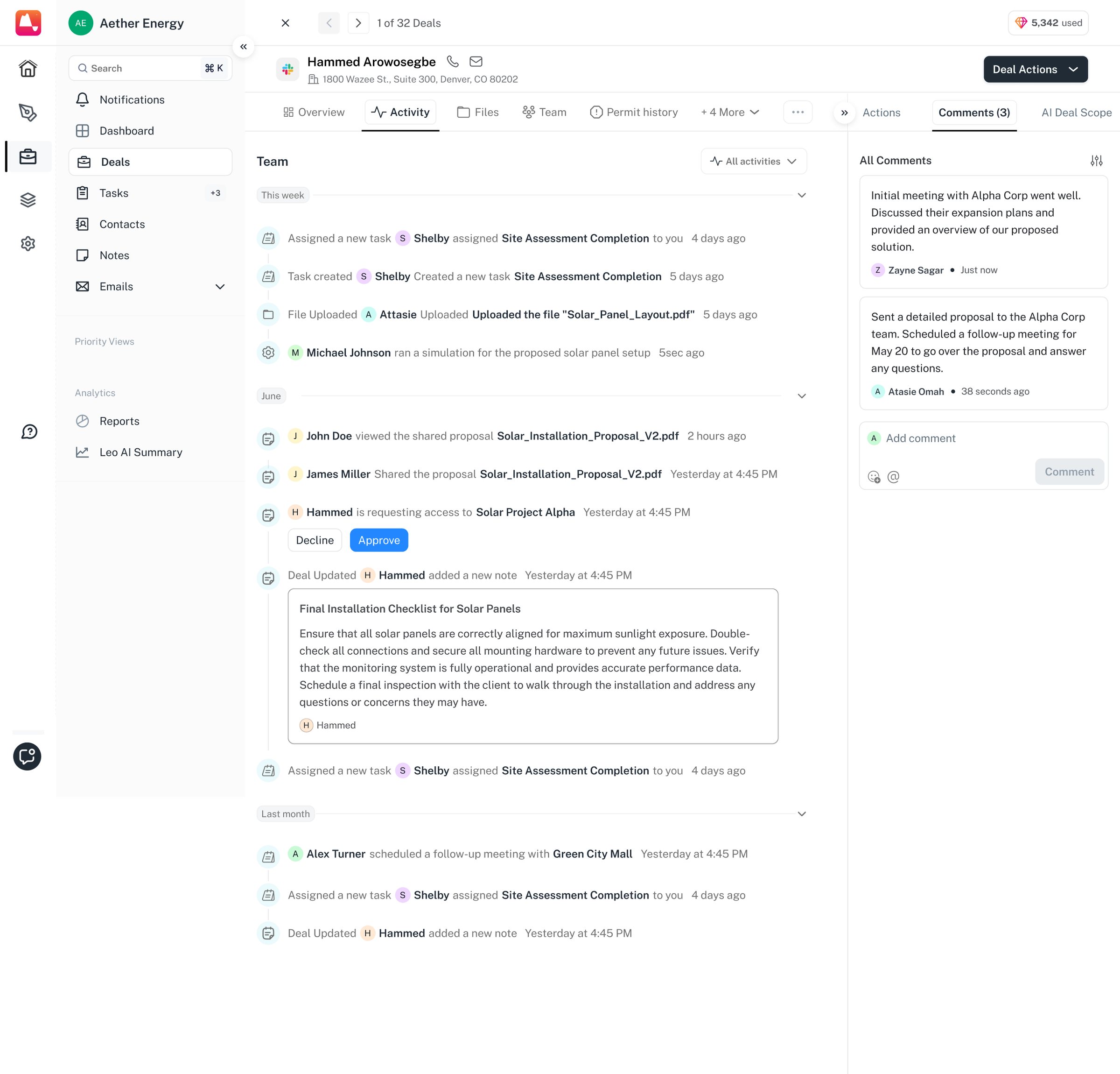
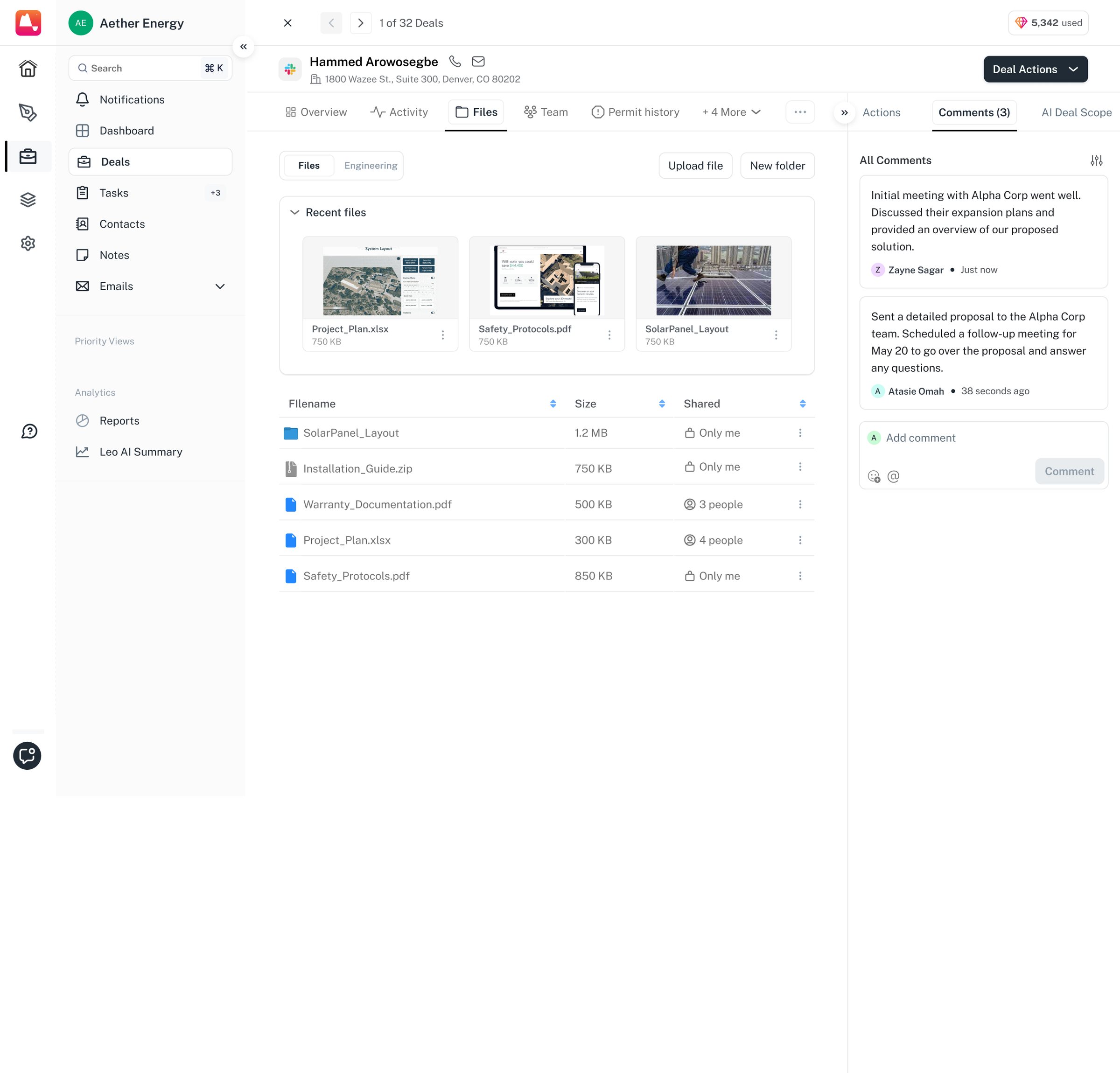
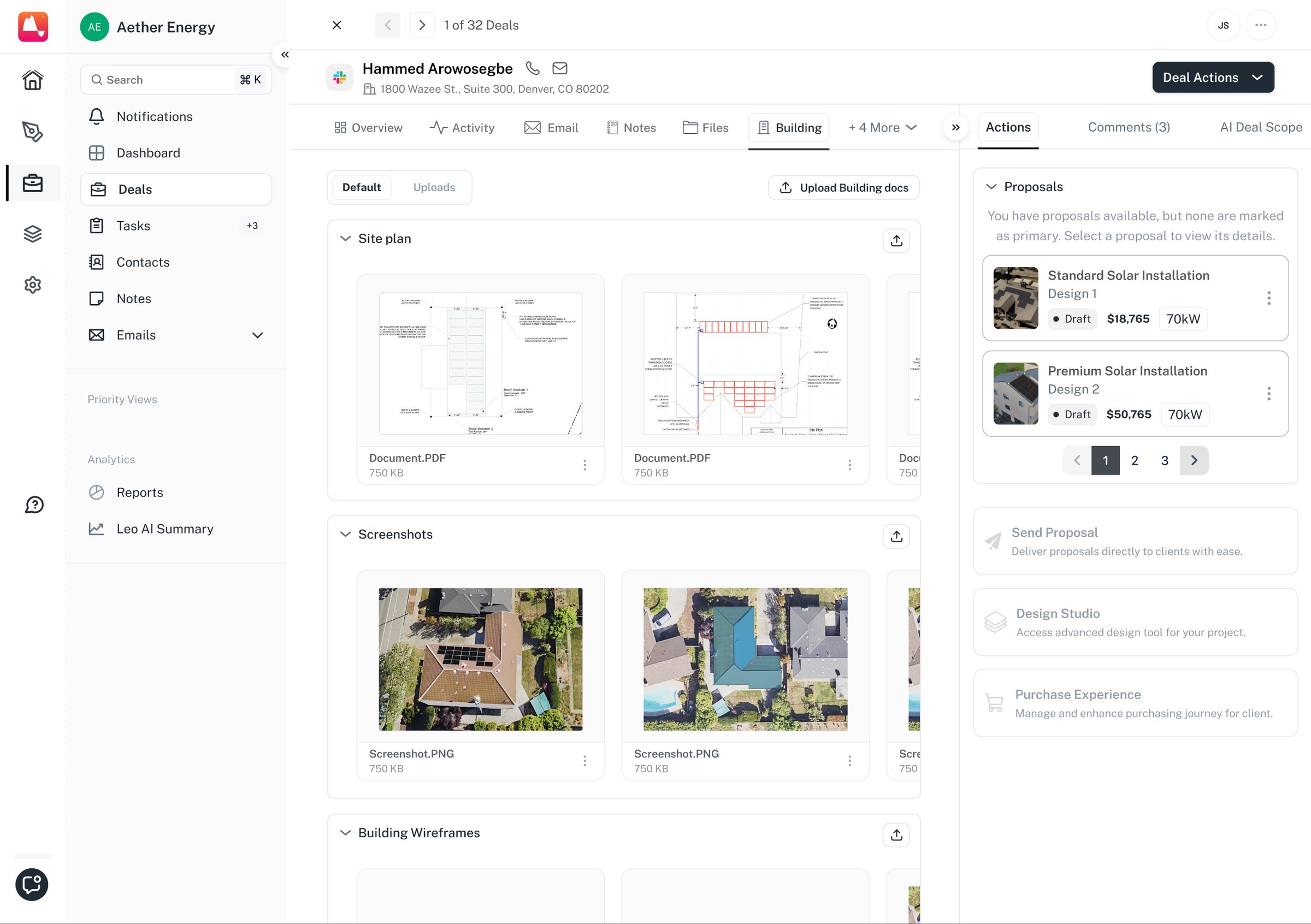
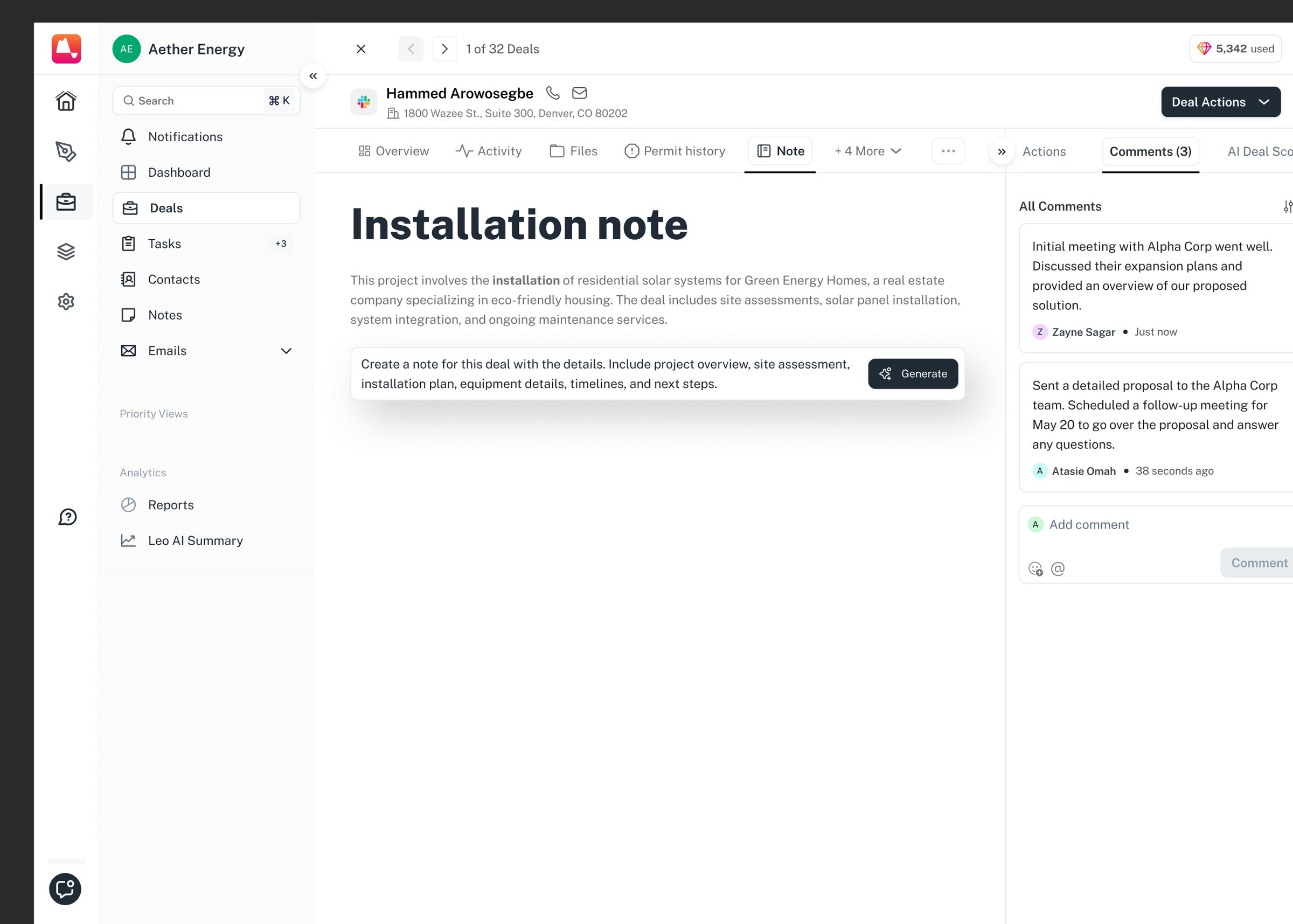
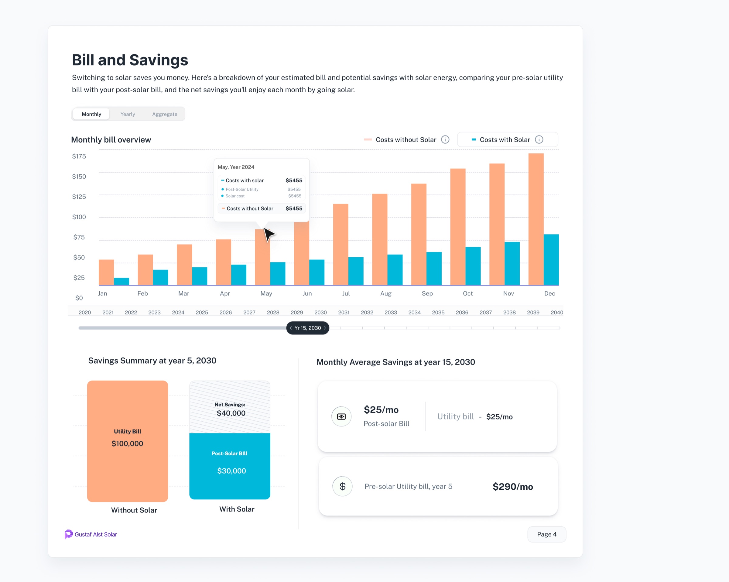
The deal in one view: the customer and stage, the system numbers (contract price, price per watt, payback period, 25-year savings), the property itself, the open tasks, and the proposals against it. One deal, opened. The homeowner and the property on the left, general information and the utility and consumption chart in the middle, and an AI deal scope on the right that summarises the install, flags the priority and lists the tasks with their due dates. Notes live on the deals themselves: tagged to the project they belong to, with who wrote them and when. Files on the deal, with the whole workspace along the top: overview, activity, pricing, utility, files, notes, tasks, permit history, agreement. Four selected, with the proposals for this project alongside. Every touch on the deal in one feed — a task assigned, a file uploaded, a simulation run, a proposal viewed and shared, an access request answered without leaving the page. The files tab with the comment rail open beside the deal. Site plans, aerial screenshots and building wireframes on the deal, with the actions rail alongside: the proposals drafted so far, and the way through to Design Studio.

The record is tabbed: the overview, notes, files, the activity log, comments, and the building the system is going on.

Notes and tasks are the two things a rep does most from inside a deal, so both happen without leaving it.

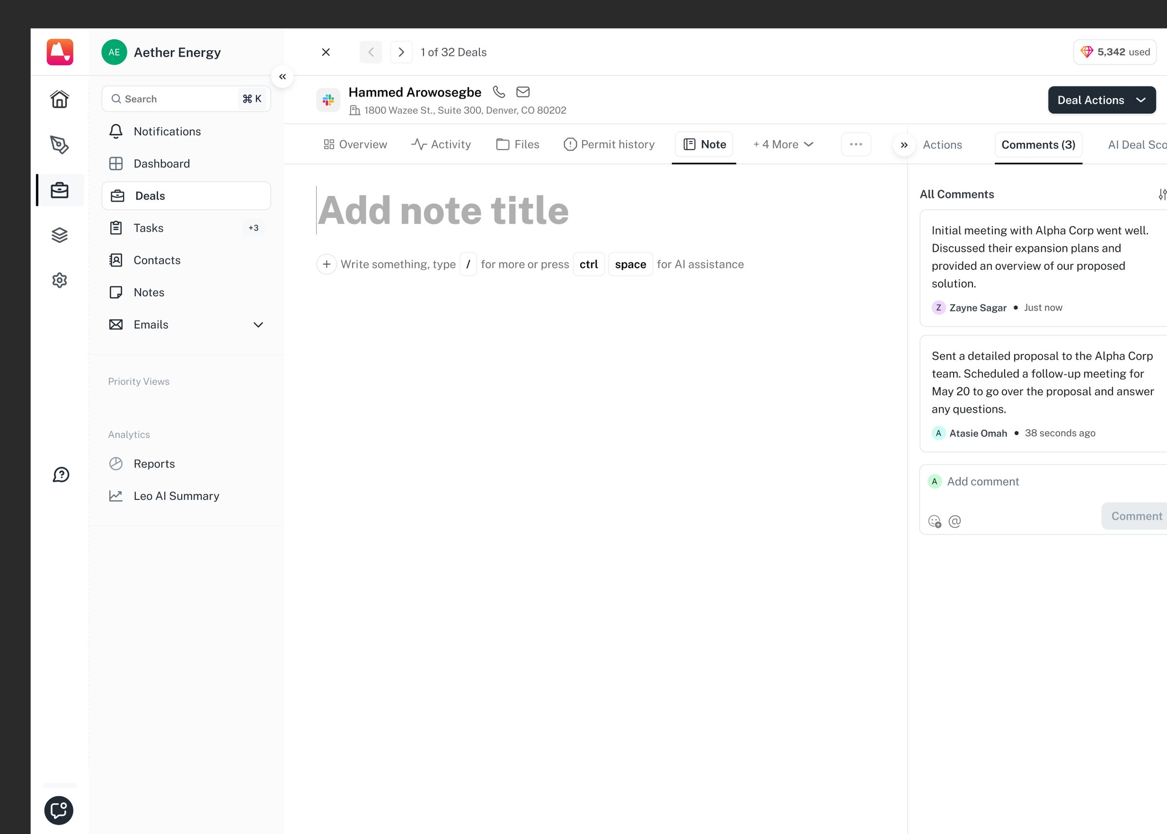
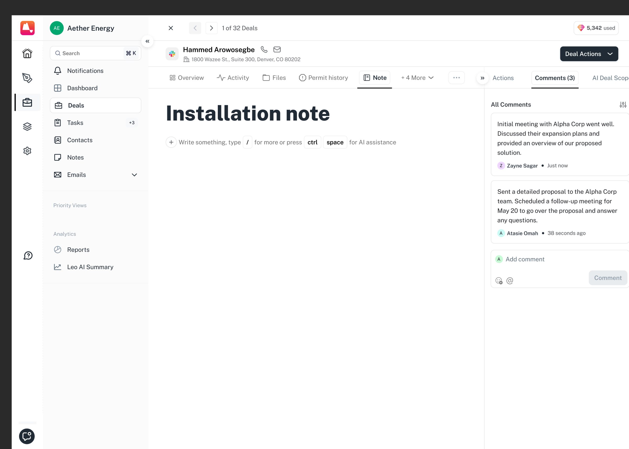
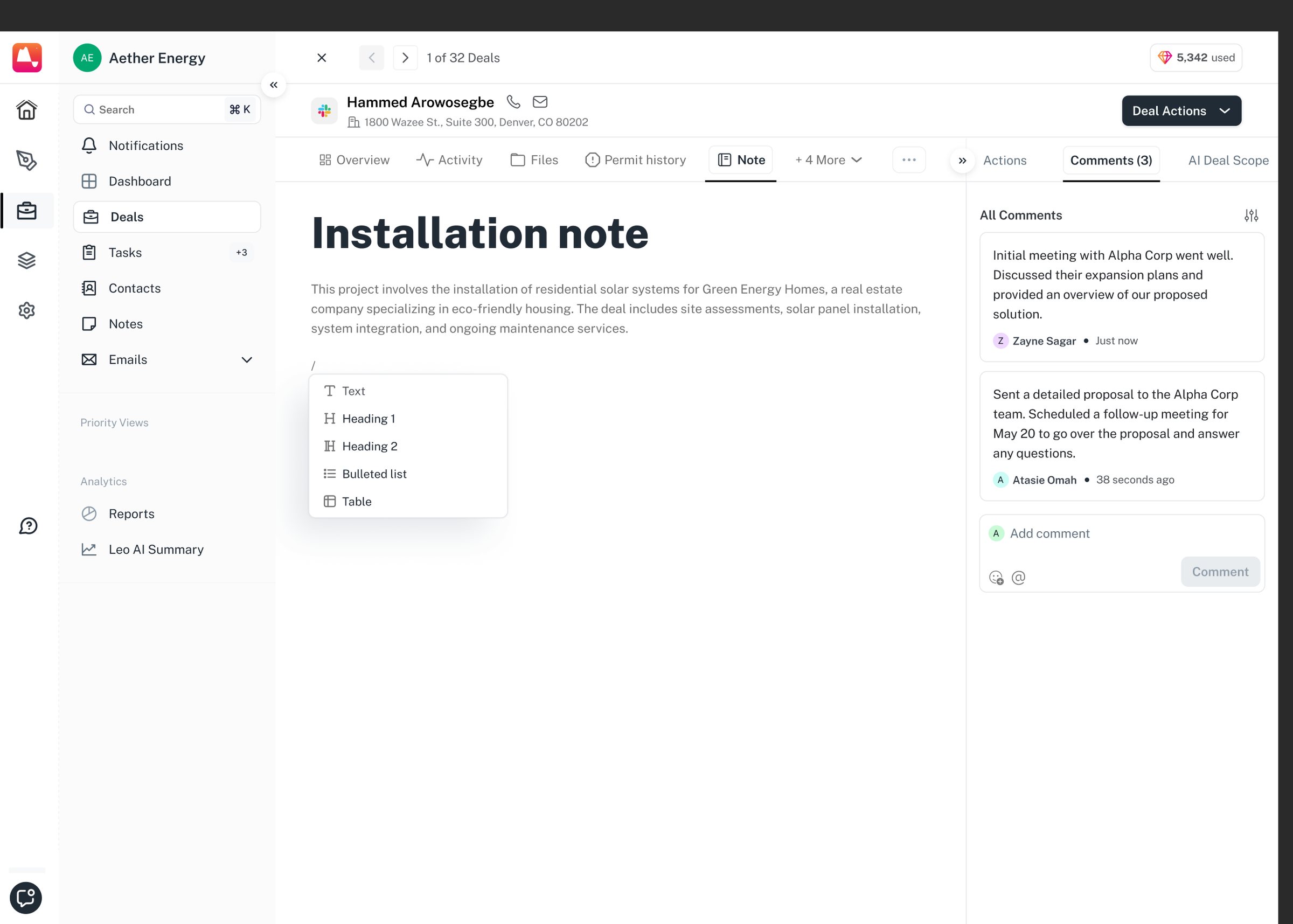
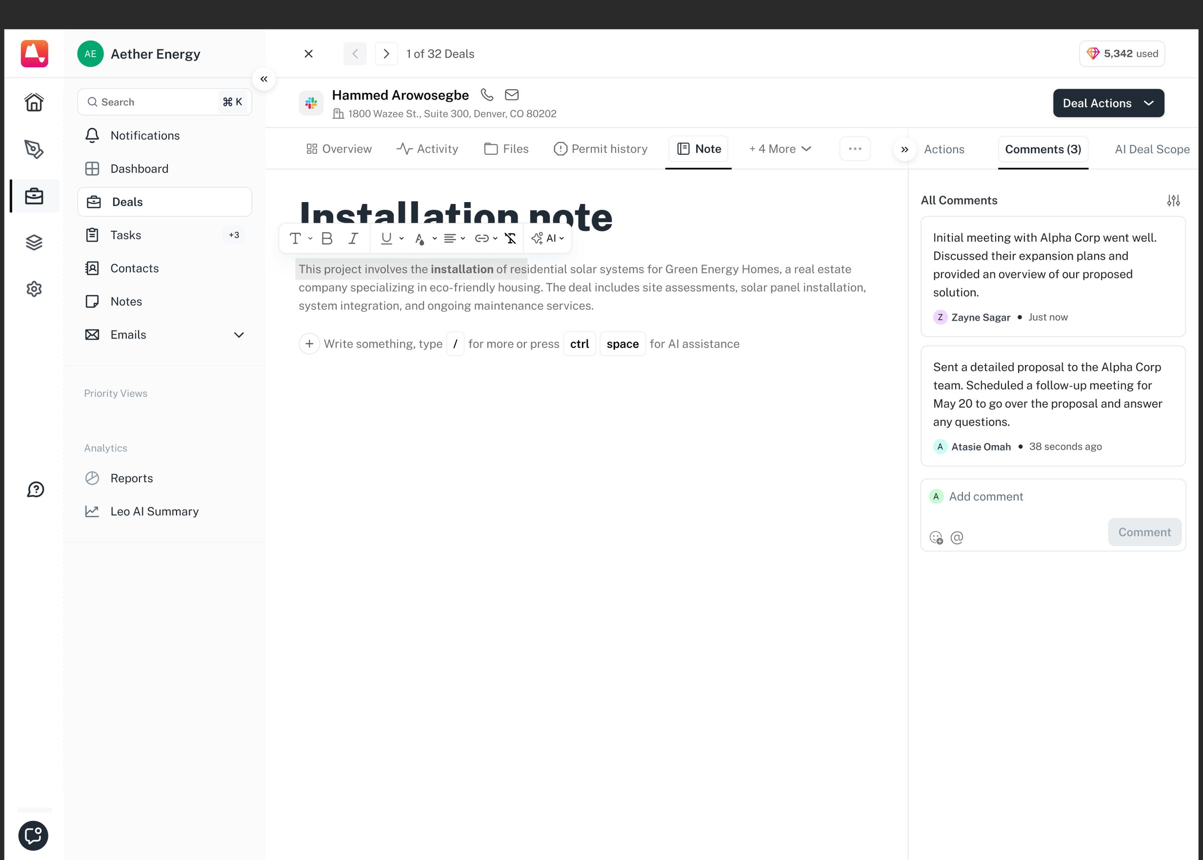
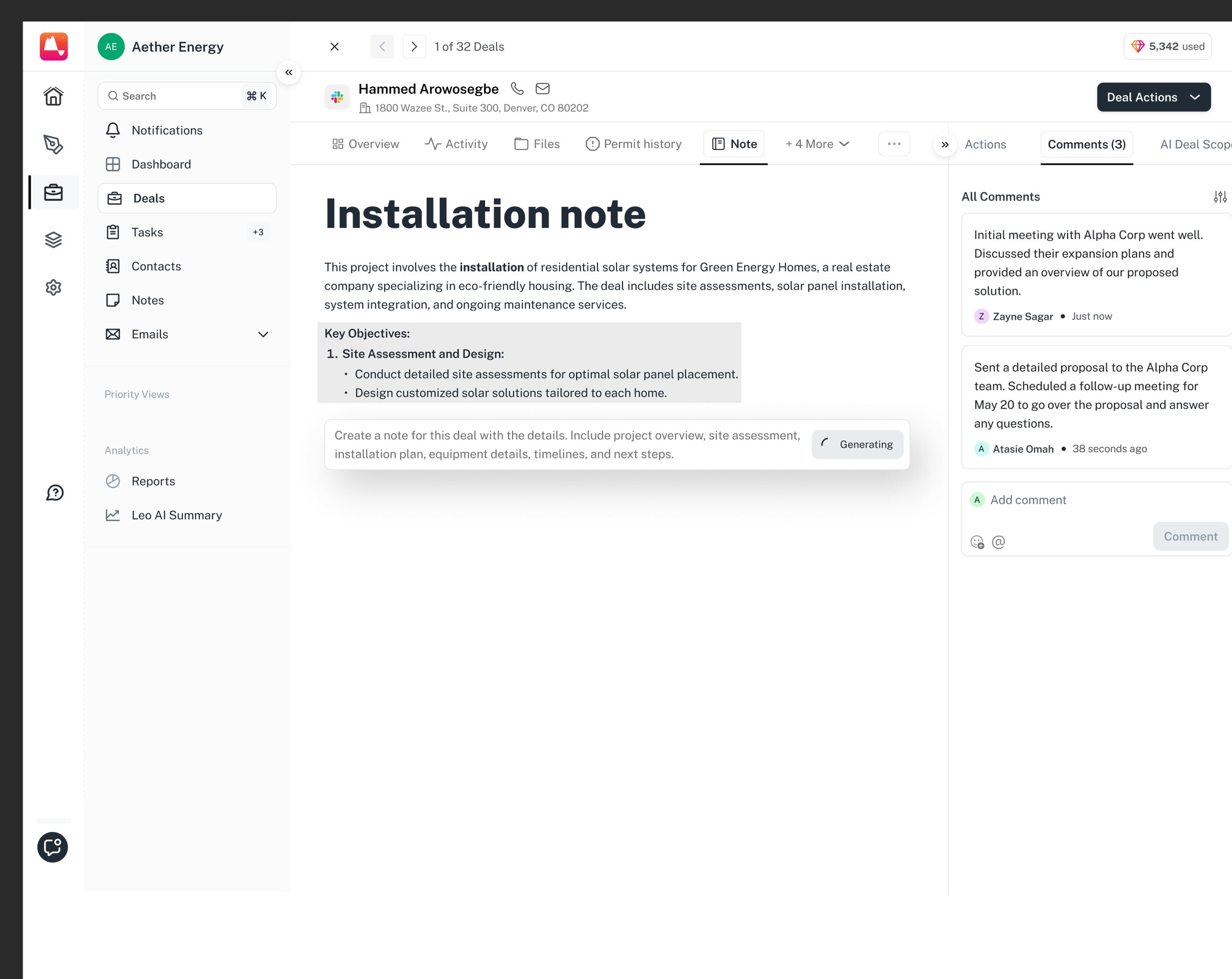
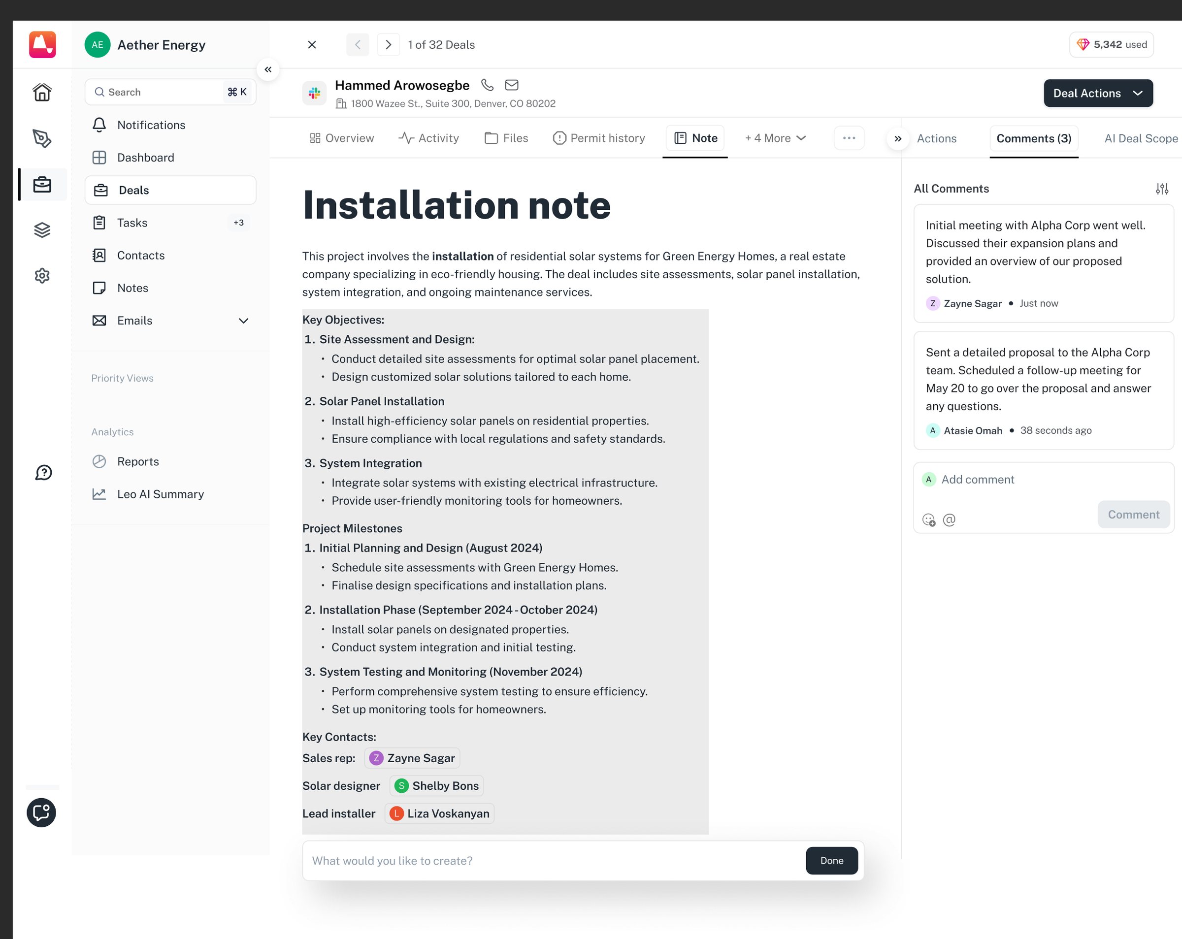
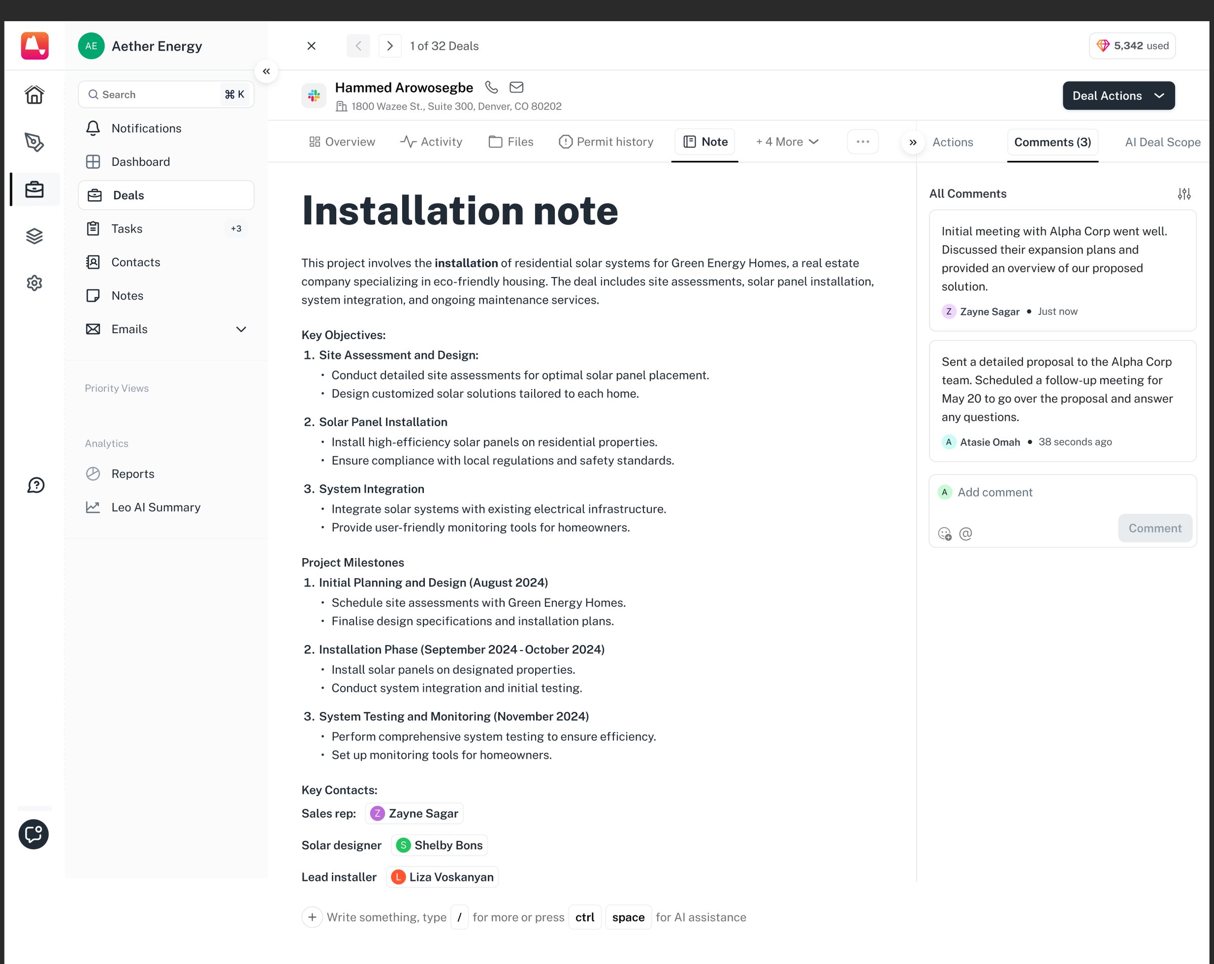
The note editor takes blocks from a slash menu and formats inline, and it will draft a note on request: the rep asks, reads what comes back, and keeps it or doesn’t.

Click throughWriting a note, with help1/8
An empty note that tells you what it can do: type / for blocks, or ctrl-space for AI. A title, with nothing else filled in. The / menu: text, headings, bulleted list, table. Select any text and the toolbar appears over it, with AI as one of its options. Asked in plain words: project overview, site assessment, installation plan, equipment, timelines, next steps. The draft is written into the note itself. Key objectives, project milestones with real dates, and key contacts — the sales rep, the solar designer, the lead installer. Accepted, and the draft becomes the note.

A task carries the deal it came from, so it shows up on the deal and in the rep’s task table.

Click throughCreating a task1/6
The empty state reads “All quiet here”. Create task offers two routes: from scratch, or one of five templates. Assignee, status, due date, priority and reporter all empty. Status starts at Not started, priority at Low. A searchable list of the real projects: Warren family solar, Lakeside Apartments, Lincoln Solar Farm, Horizon Medical Center. Finalize site survey report: assigned to Cody Fisher, in progress, due 2 November, with the proposal PDF and a CAD screenshot attached. Fourteen tasks as a table: deal, assignee, reporter, status, dates and priority, with overdue in red. The same task from the list, with its deal named above it and a link through to it.

Designing for the handoff

The CRM also had to connect with the rest of Aether.

A deal doesn’t end when a salesperson closes it. The information collected during sales becomes useful to the teams working on proposals, design and installation.

Deal the customer the site, the stage Proposal priced from that record Solar design same site, same numbers Installation scheduled from what was sold

We designed the CRM with those downstream handoffs in mind, so information captured early could continue to be useful later in the lifecycle.

Account setup, with billing as one step in the checklist. Aether is sold as hubs (Design, Deal, Proposal), each switched on separately, the rest marked coming soon.

The result was a CRM that became part of the same system as the rest of the solar workflow.

Internal Healthcare System

03/05

A suite for senior care

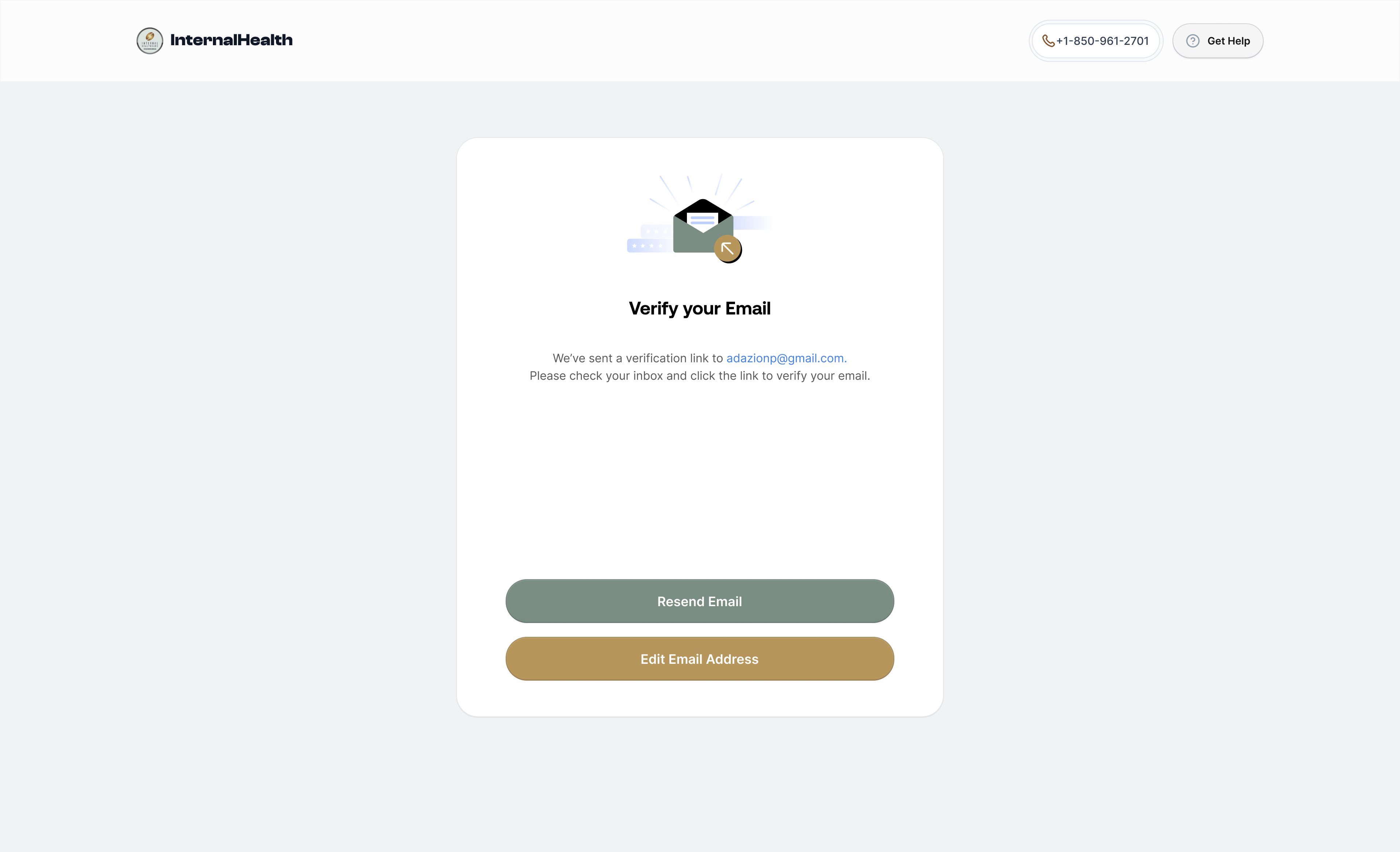
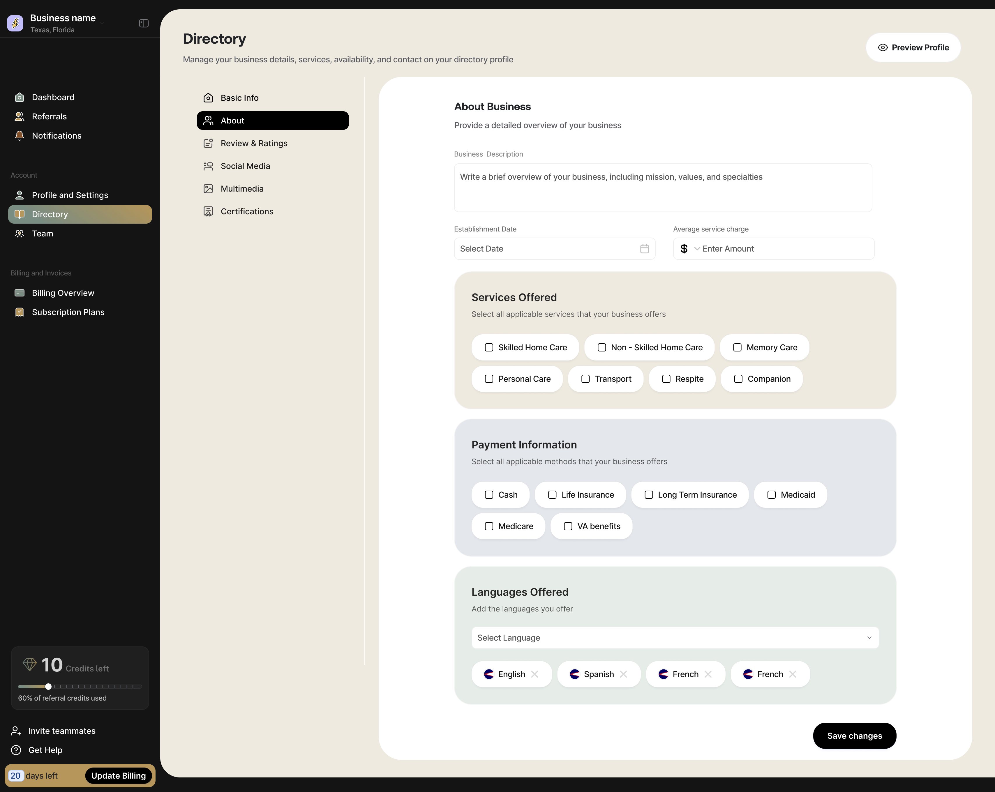
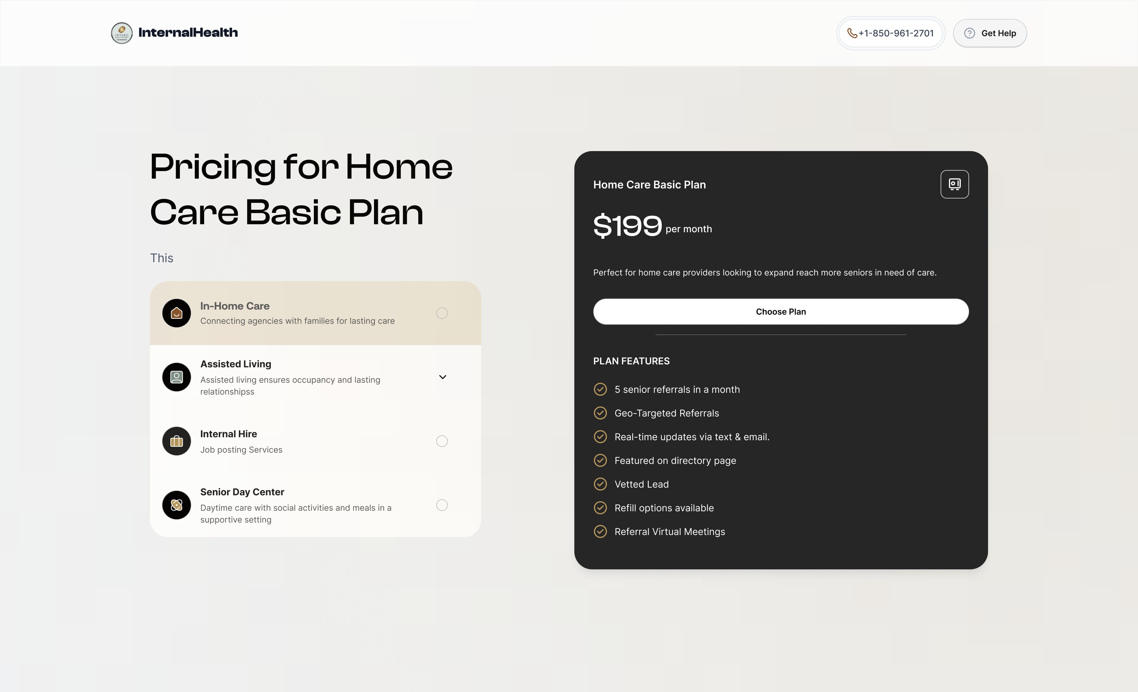
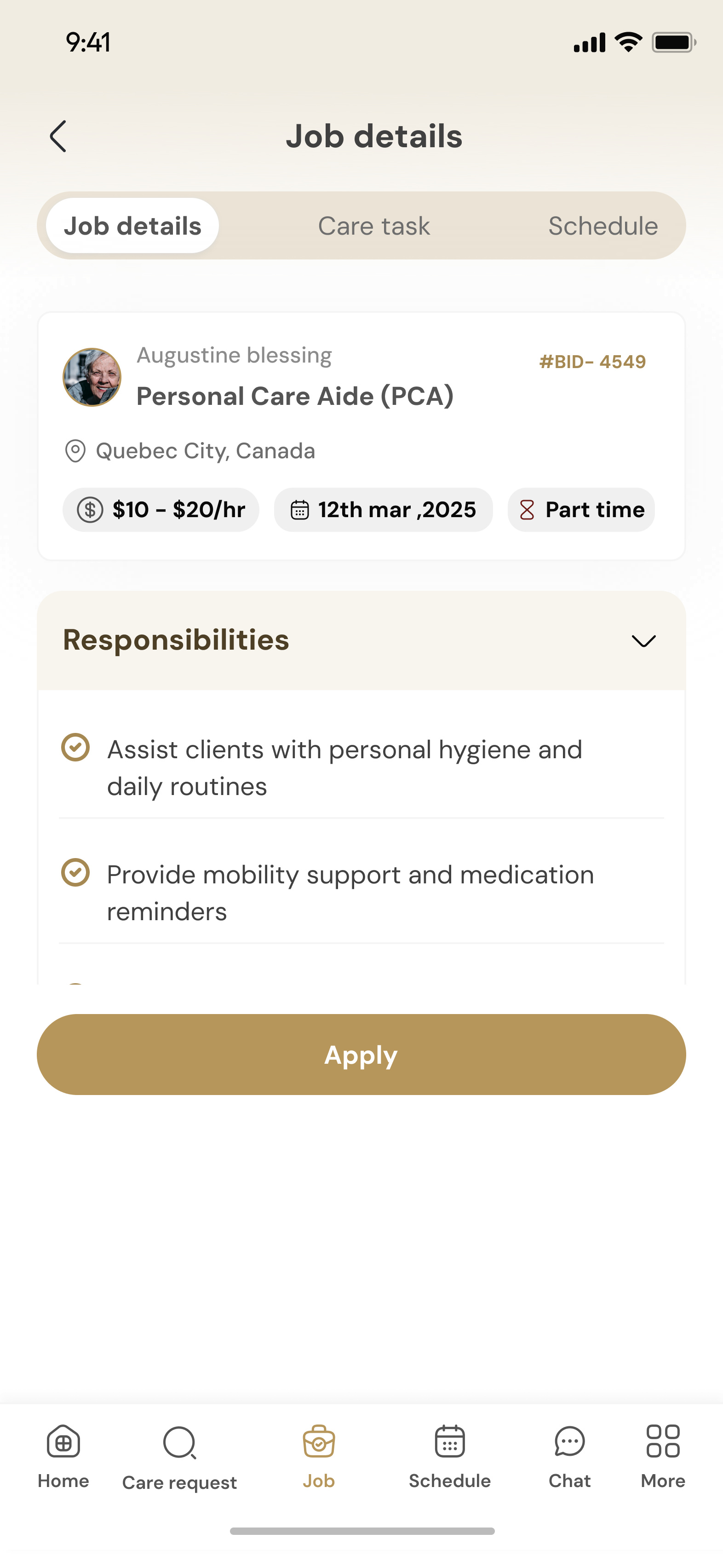
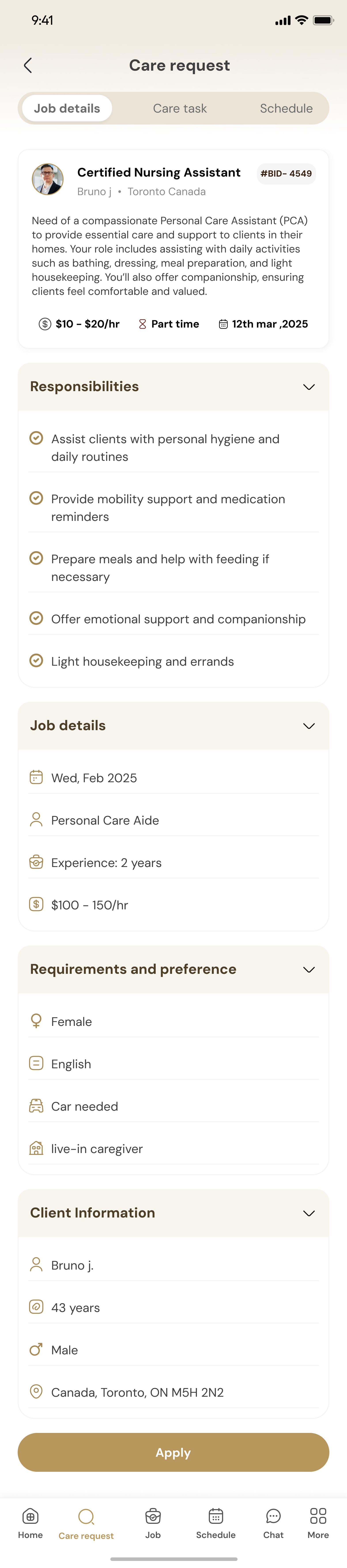
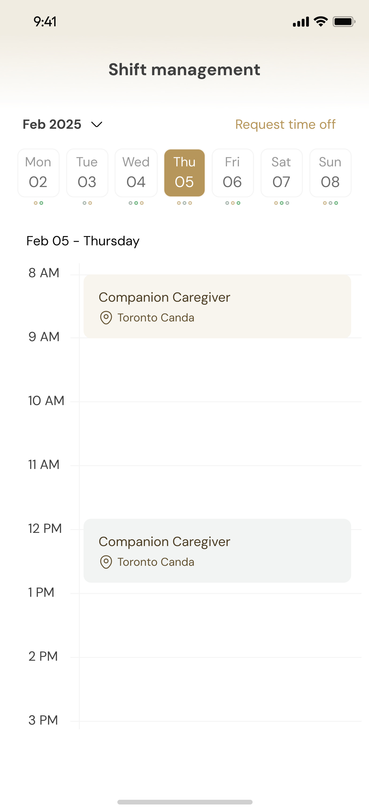
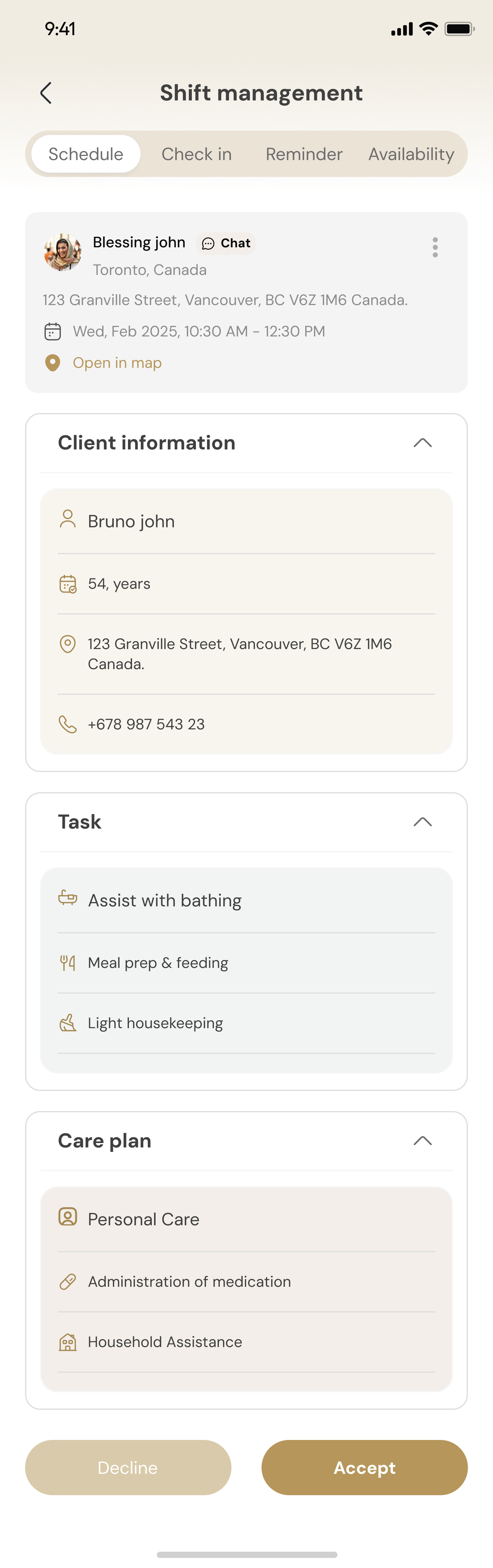
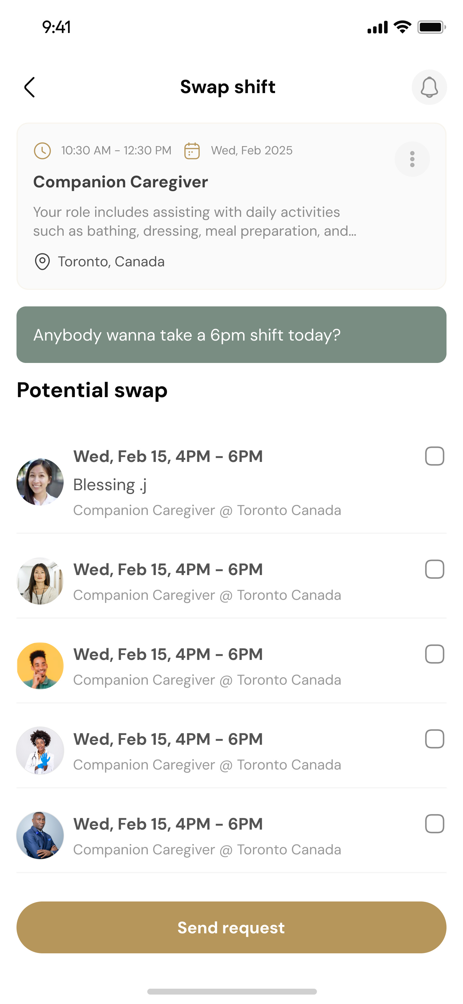
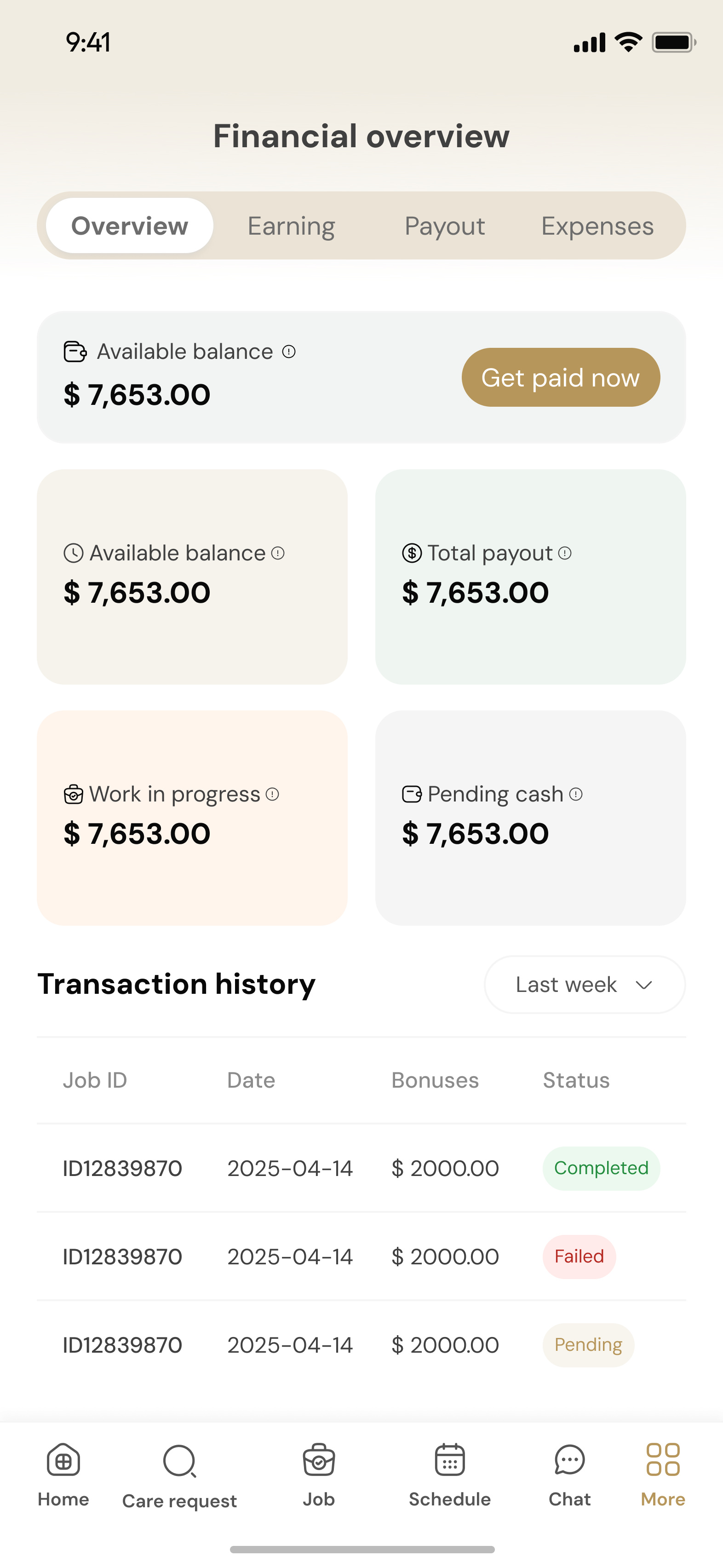
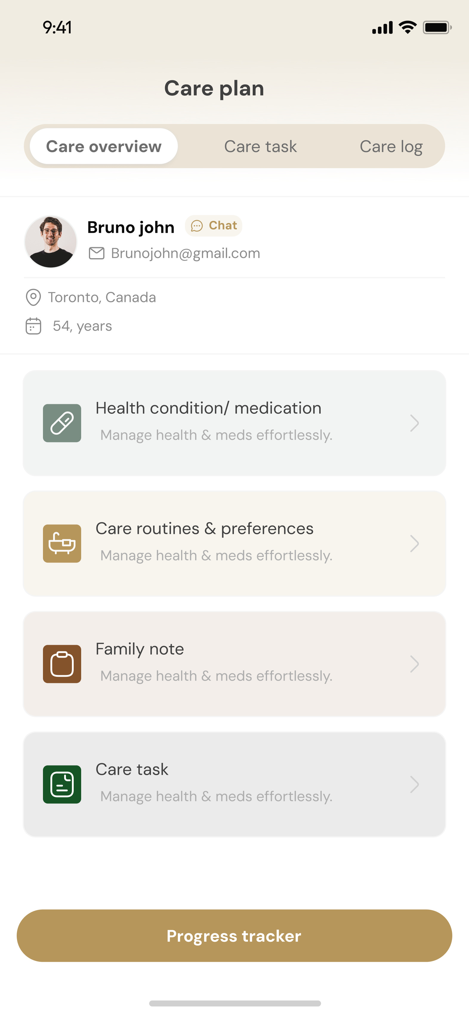
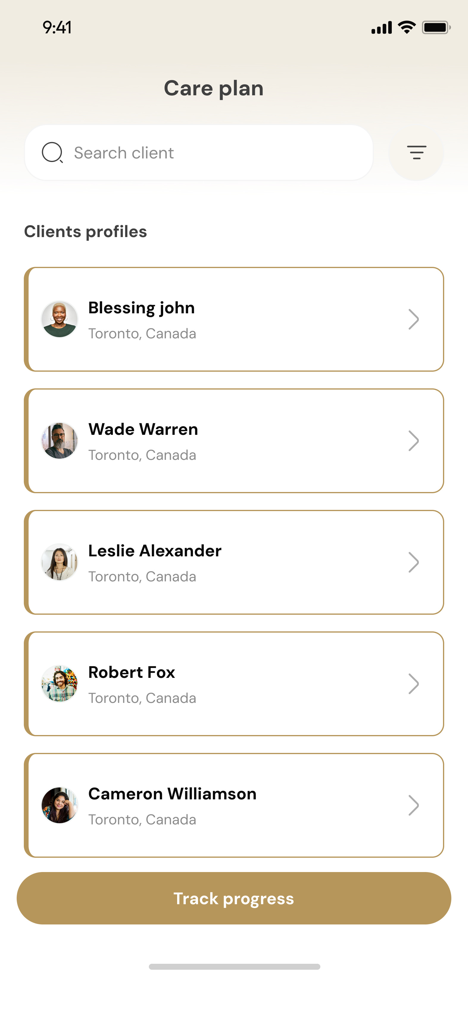
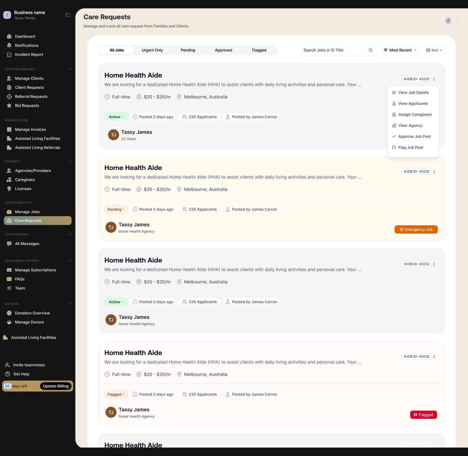
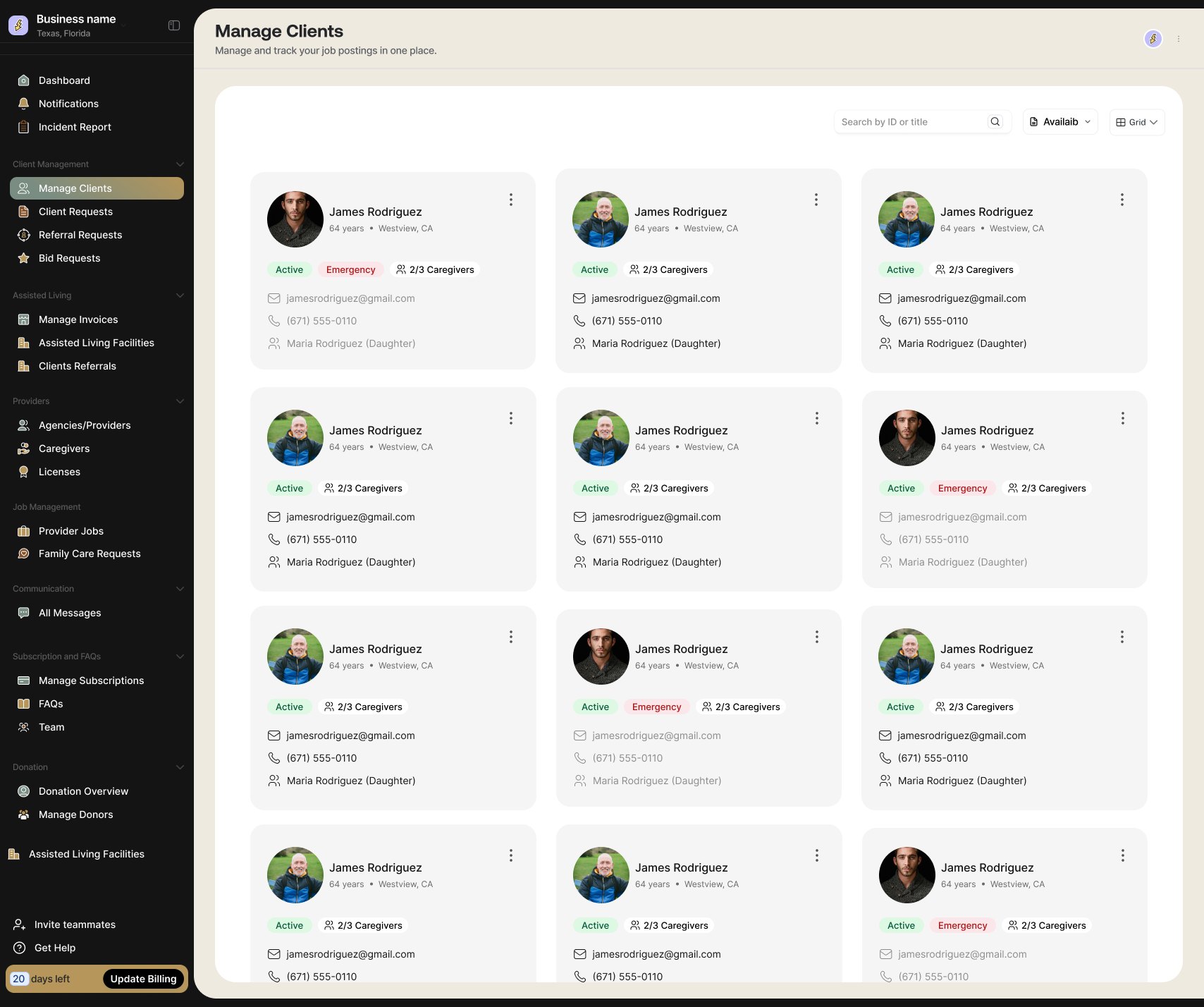
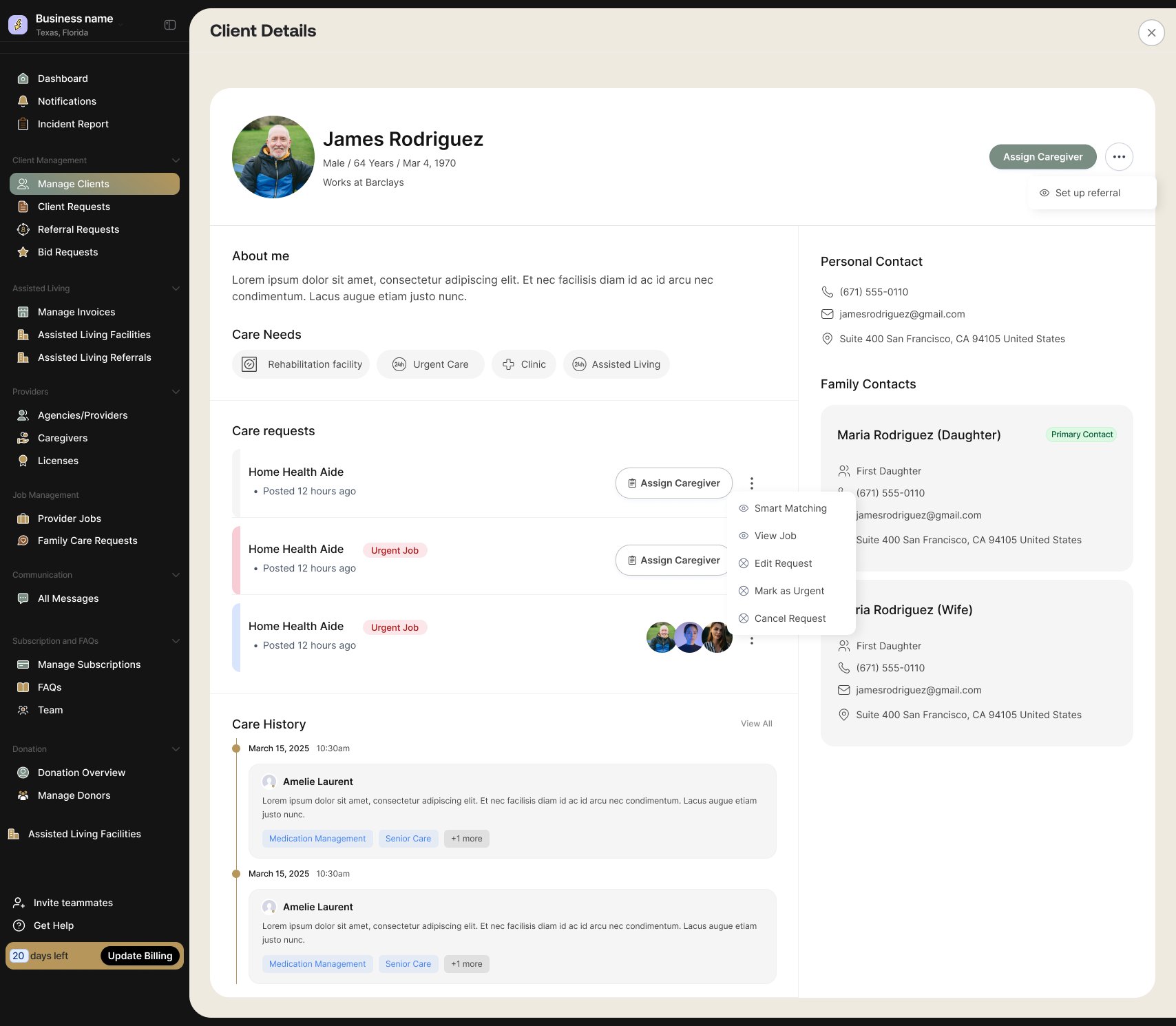
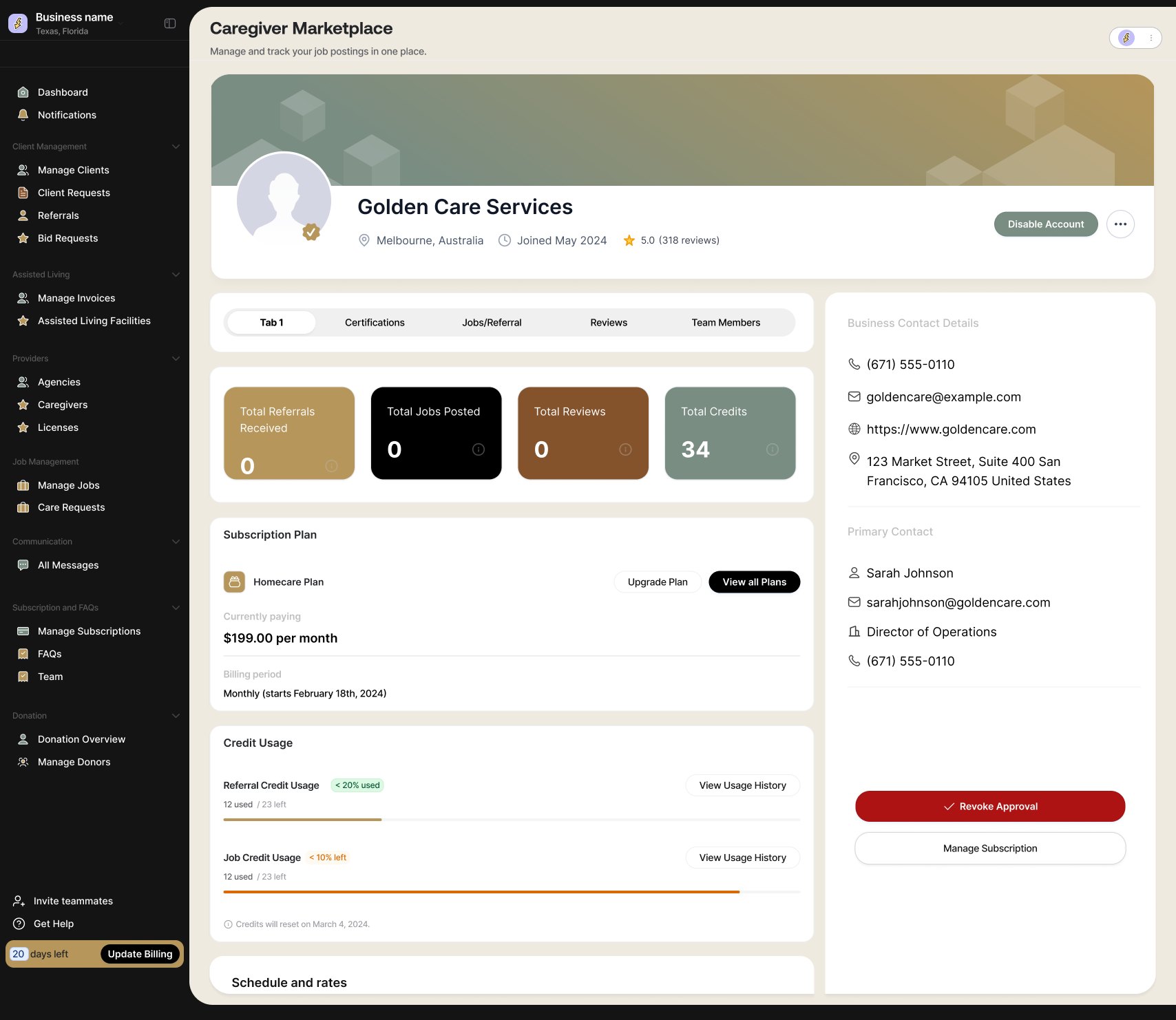
I worked with the Internal Healthcare team alongside two other designers from my agency, Homalabs, to design and bring a multi-sided senior care platform to life. I coordinated and led the design team on this one, setting the direction across all five products while we split the work between us.

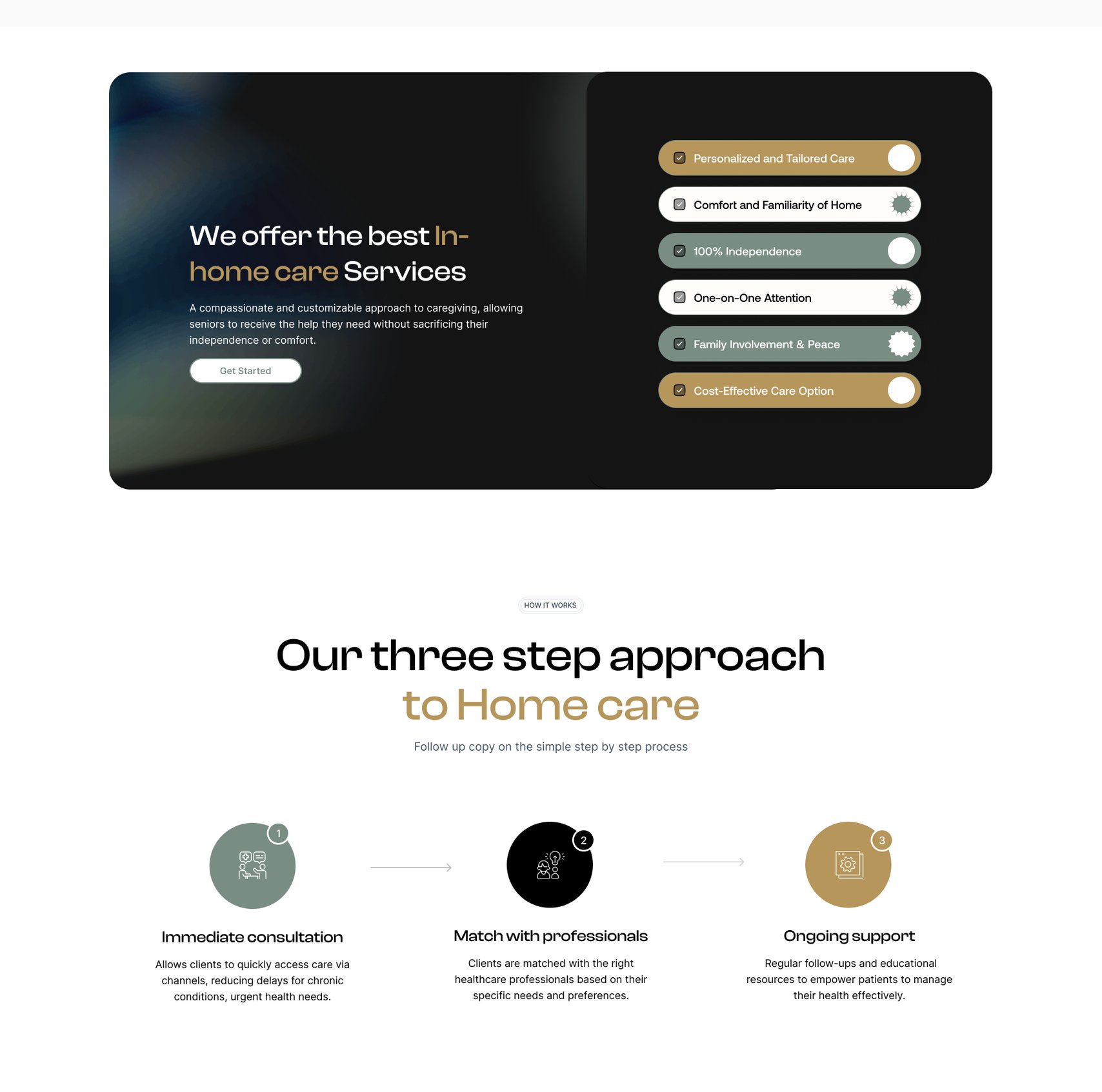
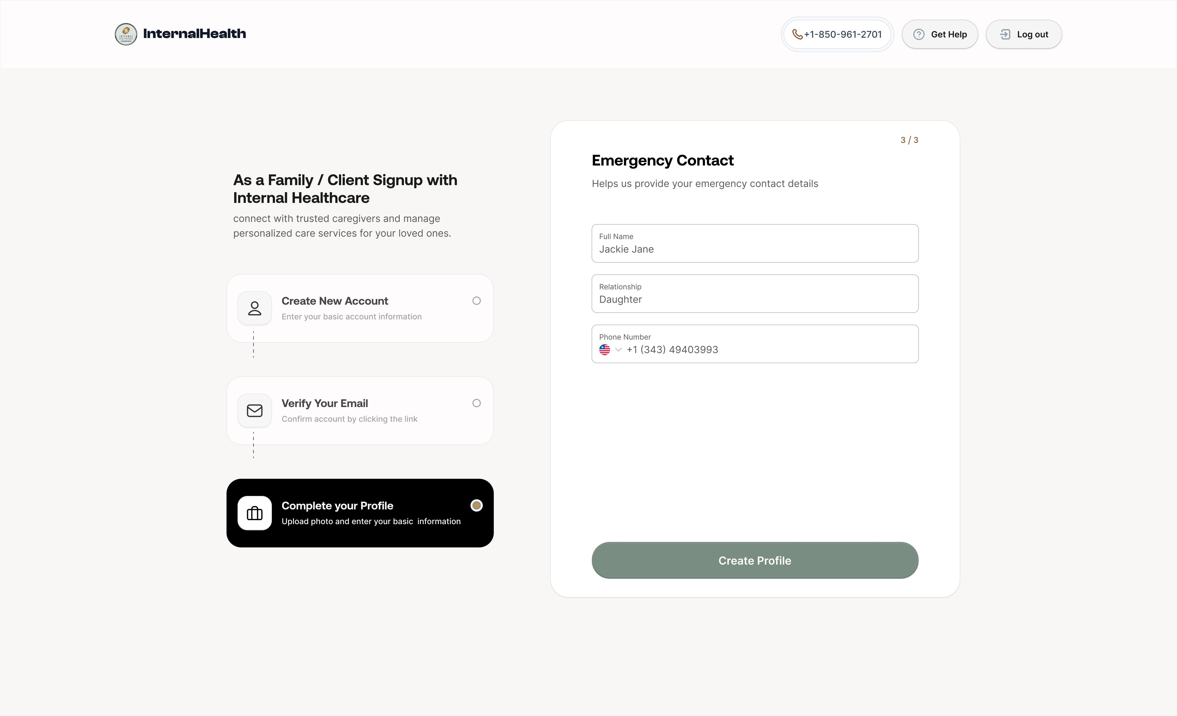
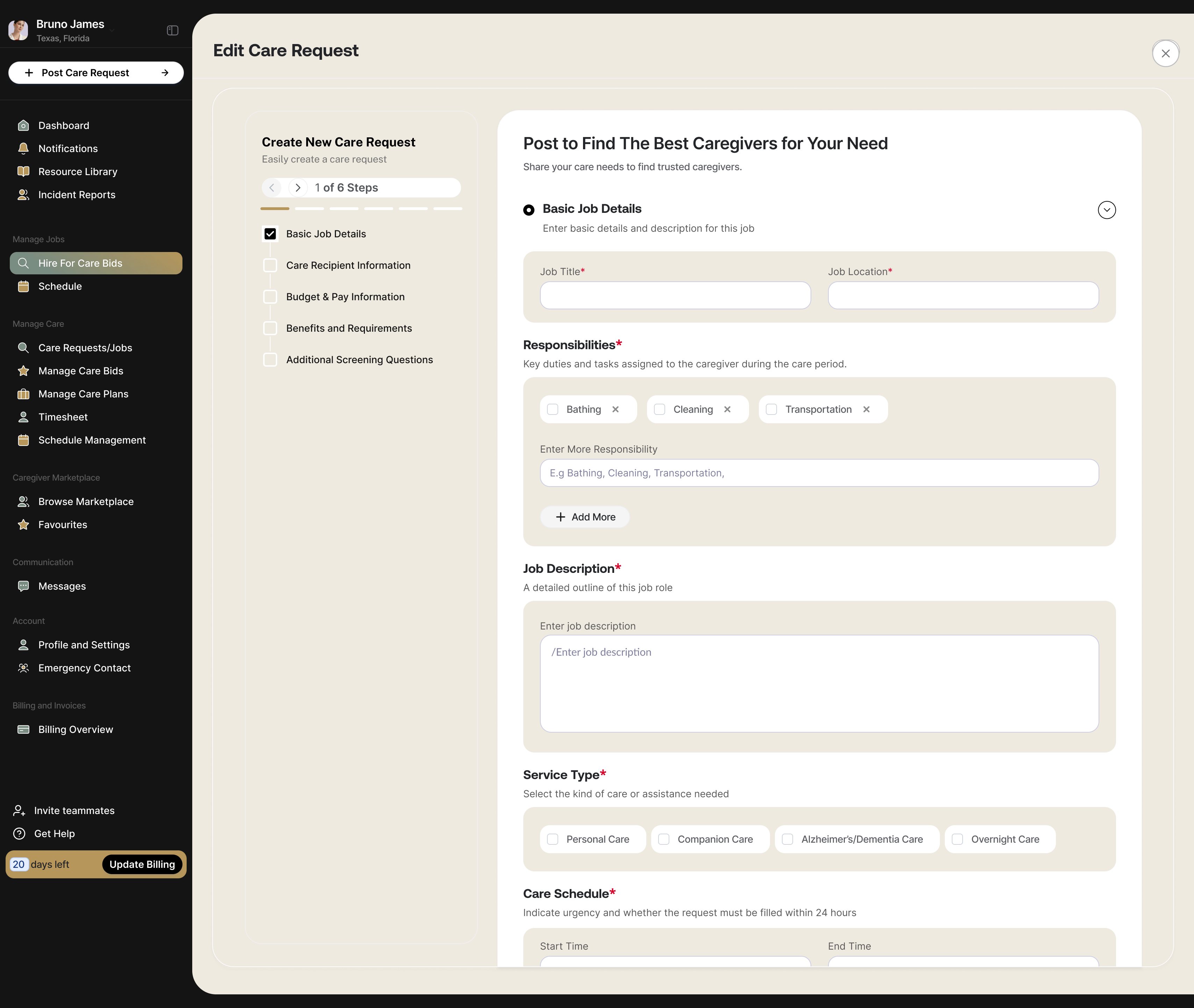
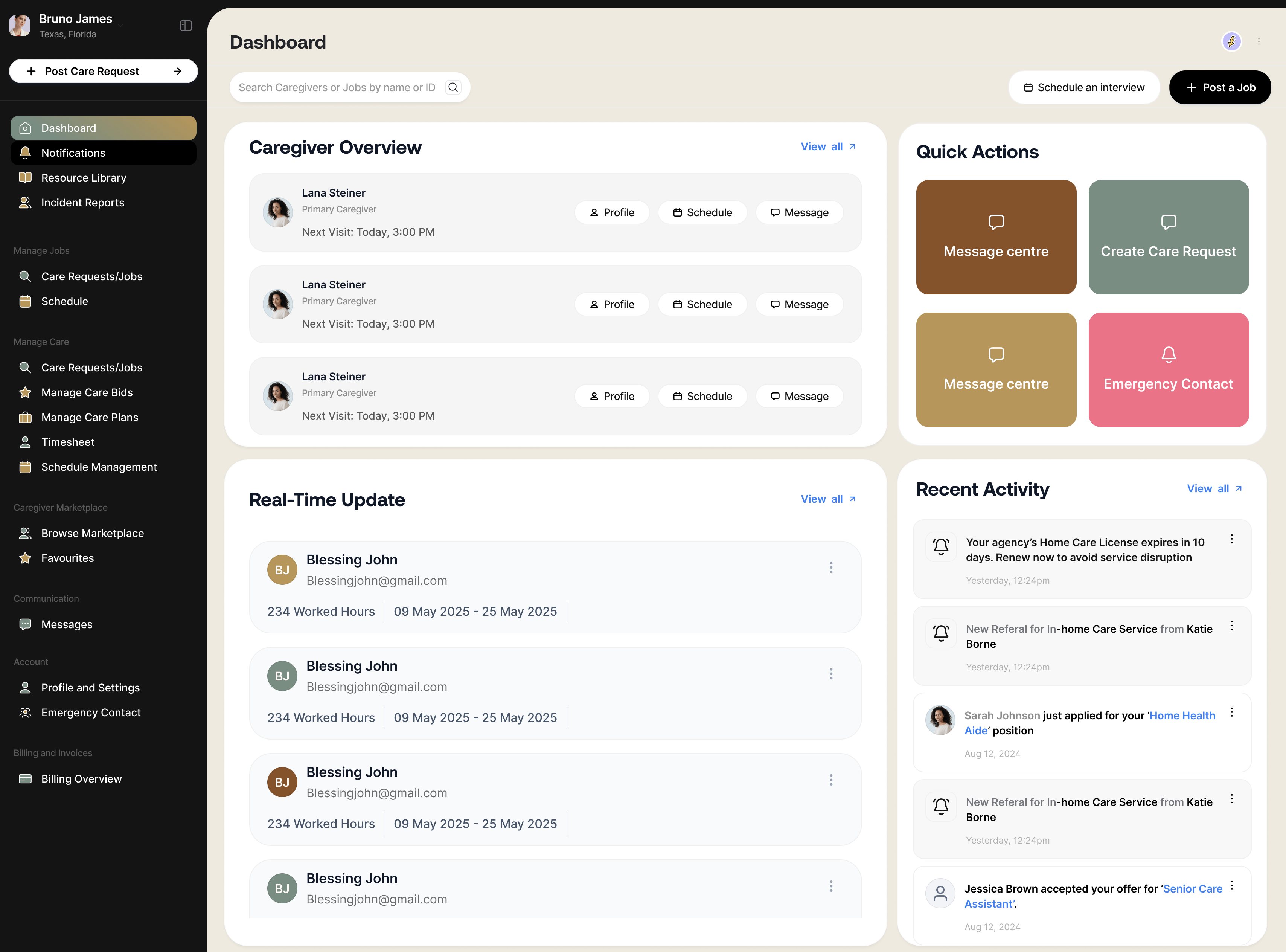
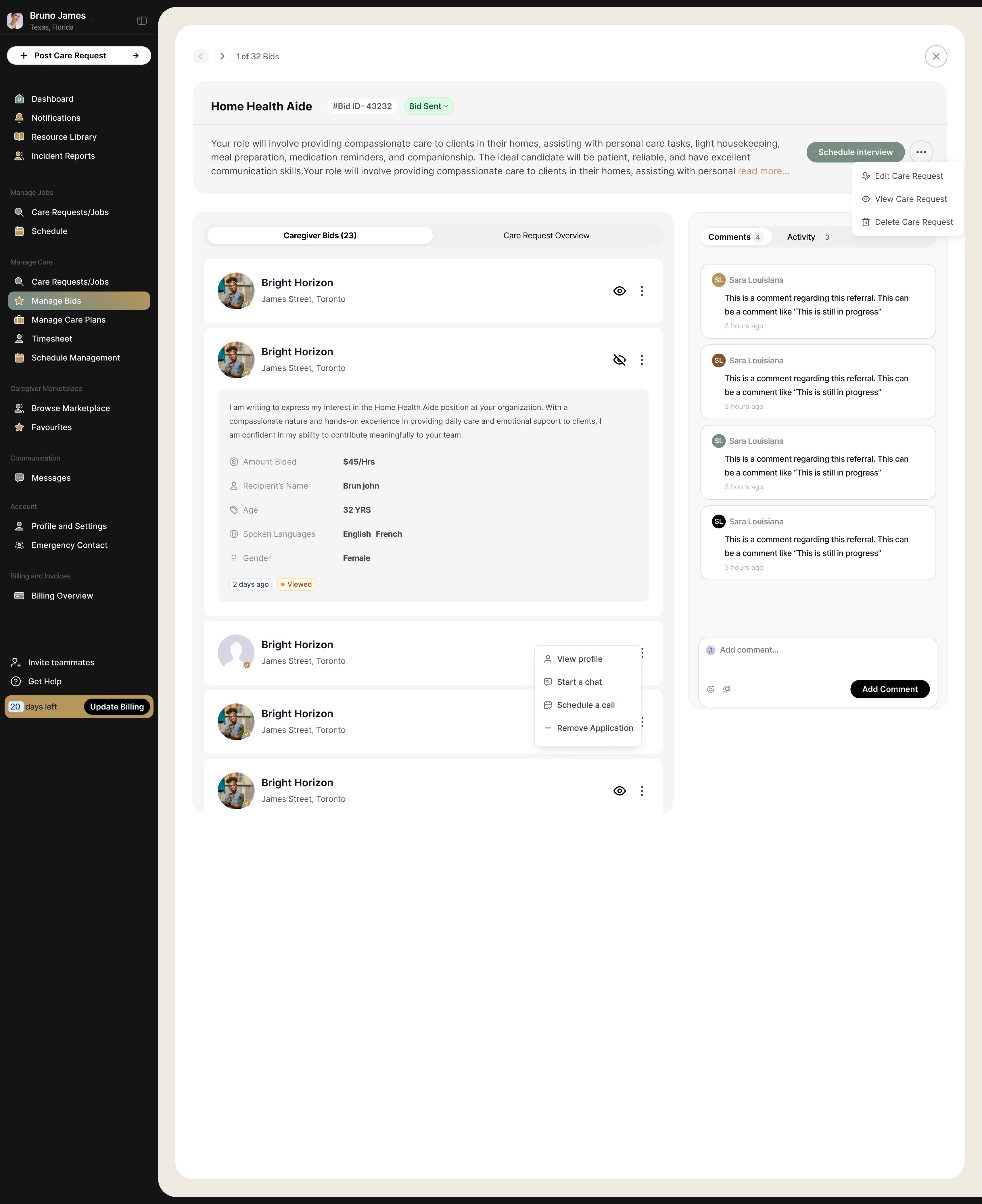
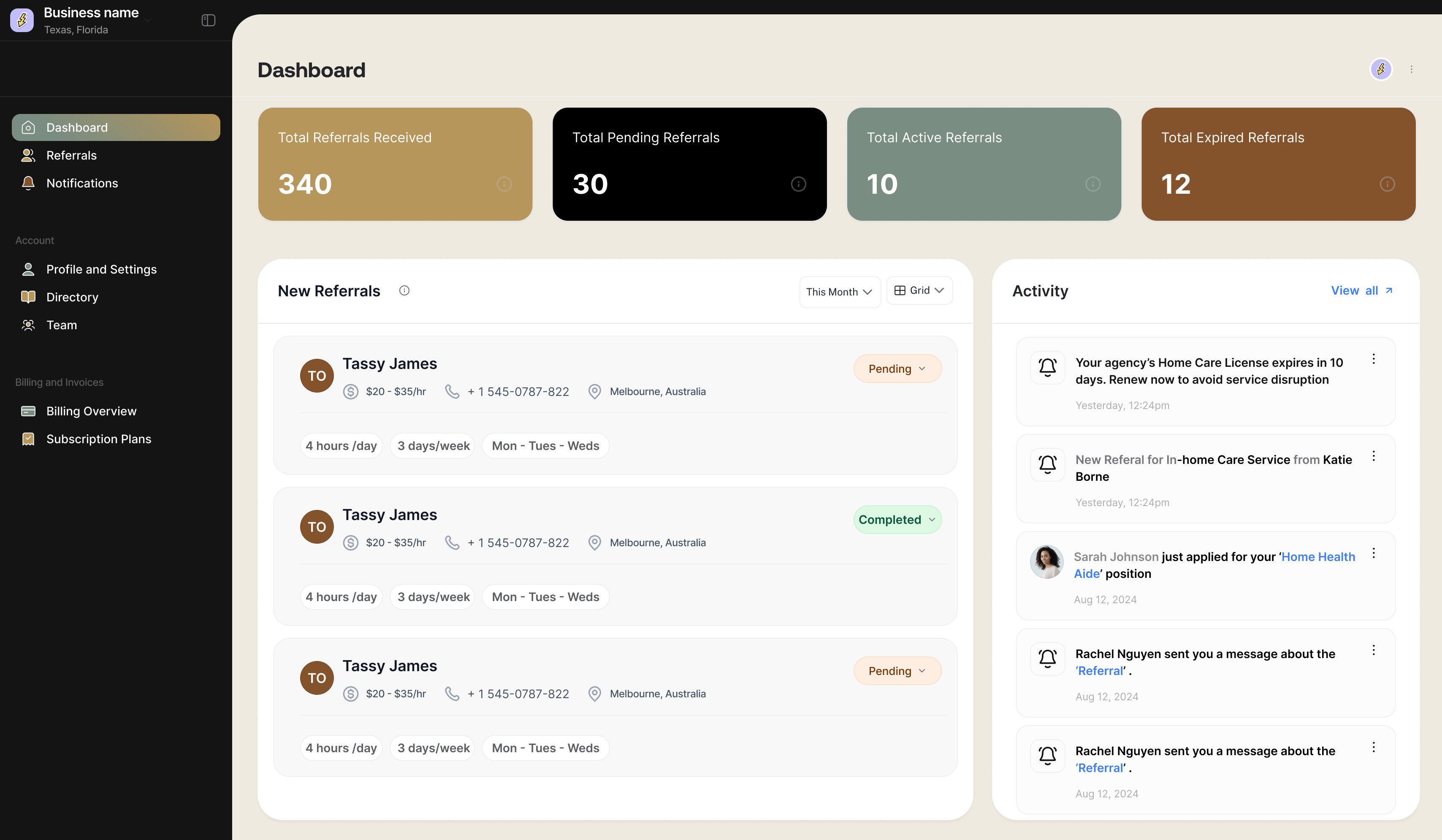
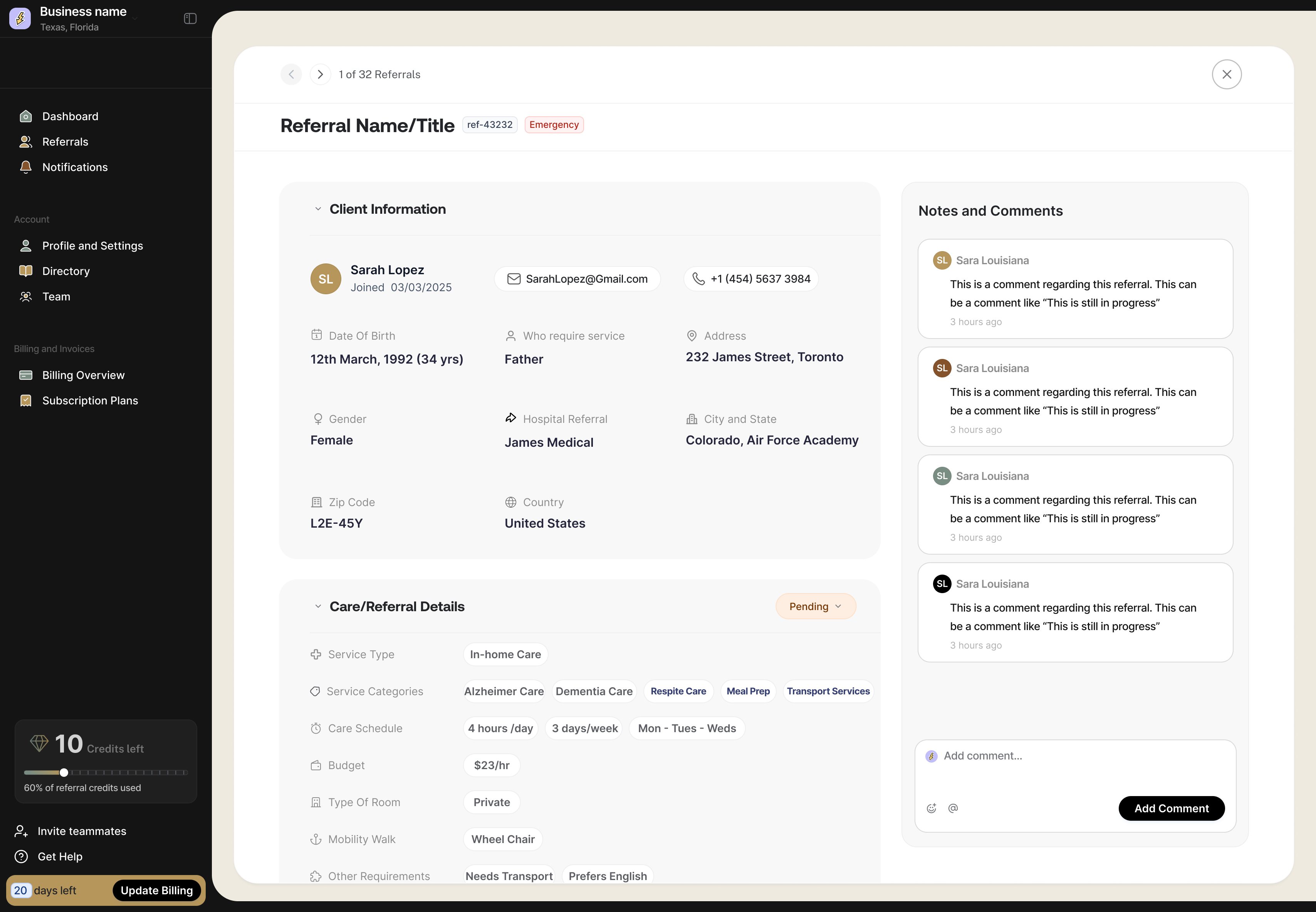
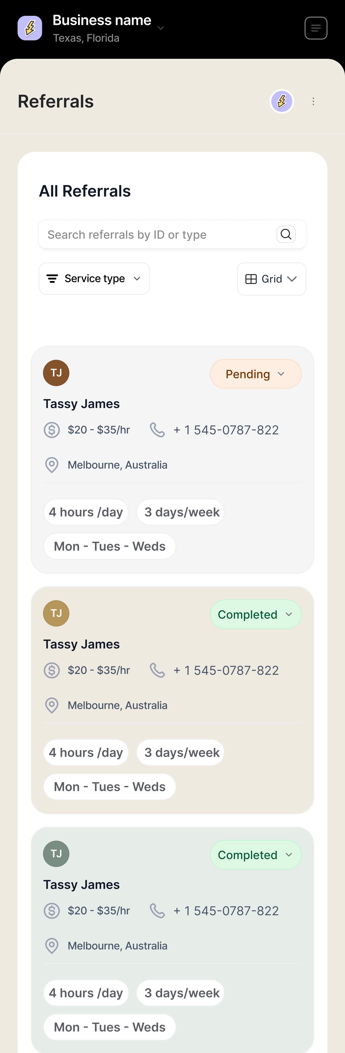
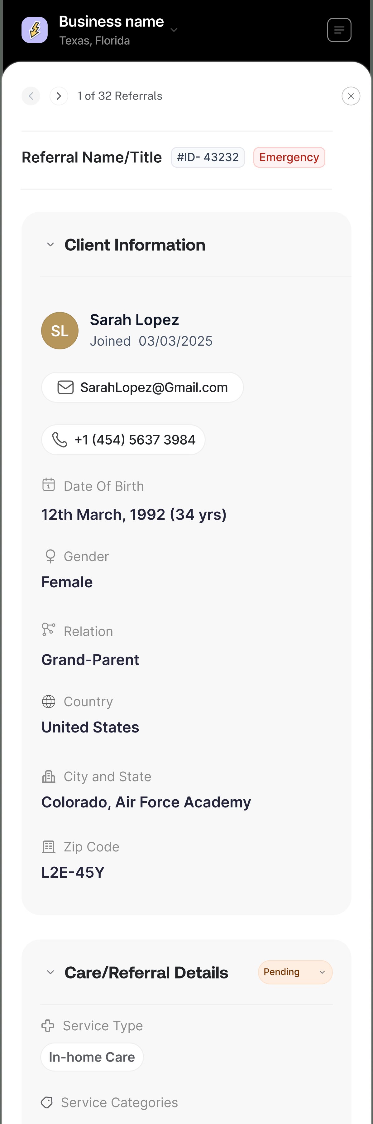
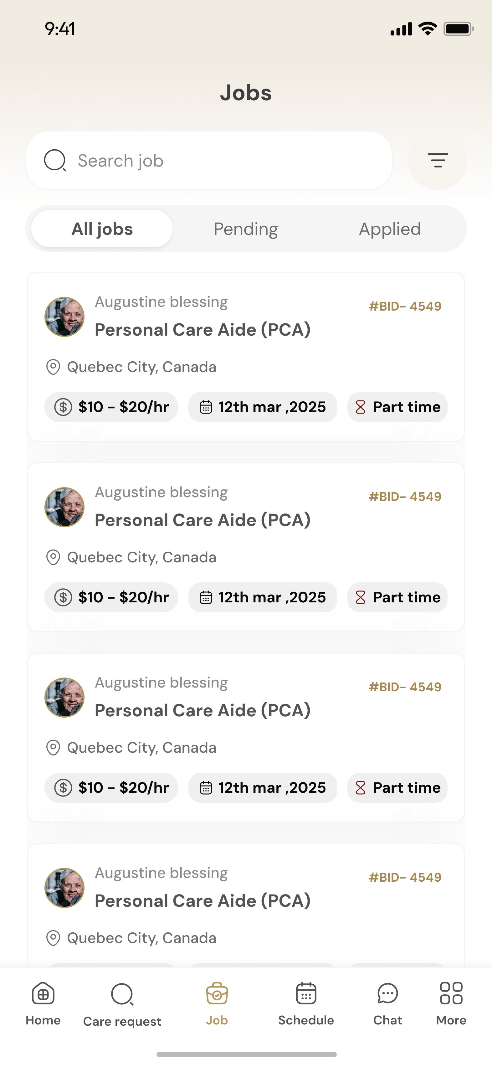
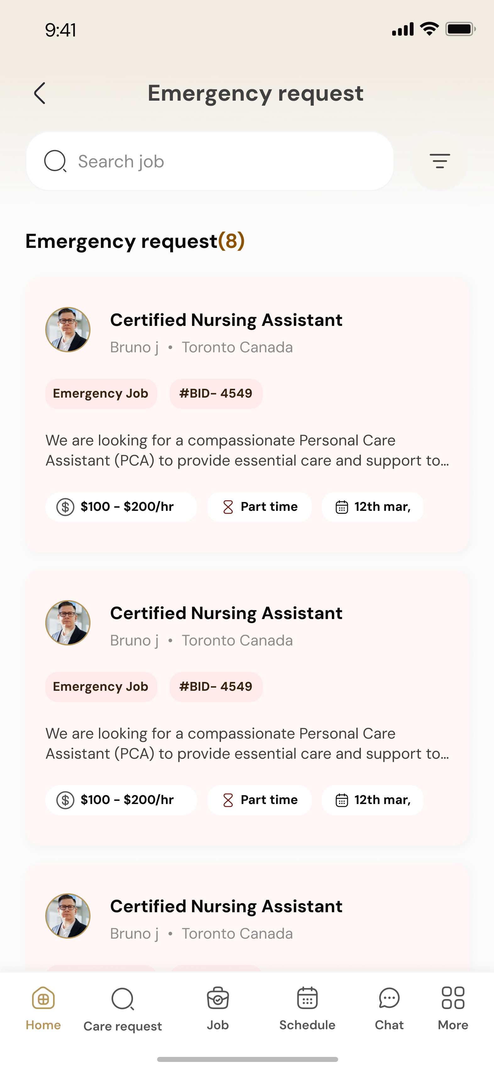
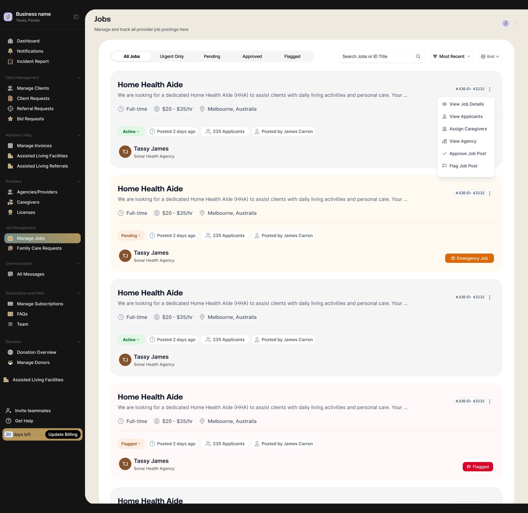
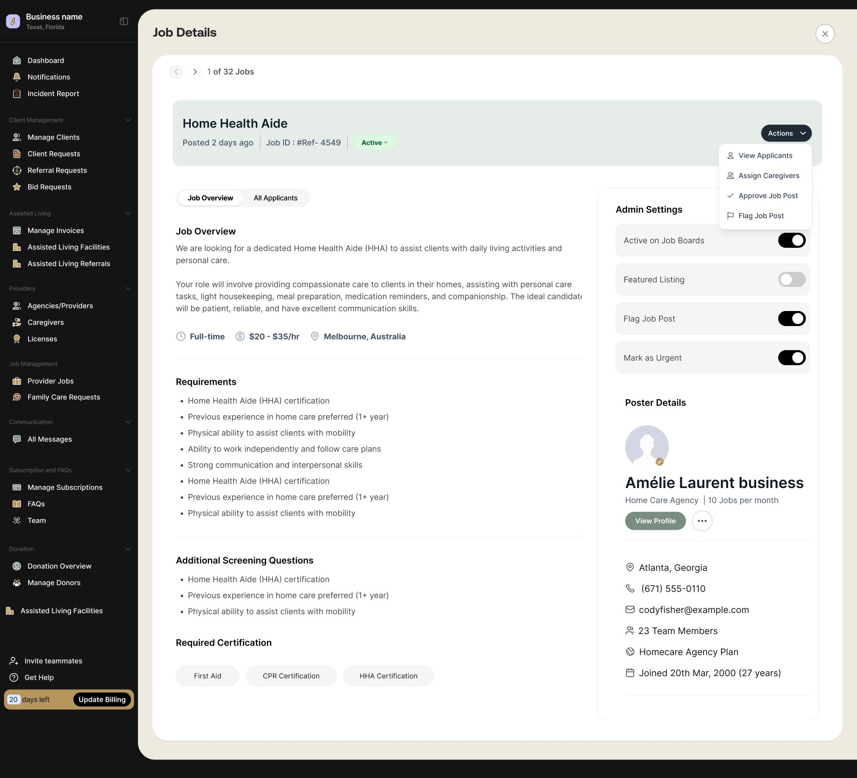
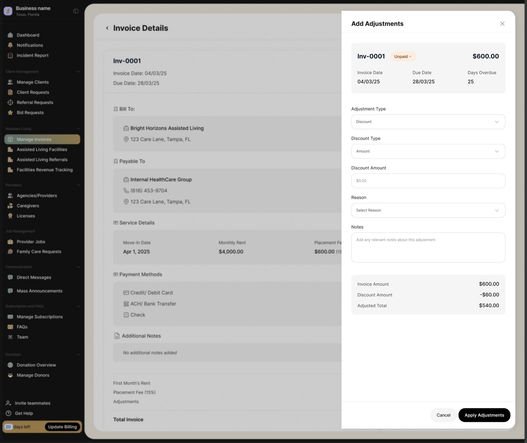
This was a large product with several user types, each with different needs and responsibilities. We worked across the product experience, from the public-facing website to the family looking for care, the provider managing clients and referrals, the caregiver handling their work, and the internal team keeping everything moving.

We stayed close to the client throughout, from requirements and early flows through wireframes, visual direction, product design and multiple rounds of reviews. We designed the different parts of the platform alongside each other so that information could move cleanly between them.

It took several months of meetings, refining and building. For part of it the process was agile: we were designing alongside the engineers.

The entire engagement brought over a thousand screens.

The system is now fully functional, with 245+ care professionals onboarded and families actively using the platform.

Family posts → Admin approves → Provider is referred → Caregiver works the shift → Family reads the log

The product

We worked across several connected products:

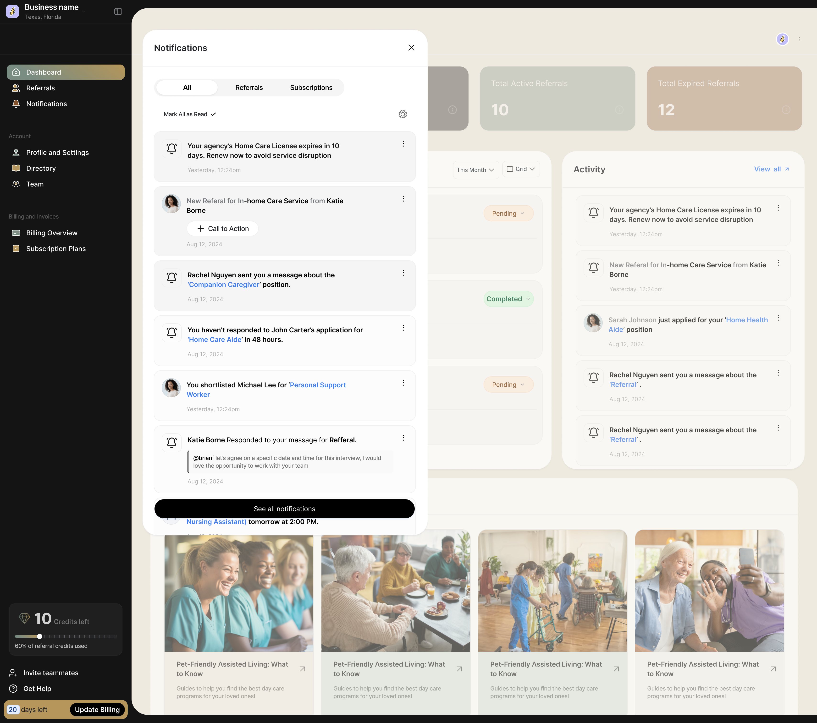
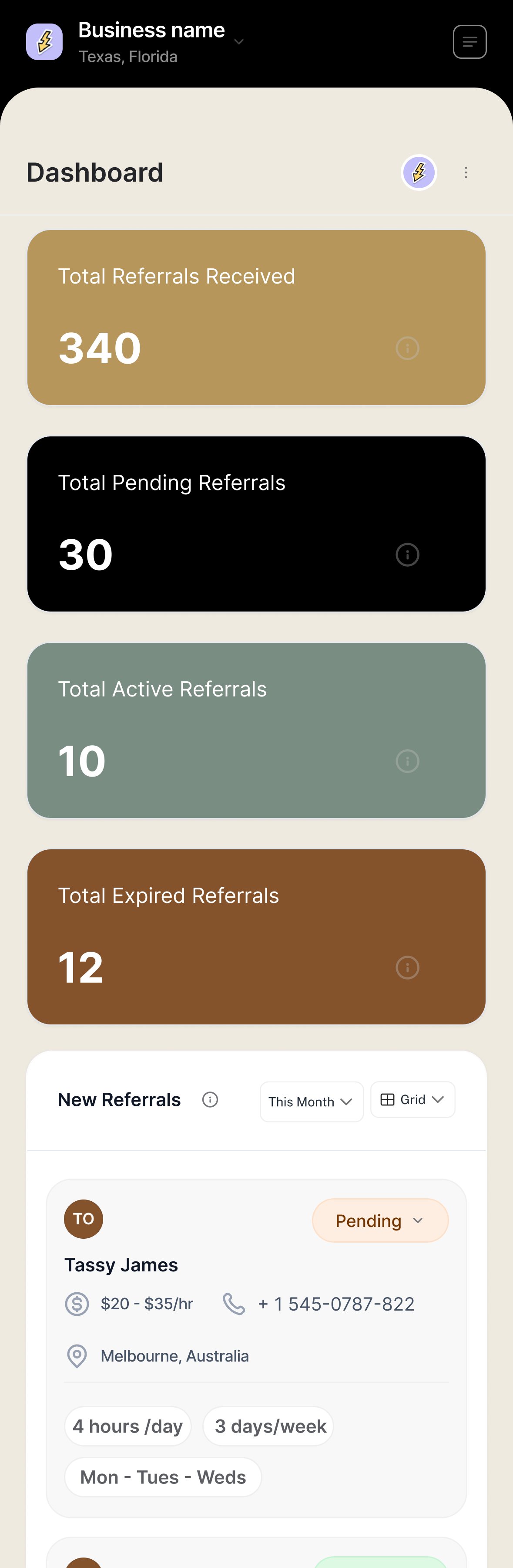
Website where families and care professionals first arrive Family portal families looking for care registering a loved one following the care Provider portal agencies managing referrals and clients caregivers, care plans Caregiver app caregivers managing their work and visits client information Admin the internal team managing providers, families and requests

Each section below covers the products we worked on.

Website

The public-facing experience where families and care professionals first encounter the platform.

I worked on the website as the lead designer.

We started with a long list of requirements and roughly 15 pages worth of content. Before getting into the visual design, we sat down as a team to work through the content and sketch wireframes for each page. This helped us figure out what each page needed to communicate and how the information could be organised.

From there, we created a moodboard and explored a few visual directions. We reviewed these with the client, talked through what felt right and what didn’t, and kept refining until we had a direction we could all agree on.

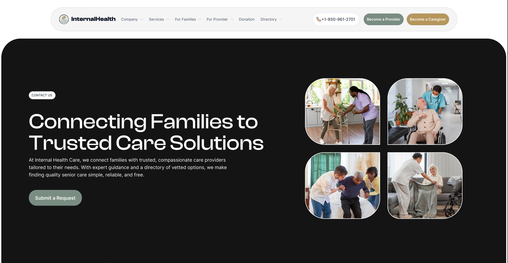
One thing the client was specific about: real images of people, and visuals from the platform itself, in place of illustrations. That decision carried through every page: each header leads on photography or a product shot.

Making each page its own

Once the direction was settled, we didn’t want to copy the same layout across all 15+ pages.

Each service had different content and a different story to tell, so we treated the pages individually. We kept the same visual language across the site, but played with layouts, imagery, sections and interactions so that each page had its own character.
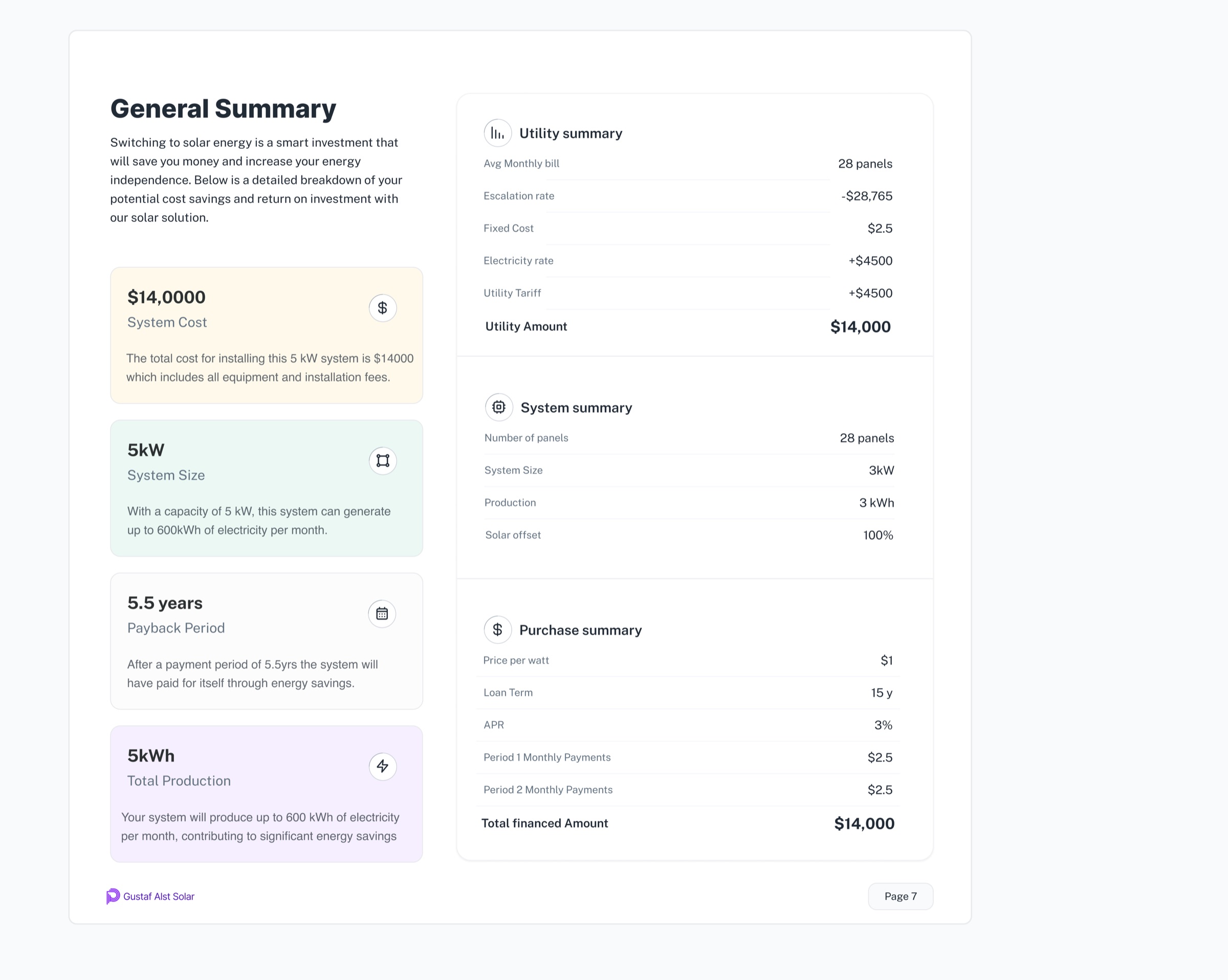
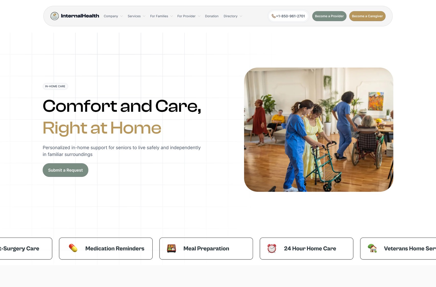
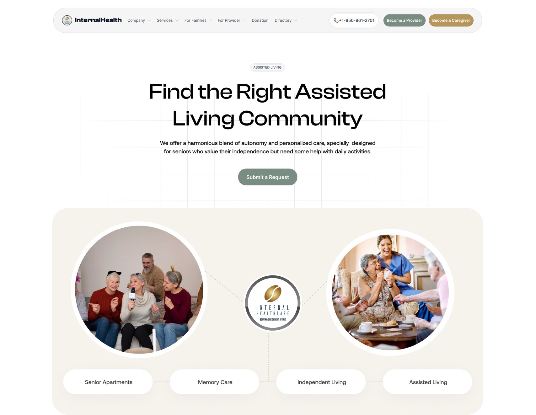
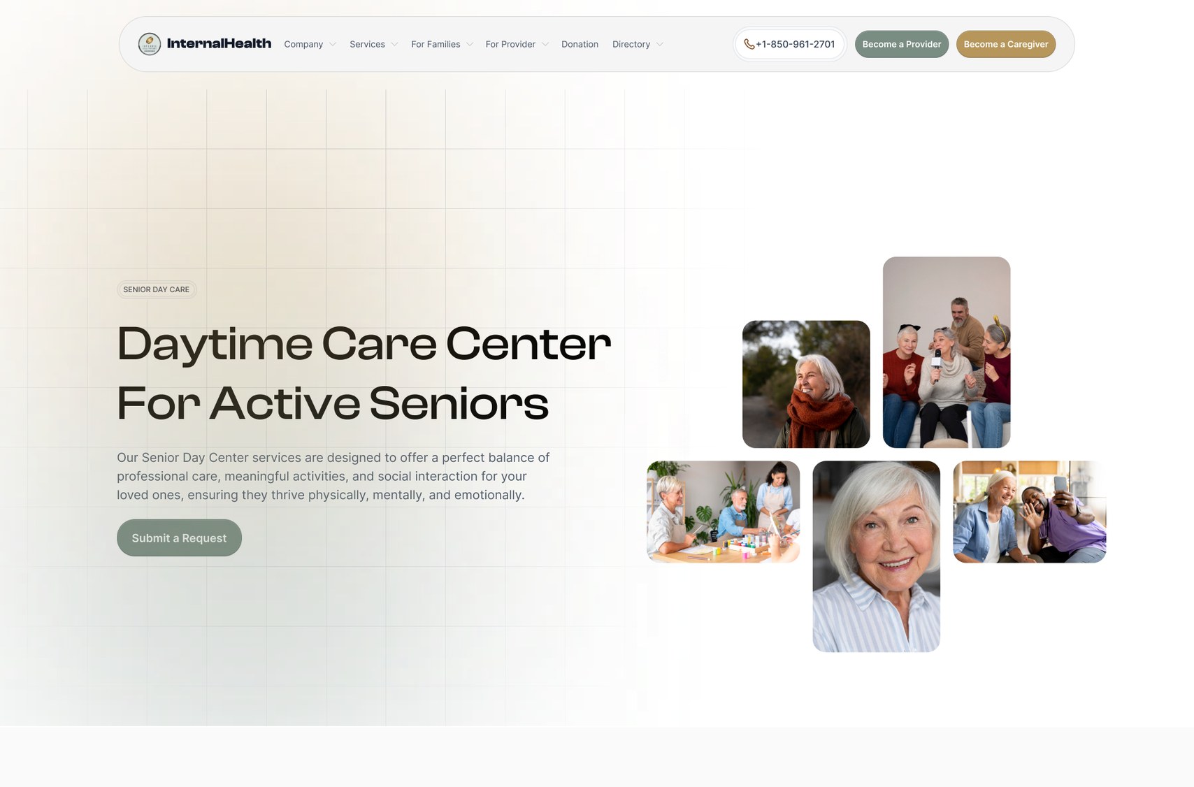
ScreensWebsite headers1/6
About Home care Assisted living Senior day care For caregivers Directory

Home Care

Click throughHome Care1/7
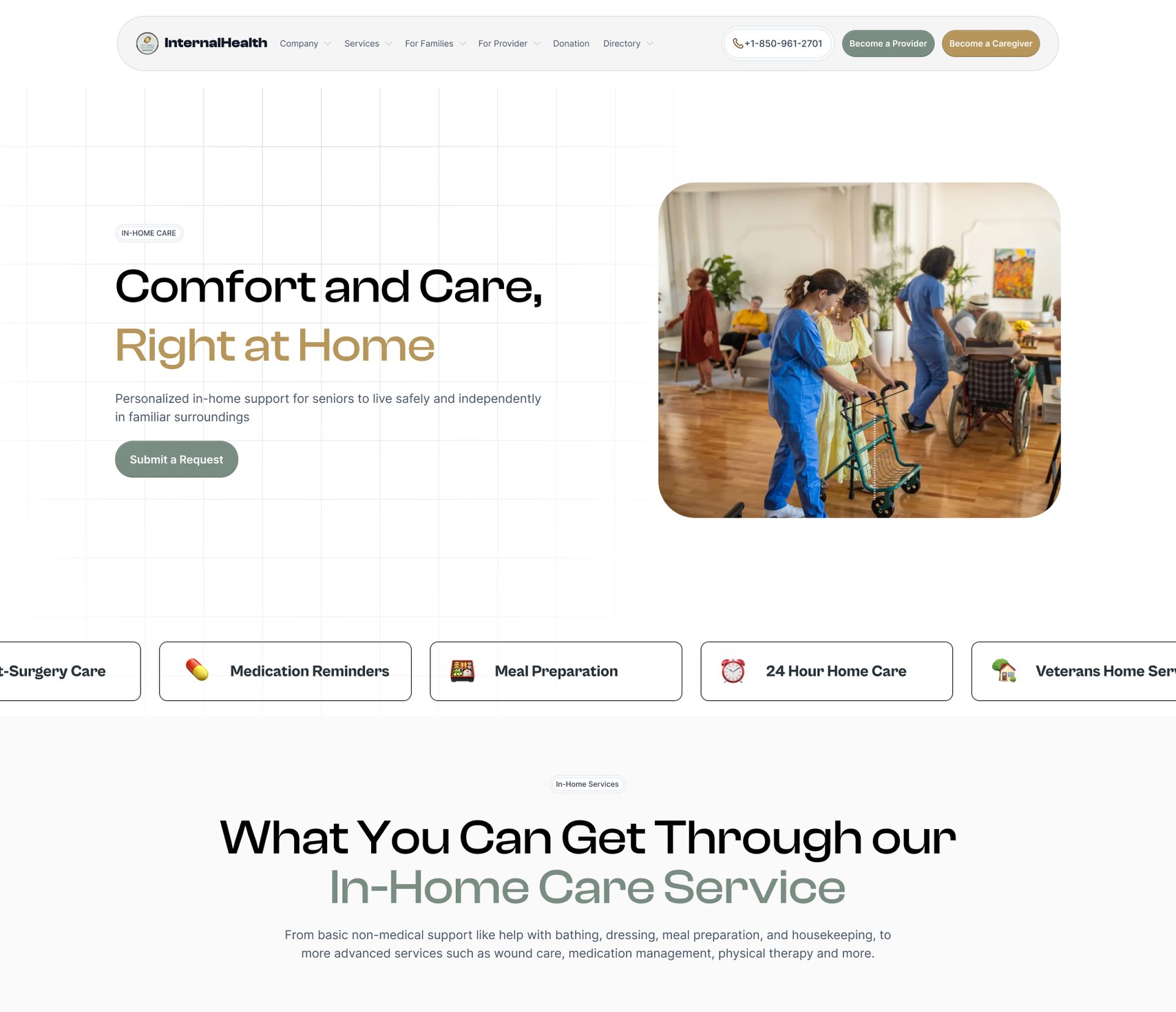
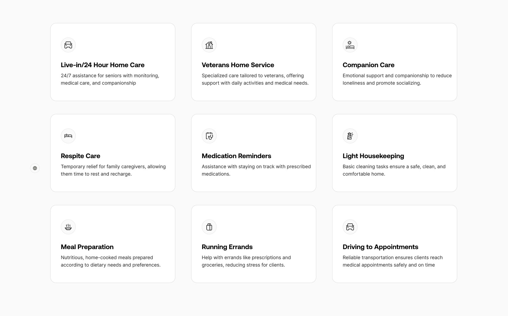
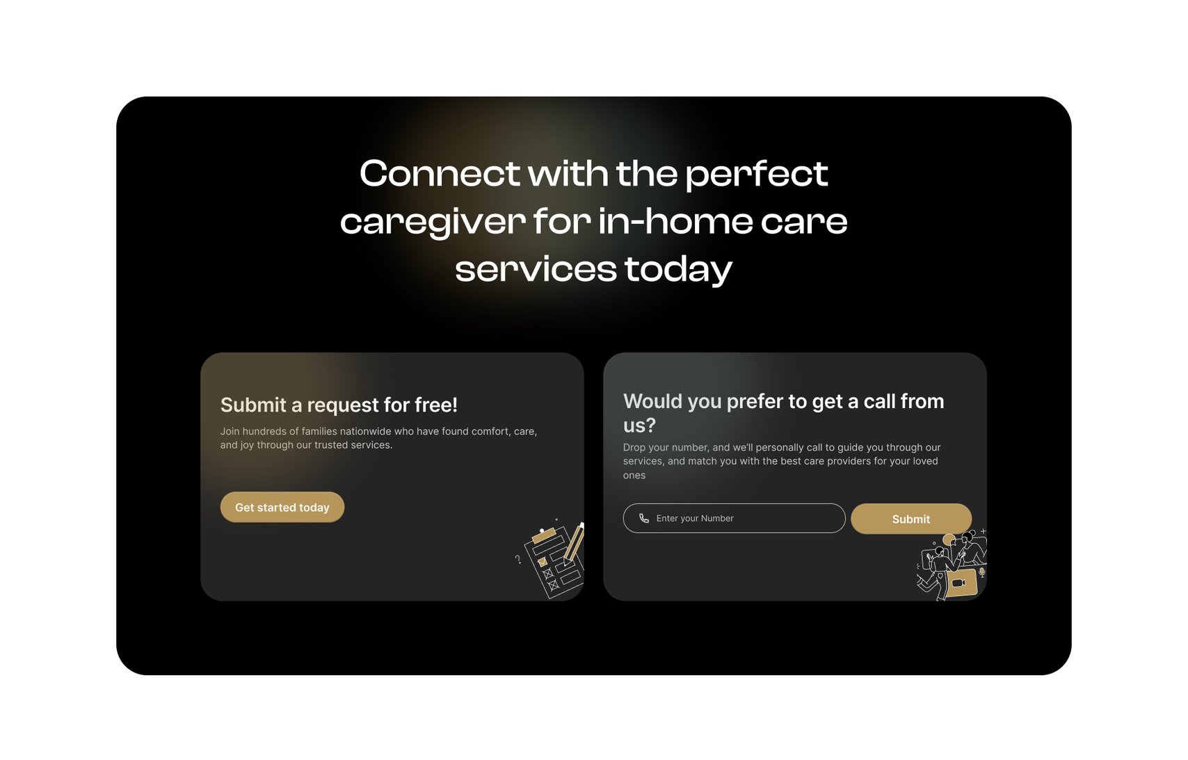
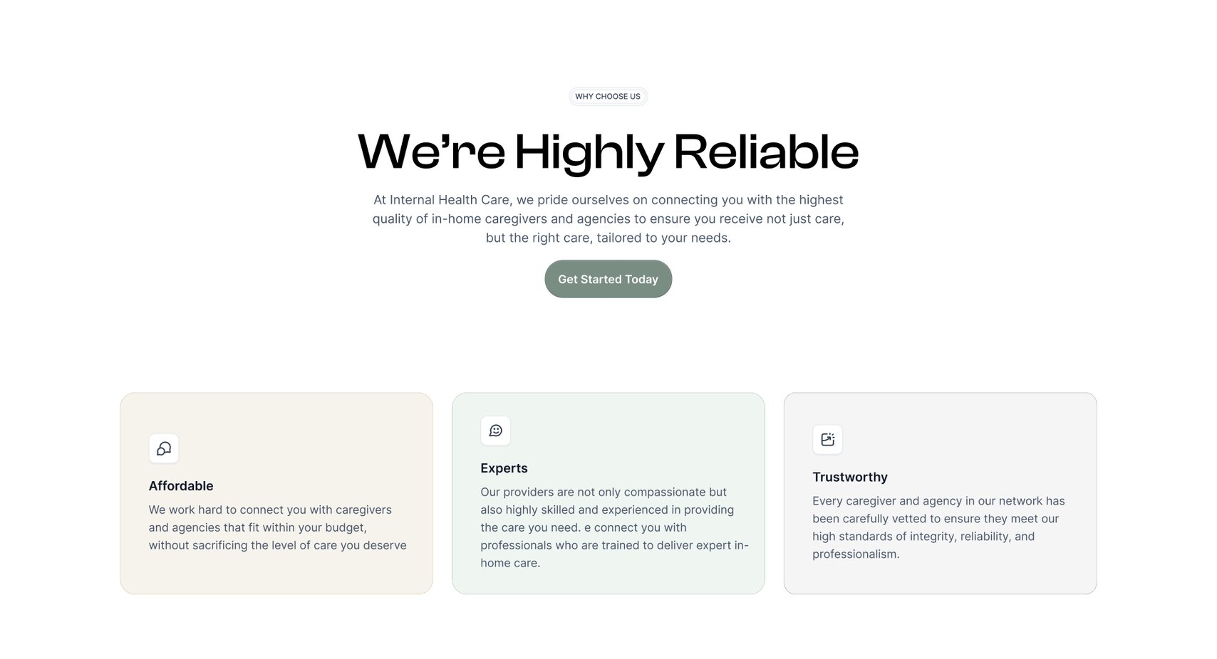
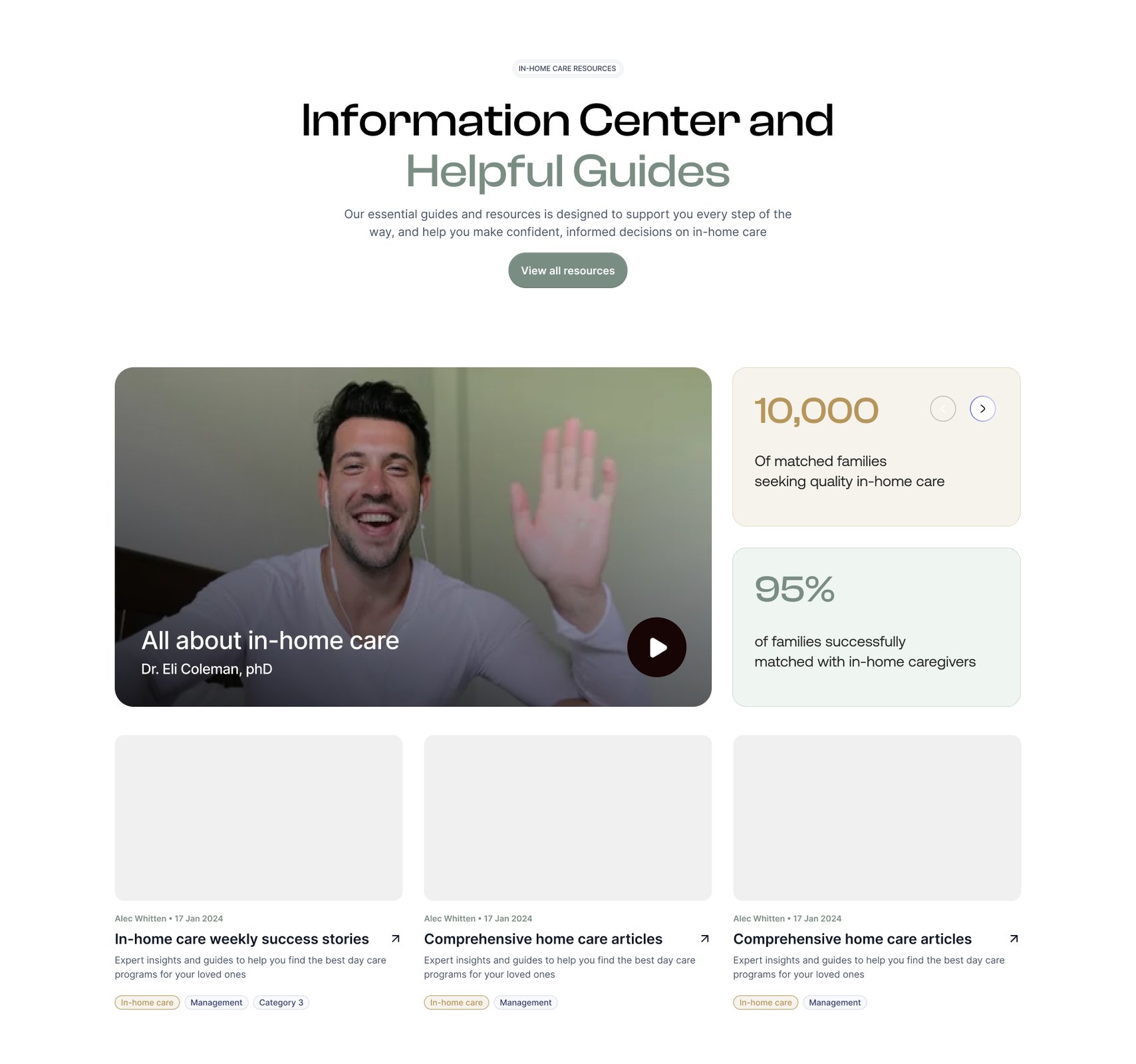
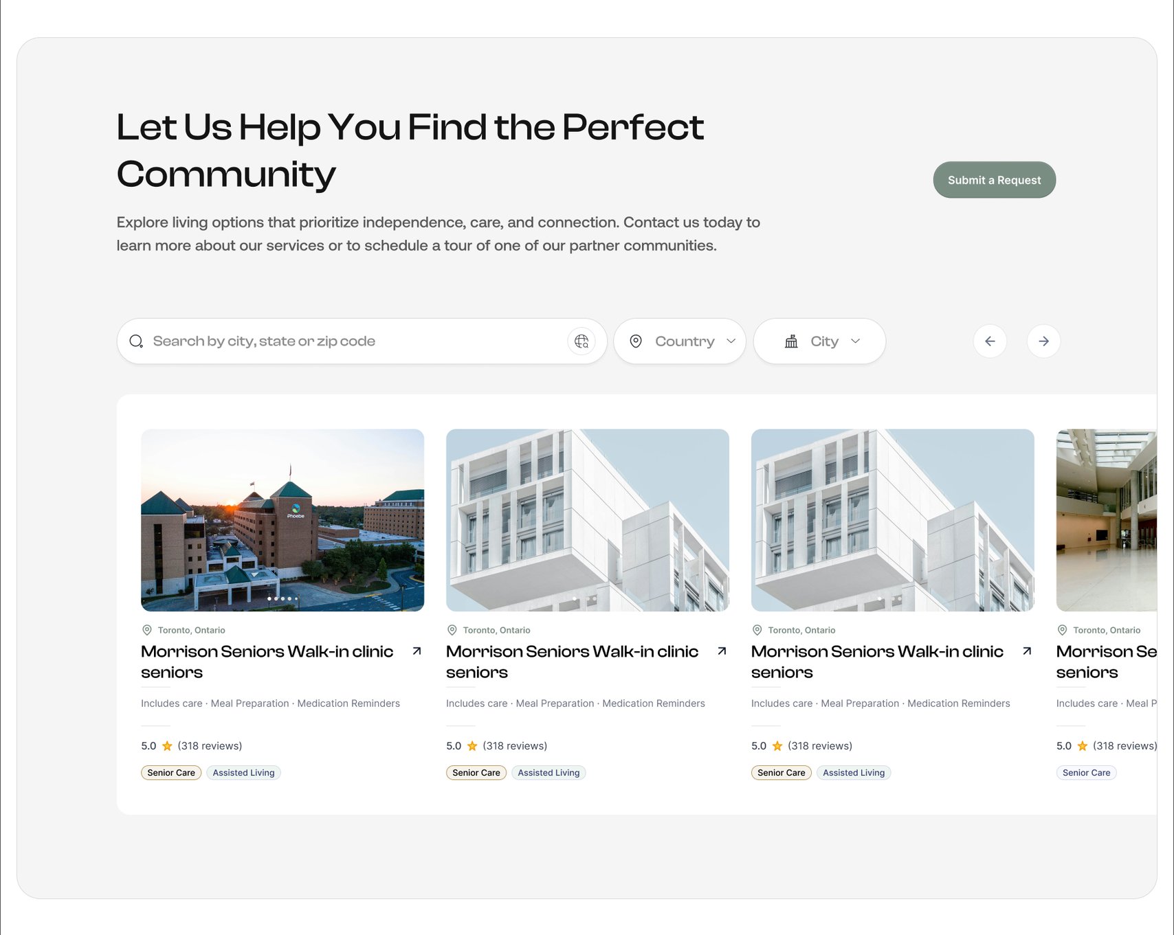
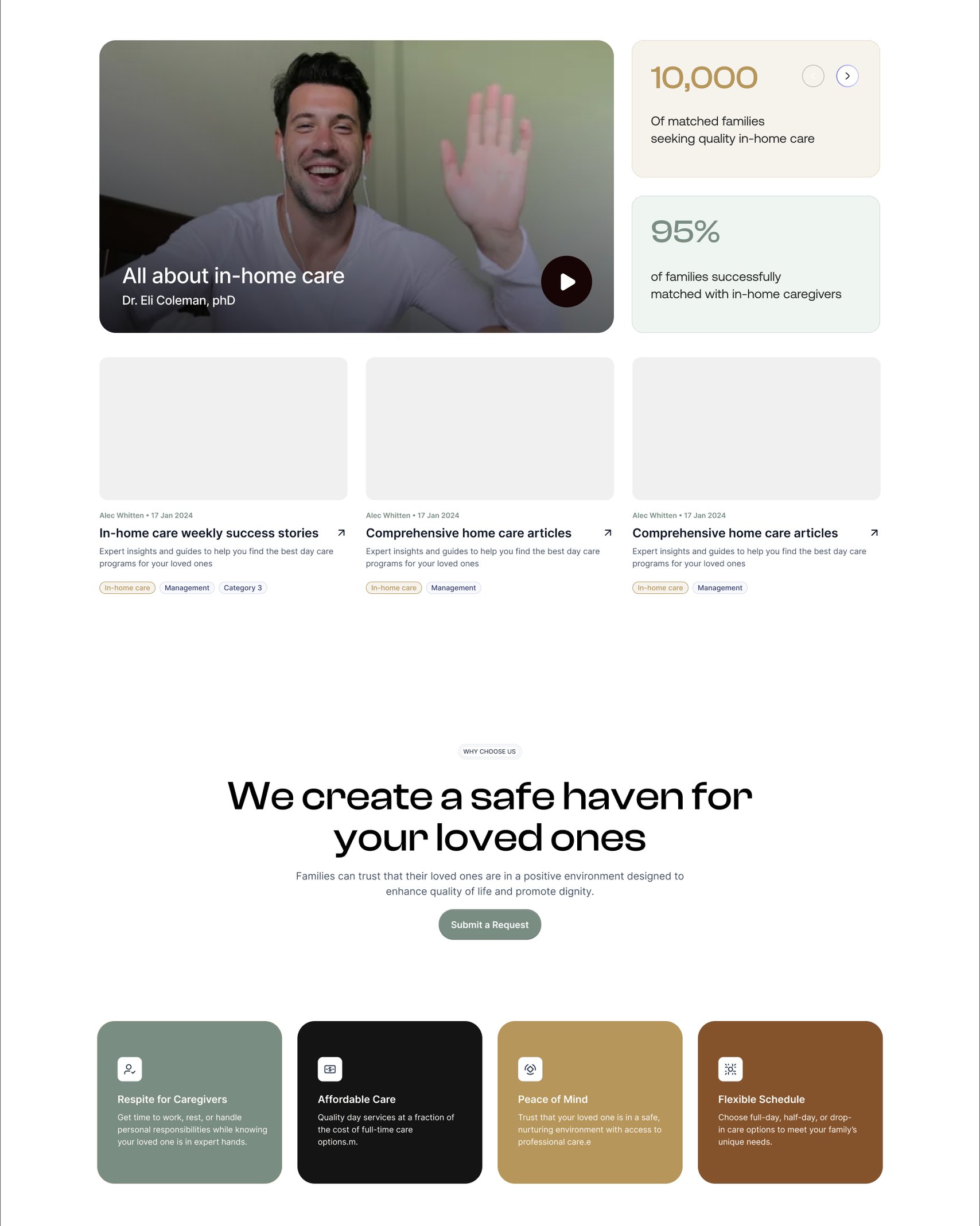
In-home care, and who it is for. The kinds of support available at home, broken into sections. How a family starts, and what happens after they ask. The people and agencies behind the service. What the service commits to. Reading for a family still deciding. The care request at the end of the page.

The Home Care page is for people looking for support that can be provided in their own homes, whether that’s help with everyday activities, personal care, or ongoing support.

There was quite a bit of information to communicate, so we focused on breaking it into clear sections without making the page feel overwhelming.

Assisted Living

The Assisted Living page is for people looking for a more supported living arrangement, where care and day-to-day assistance are available within a residential setting.

Click throughAssisted Living1/7
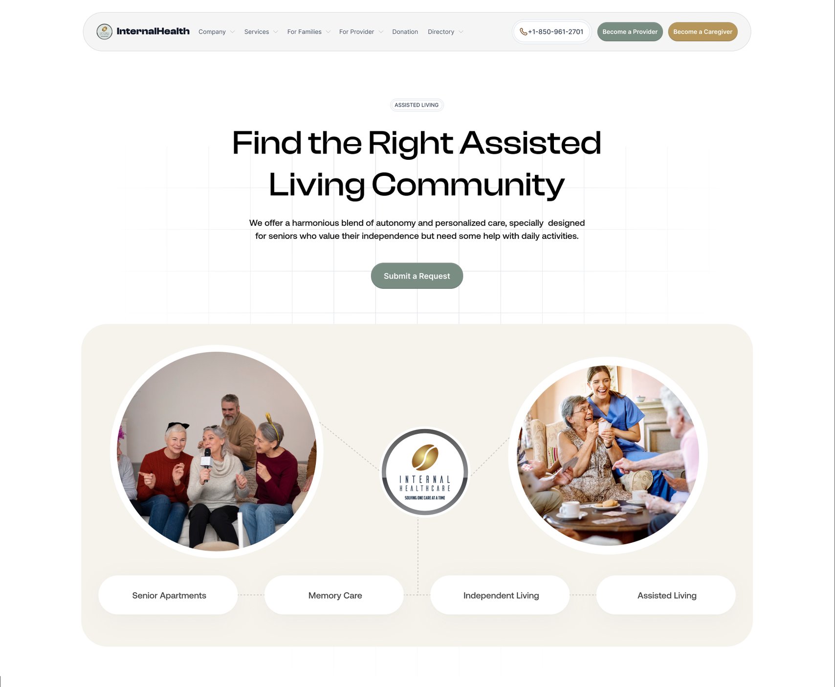
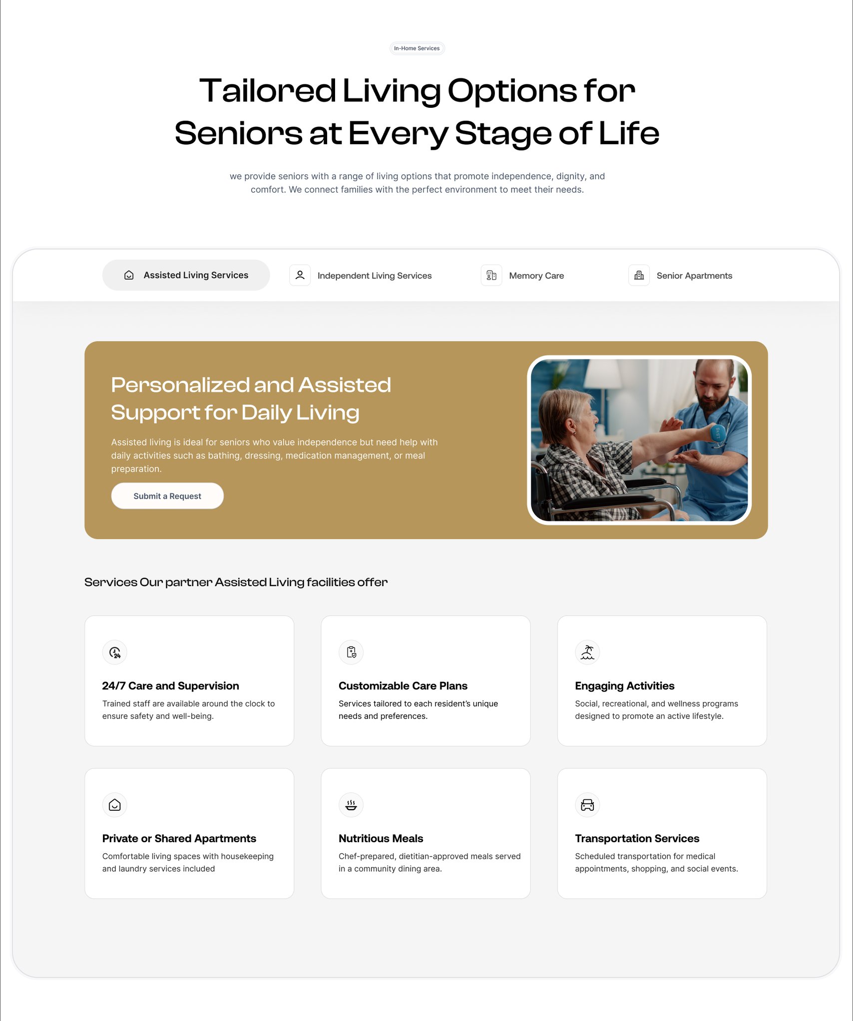
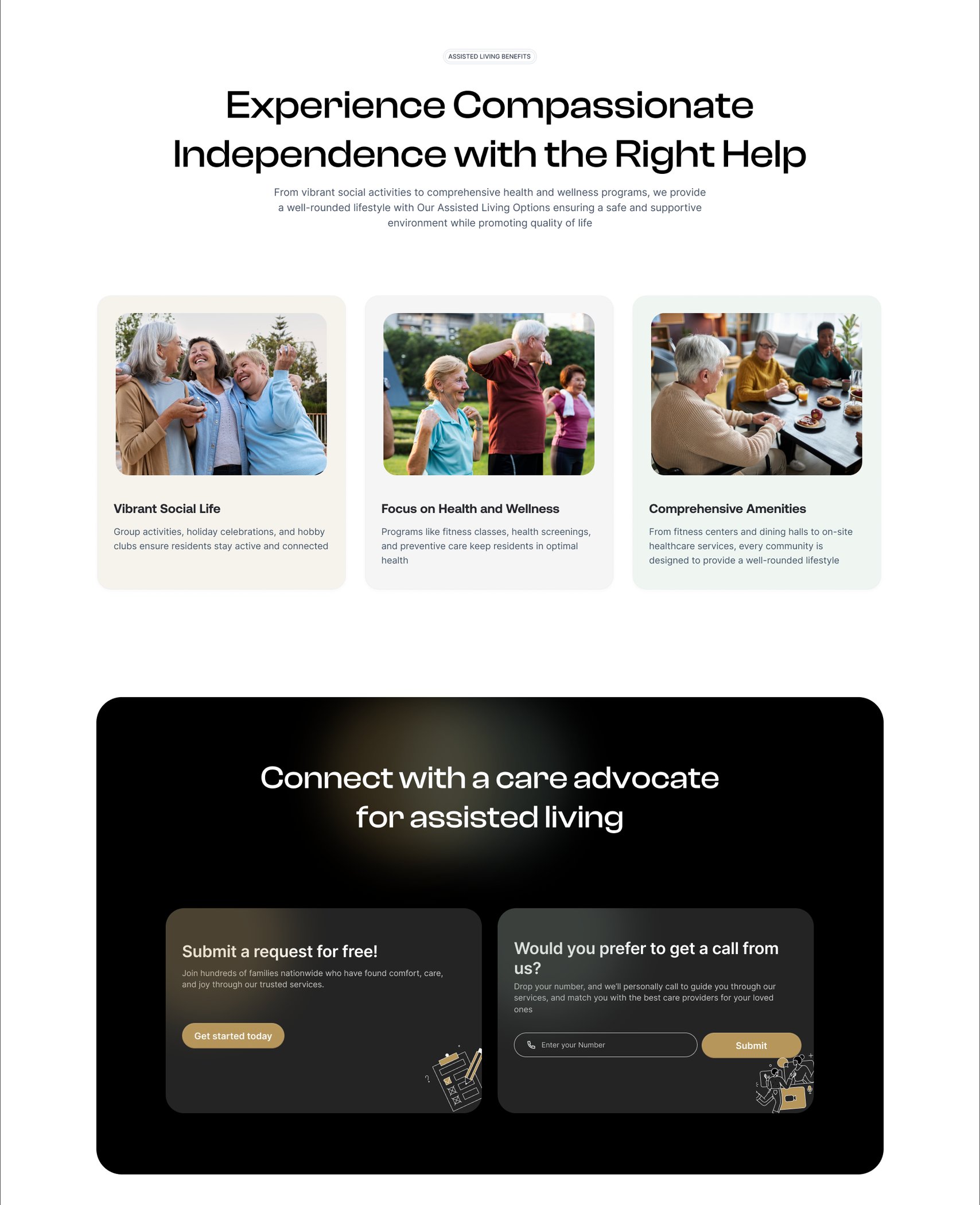
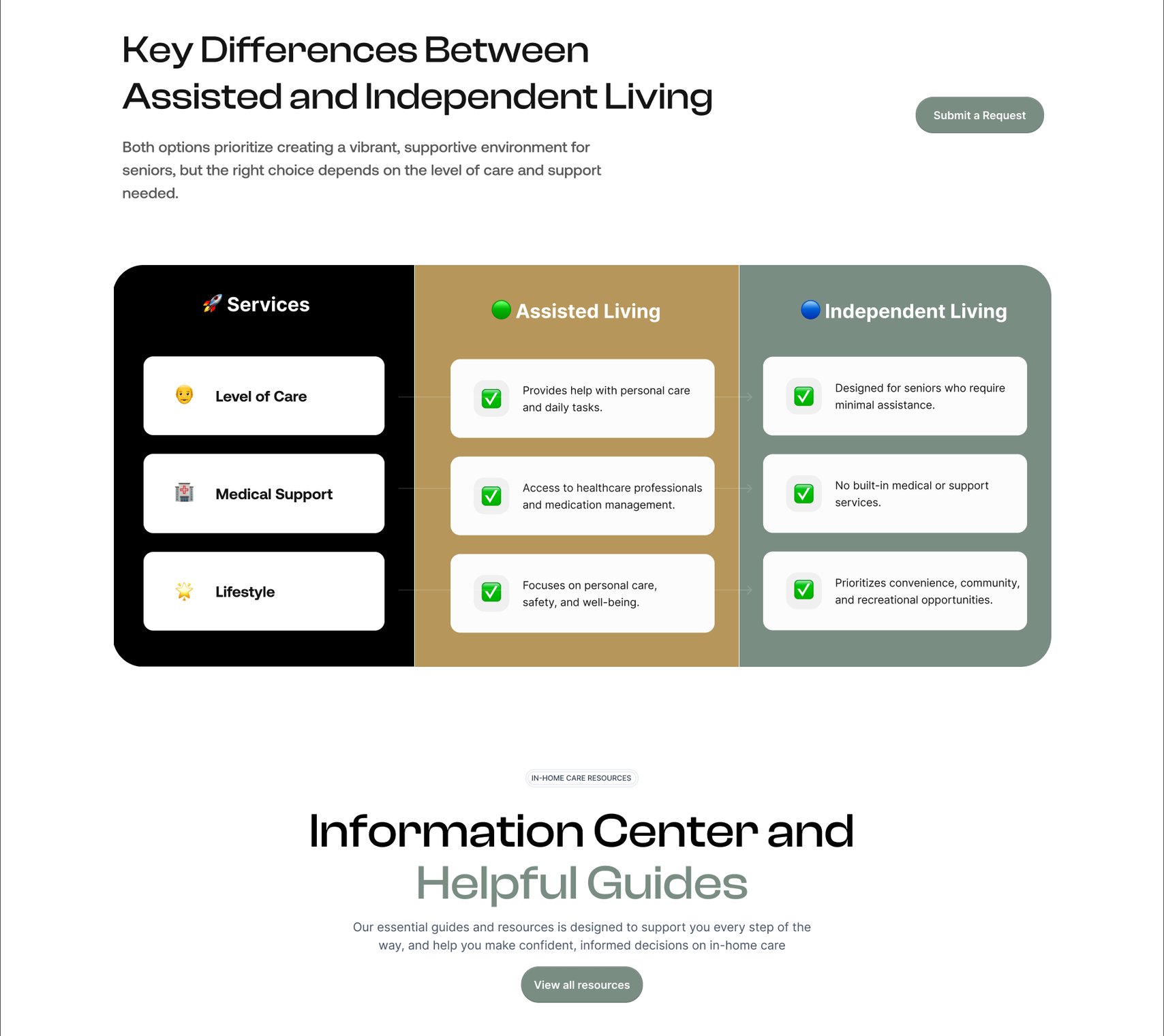
Finding the right assisted living community, with the kinds of care laid out underneath. Tailored living options for seniors at every stage of life. Personalised and assisted support for daily living, and what a partner facility offers. Experience compassionate independence with the right help. What to weigh when choosing a community. The information centre and helpful guides. The care request at the end of the page.
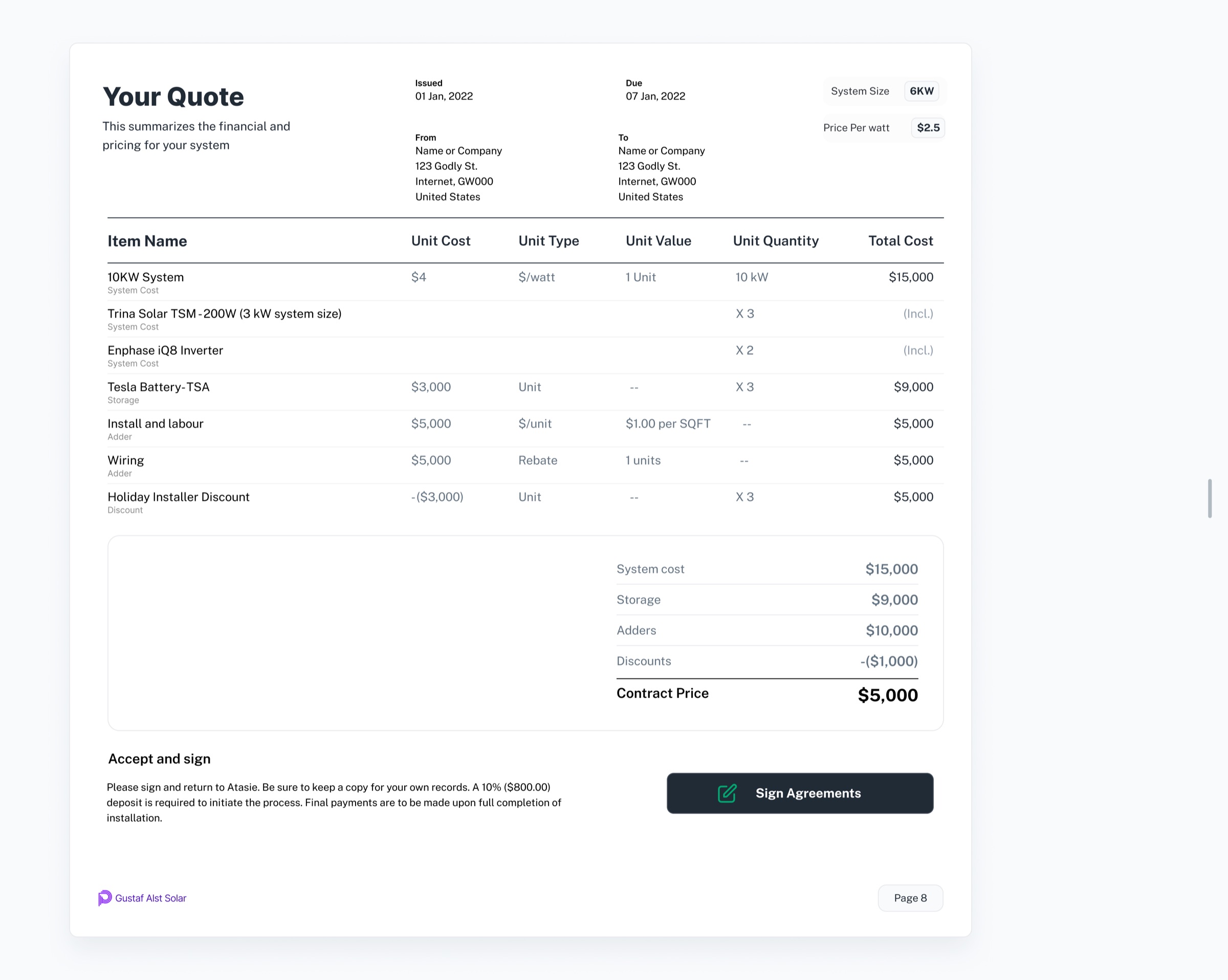
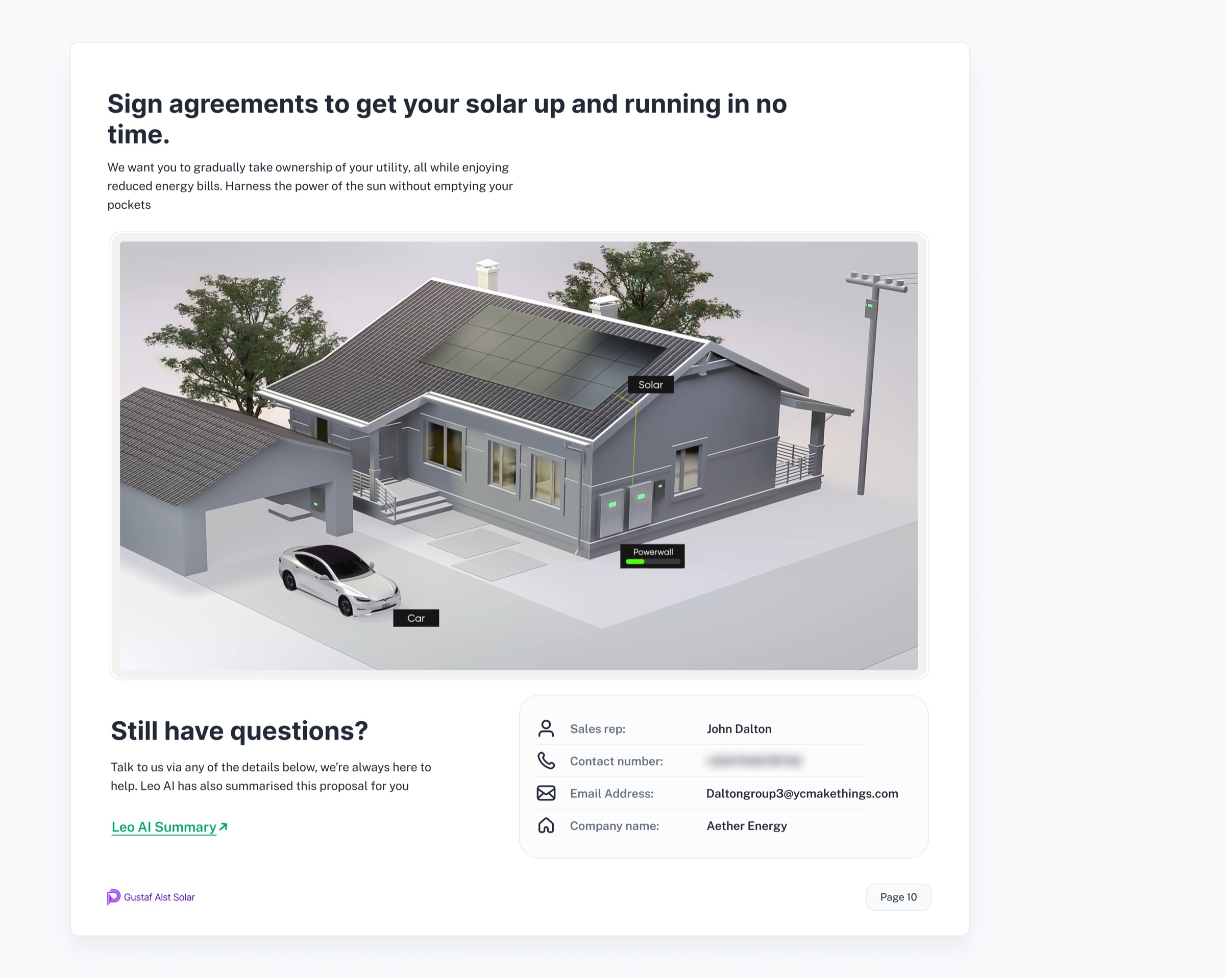
The content was different from Home Care, so we gave the page its own structure rather than repeating the same layout.

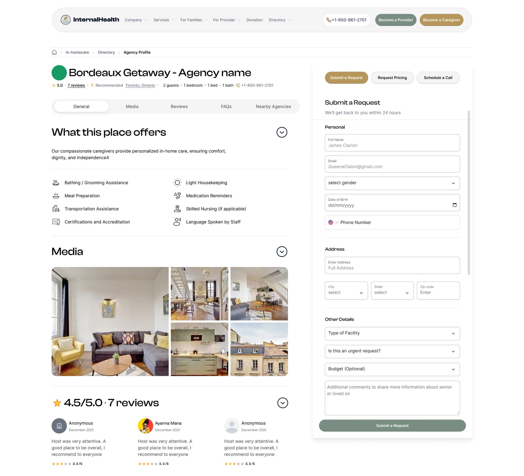
Provider Directory

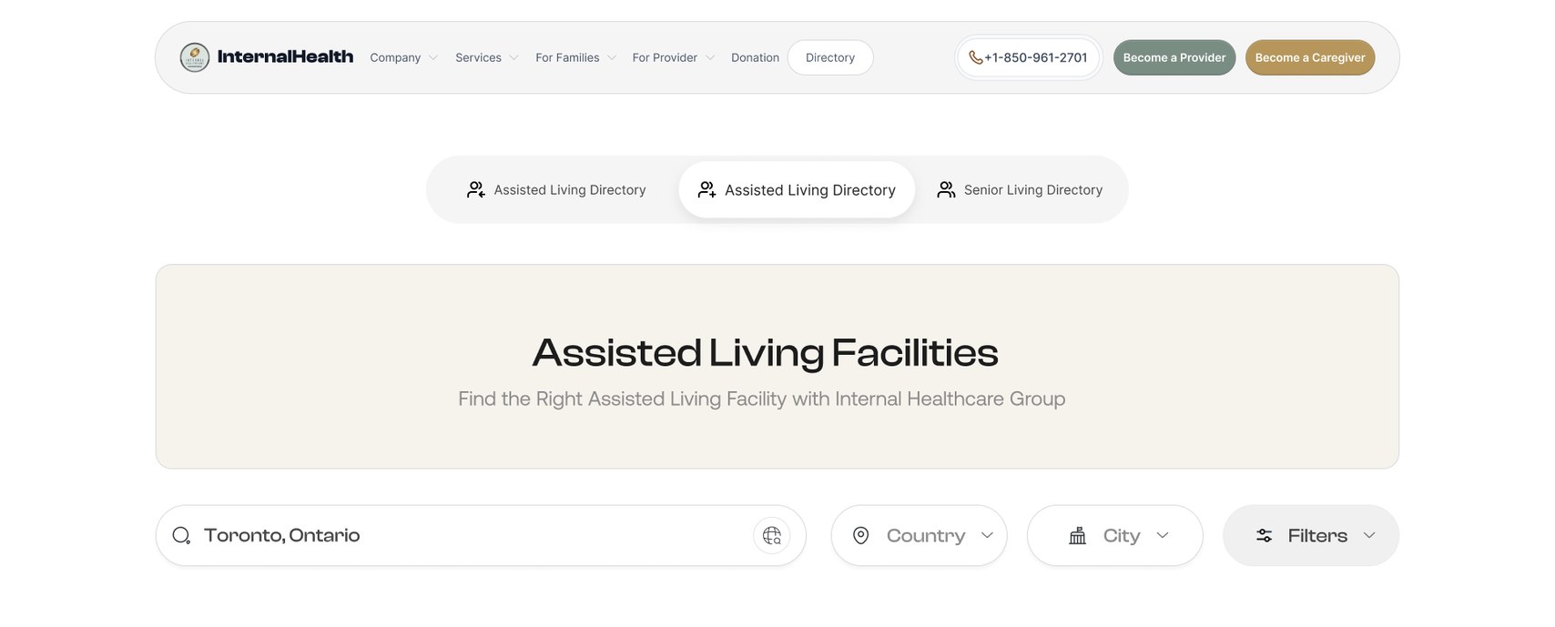
The directory is where families can browse care providers and find options based on the kind of care they’re looking for.

Unlike the service pages, this wasn’t about explaining a service. It was about helping someone find and evaluate their options.

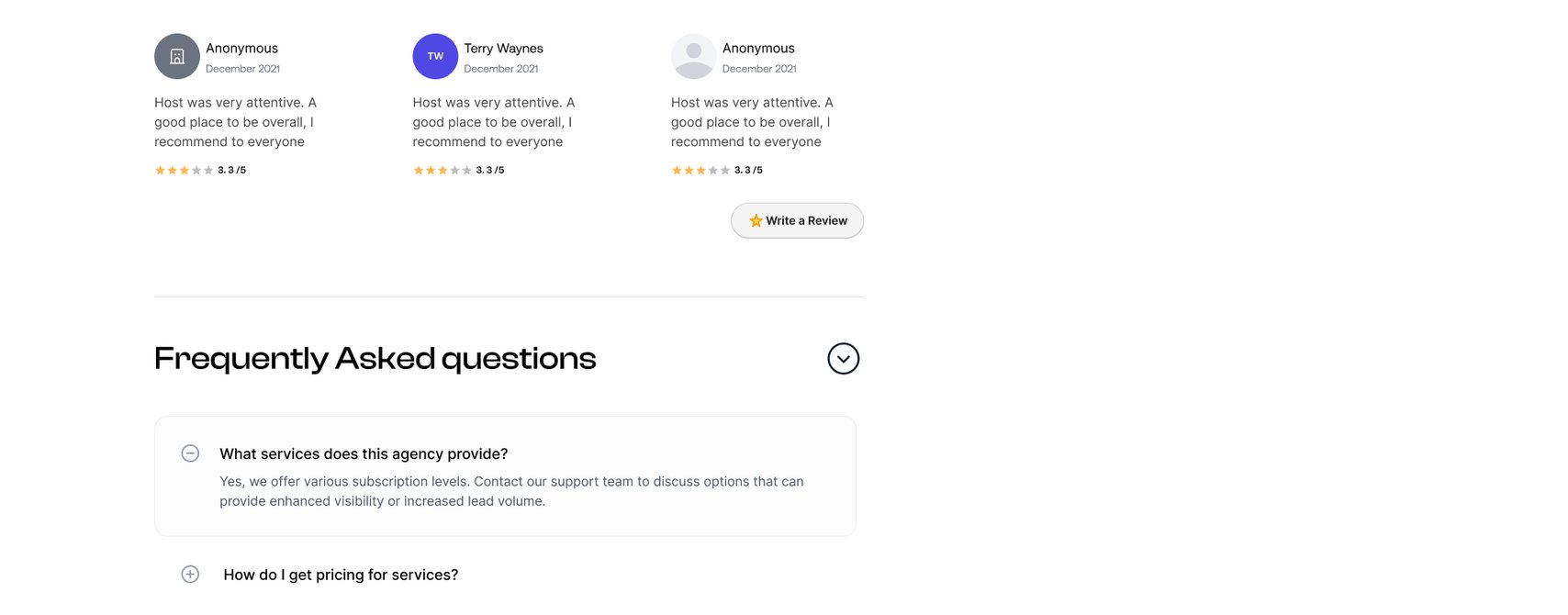
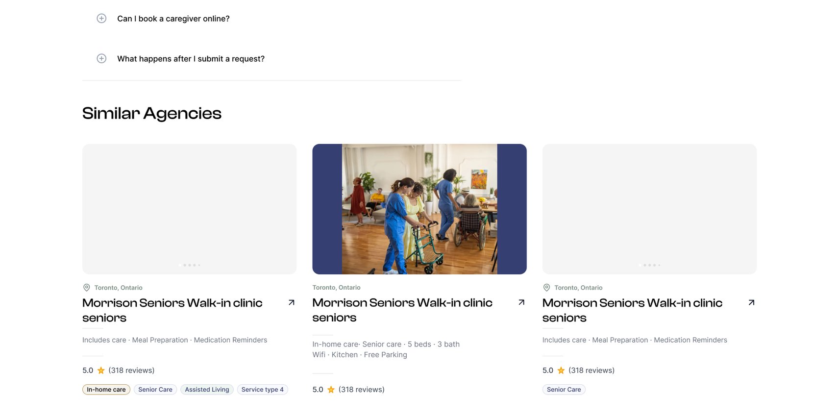
Click throughA provider’s page1/4
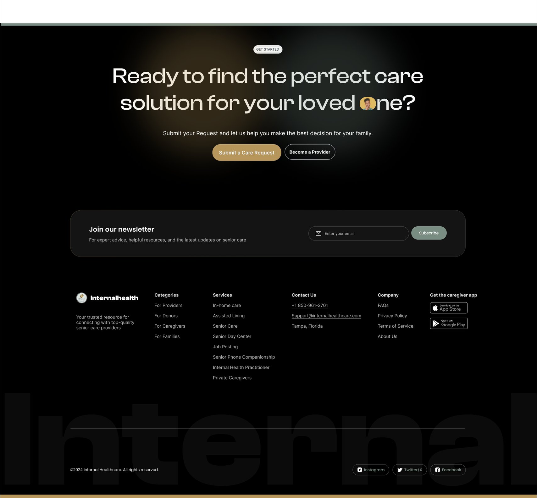
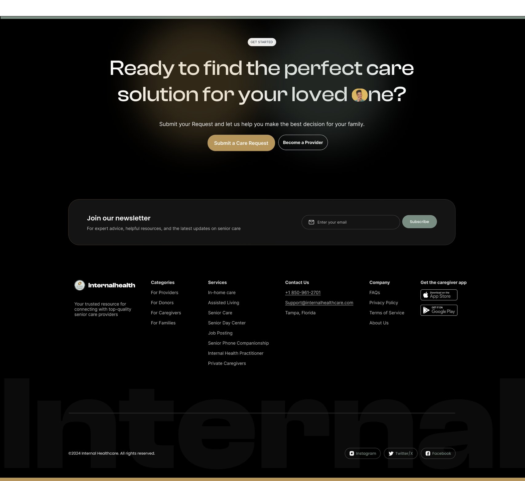
What the place offers, its photographs, and the request form running alongside from the top. Ratings and written reviews, then the questions families ask before they commit. Similar agencies close by. The care request repeated at the end, with the newsletter and the rest of the site underneath.
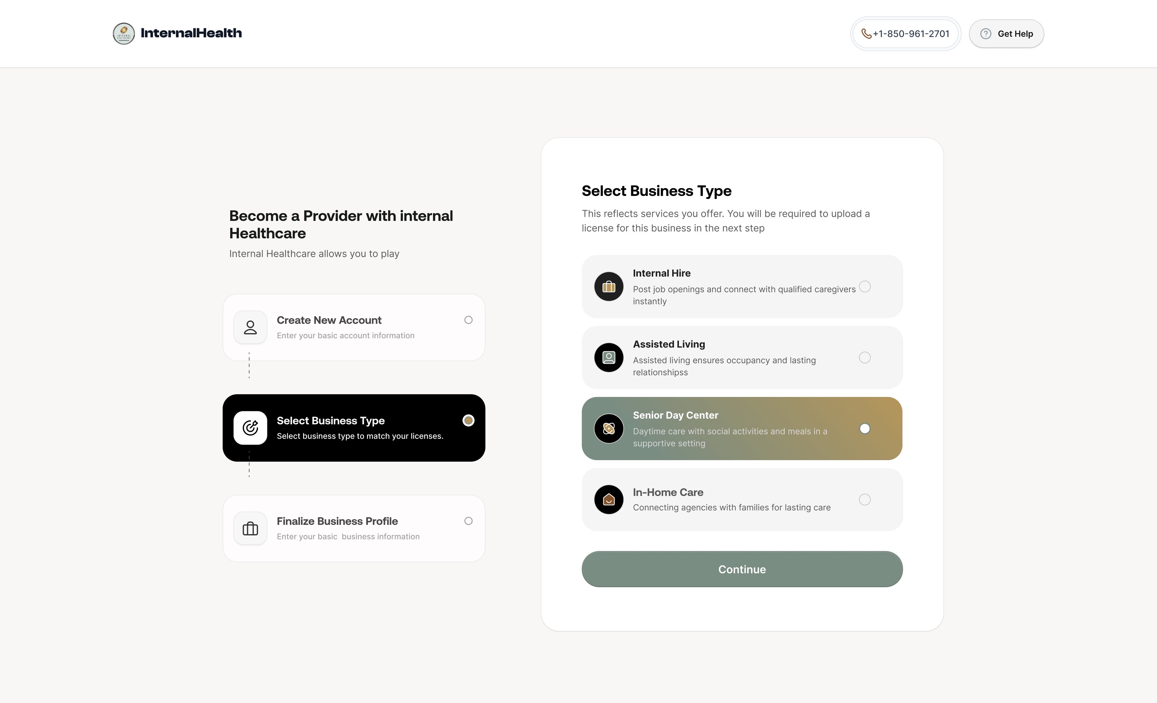
The rest of the site

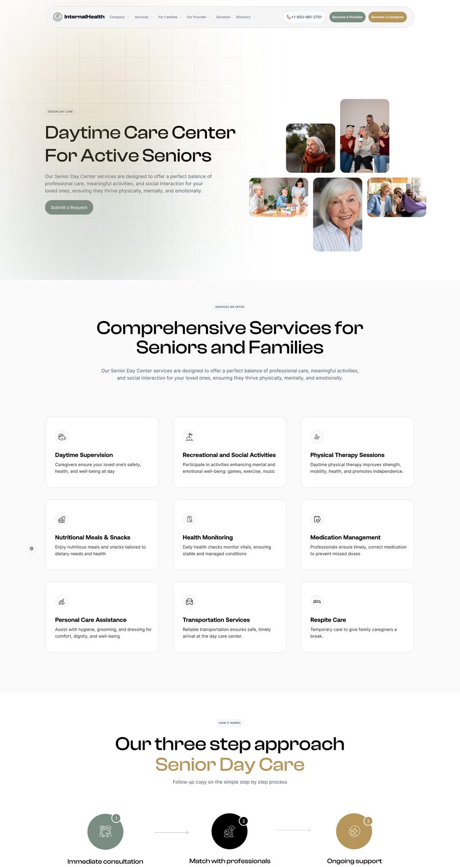
Senior Day Care, the top of the page: daytime care for active seniors.
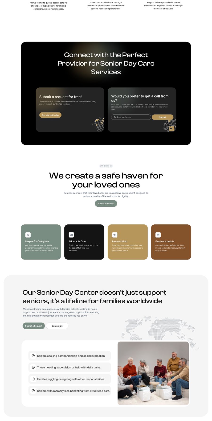
Senior Day Care: the services offered and the three-step approach.
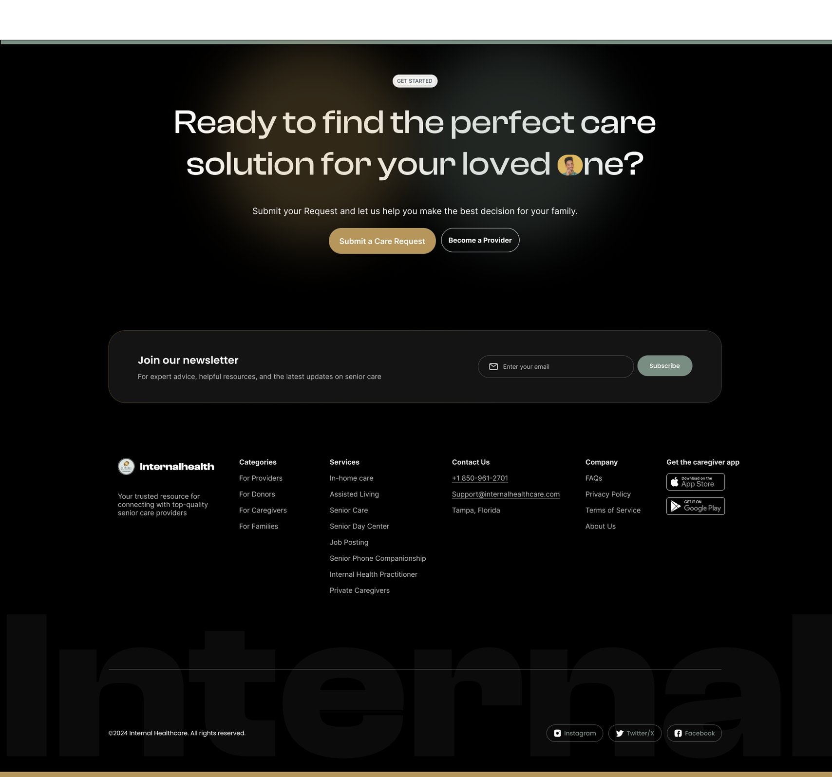
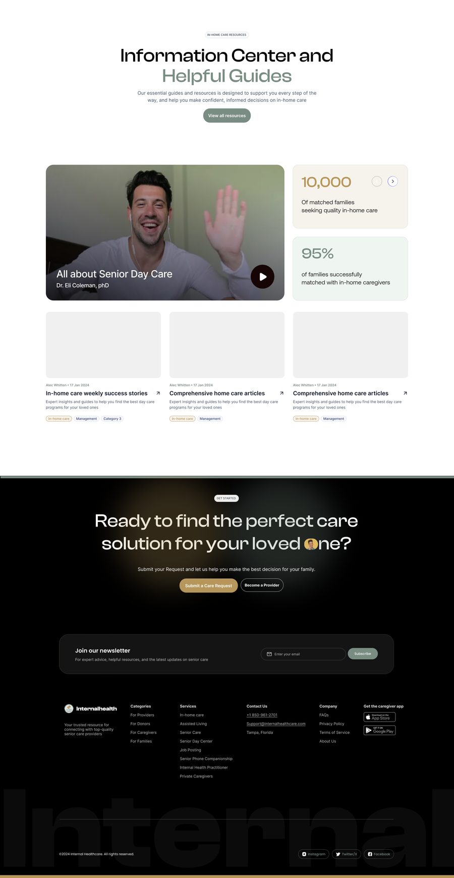
Senior Day Care: the guides, and the care request at the foot of the page.
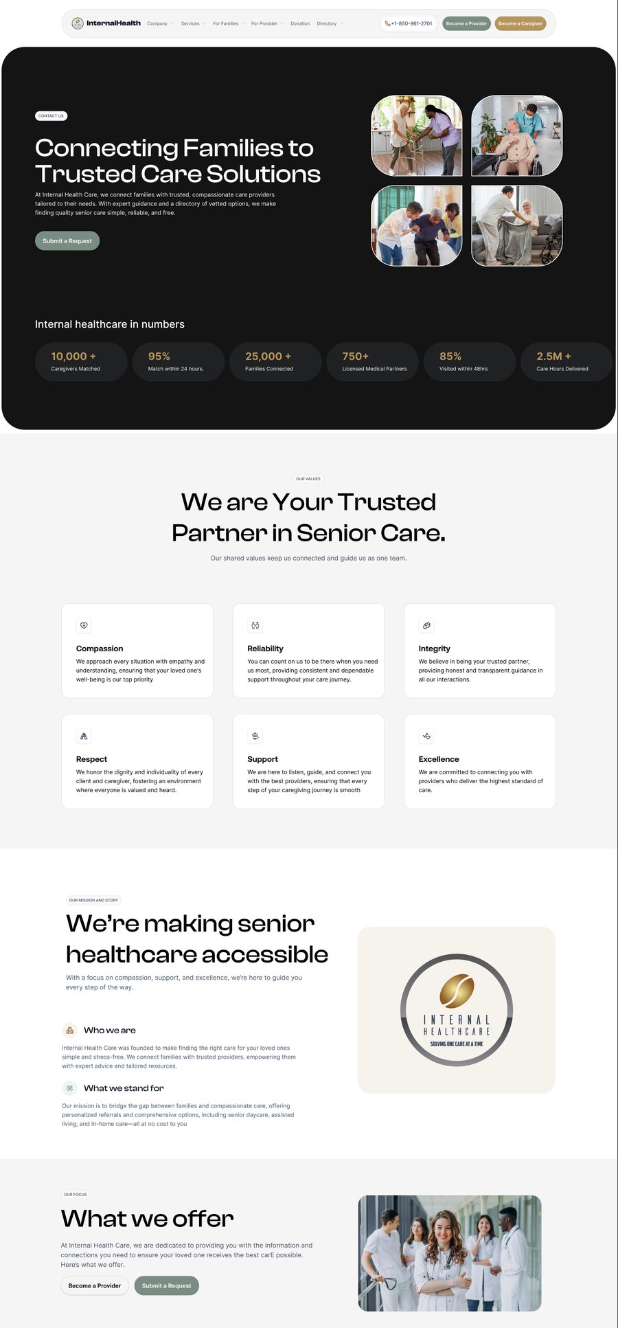
About: who Internal Healthcare is, and the numbers behind the service.
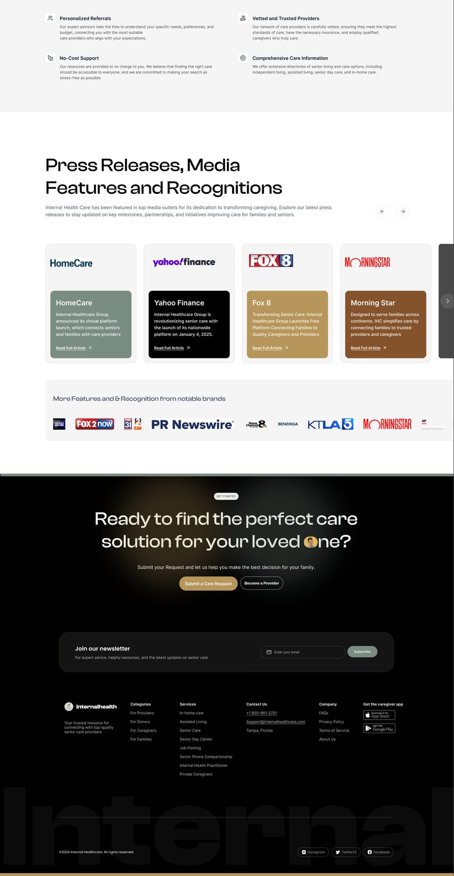
About: the mission, what they offer, and the press coverage.
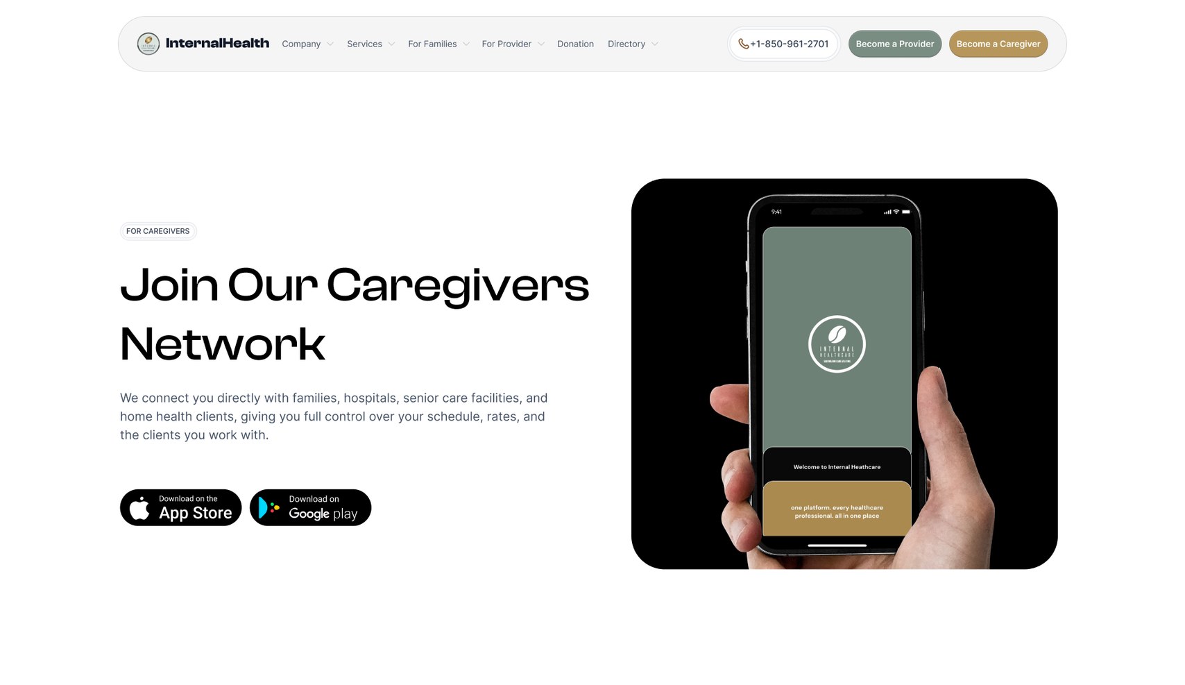
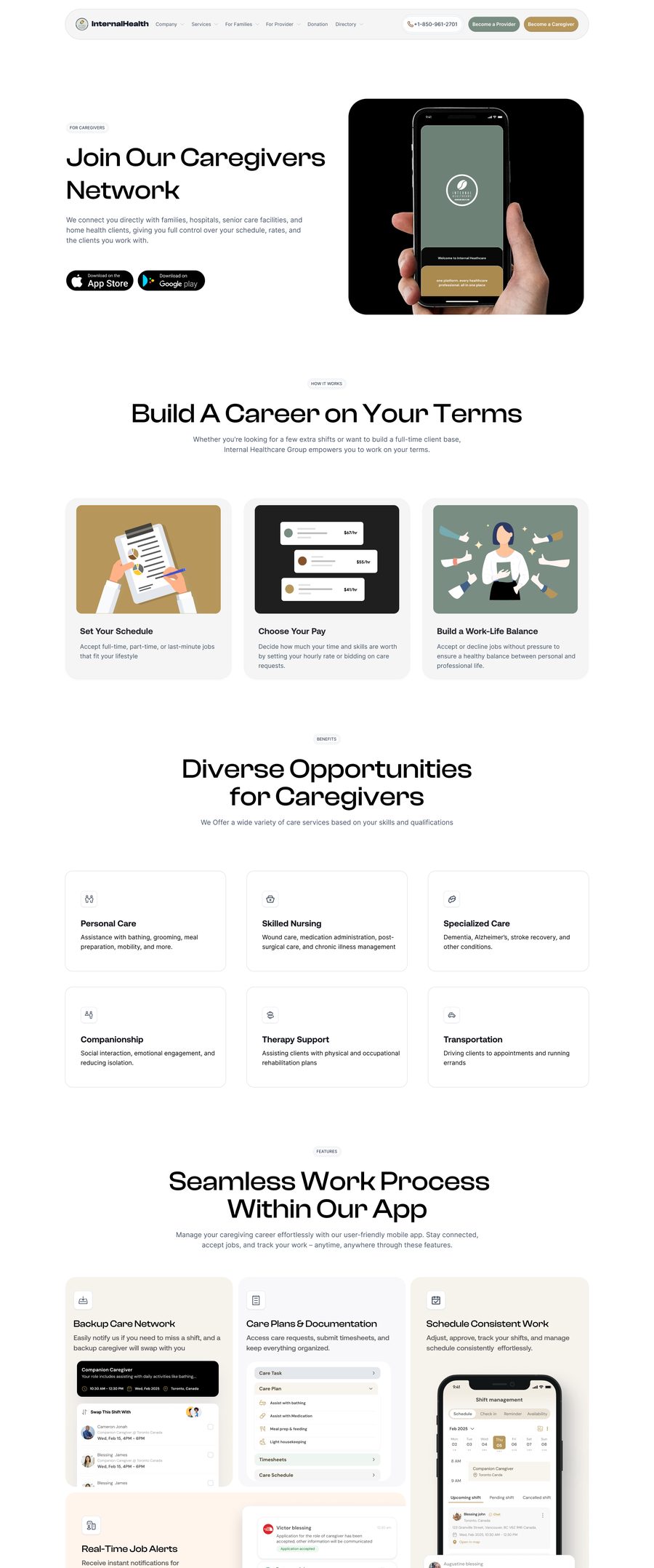
For caregivers: joining the network, and building a career on your own terms.
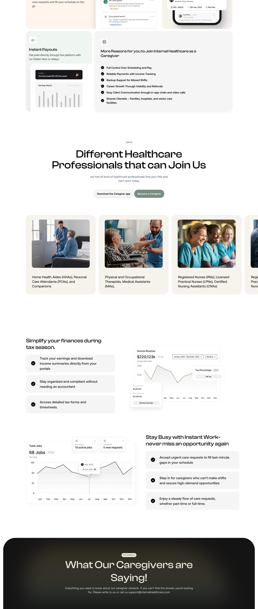
For caregivers: the opportunities, and what the app does day to day.
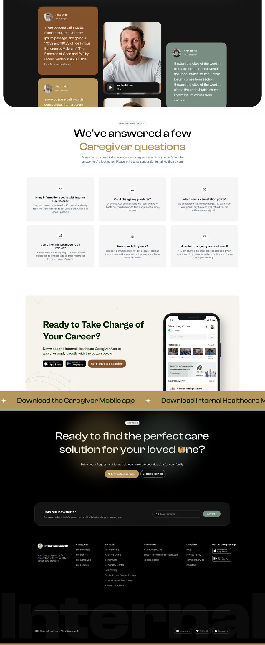
For caregivers: the earnings, the questions and the sign-up.

There were other pages covering the remaining services, resources and information the client wanted to make available. Each one followed the same visual direction, but we adjusted the structure depending on what the page needed to communicate.

Reviews and handoff

The website went through several rounds of review with both the client and our team. We were making changes while engineering had already started building, so the design and development work happened alongside each other.

By the end, we had worked through 15+ pages, from the initial wireframes and visual direction through detailed UI and the handoff into development.

From there, we moved into the portal side of the platform.

Where it got to

Live at internalhealthcare.com, operating out of Tampa, Florida, with 245+ professionals listed.

The engagement ended in a hand-off, and one of the designers from the team stayed on with the client to continue the work.

Uiland

04/05

Building UIland

Most design inspiration platforms didn’t cover African products. We wanted to change that.

I joined two engineer friends to co-found UIland in 2023, taking on the design side as the only designer on the team. We started with a small collection of African web and mobile products. Since then, it has grown into a design platform with 1,000+ products, 100K+ visits and thousands of dollars in revenue.

Building with a two-person engineering team

I work directly with both engineers to take ideas from rough concepts to shipped features, from product direction down to the details of the interface, and into how the library, website and wider experience have evolved.

From a library to a product

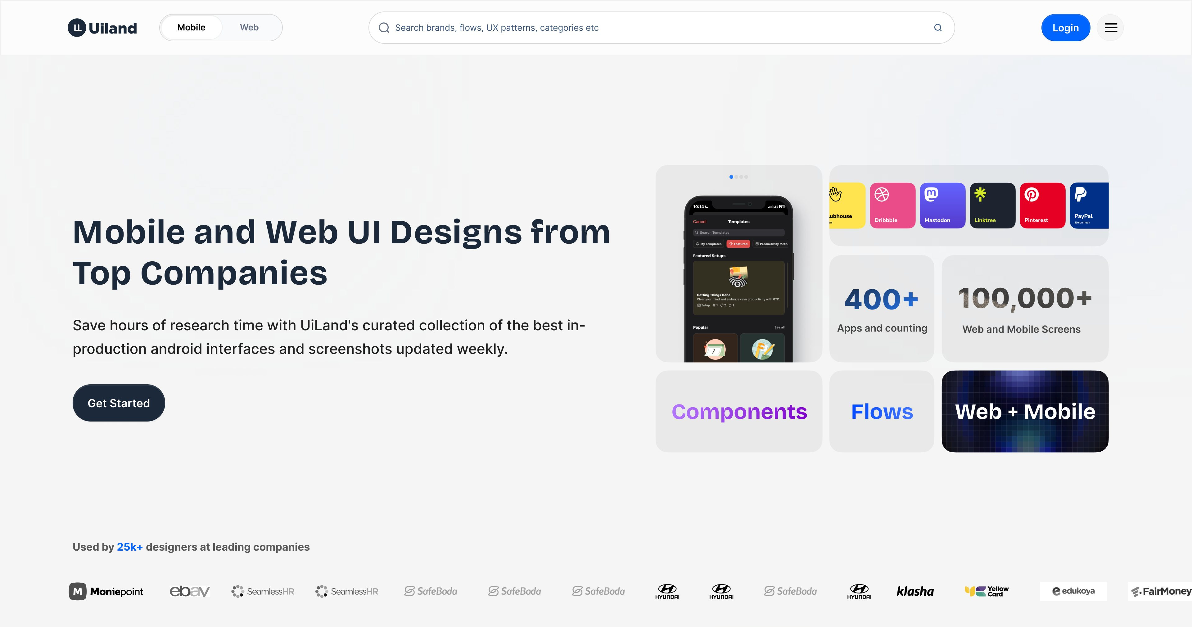
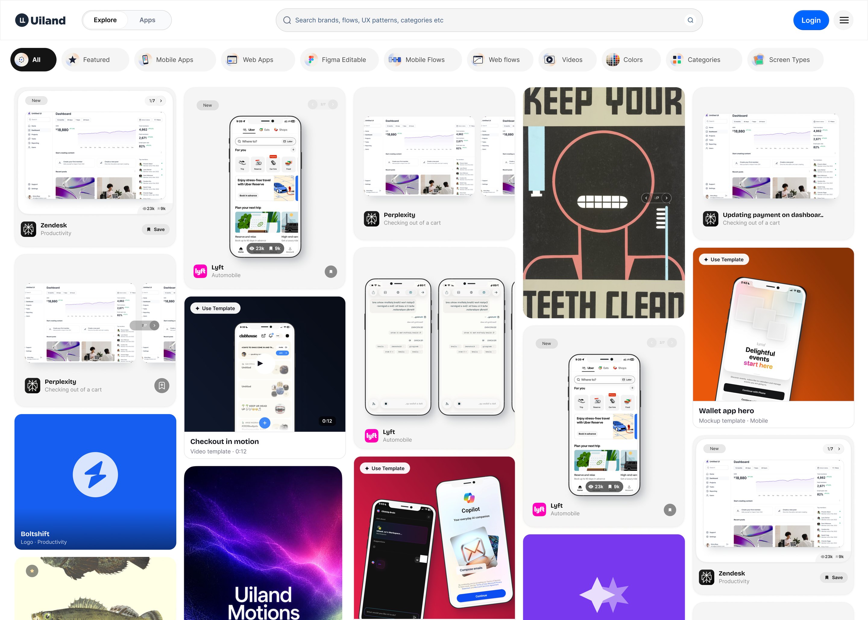
The Uiland homepage as designed: the hero and search, 400+ apps and 100,000+ screens, the Components, Flows and Web + Mobile entry points, the brands covered, and the filter rail above the grid.
The home grid: app screens, logos, colours and websites in one scroll.

The first version was straightforward: make African products easier to discover and study.

As the library grew, we started asking what would make UIland useful beyond browsing screenshots.

That led us into websites, app store screenshots, OG images, interactions and other references designers could use in their work.

Designing around real usage

We use Cloudflare Web Analytics for aggregate visits, page views and page load times, and Google Analytics, Hotjar and other tools to understand how people use the platform, where they drop off and what keeps them coming back. I use that alongside user feedback and conversations with the team to decide what needs attention.

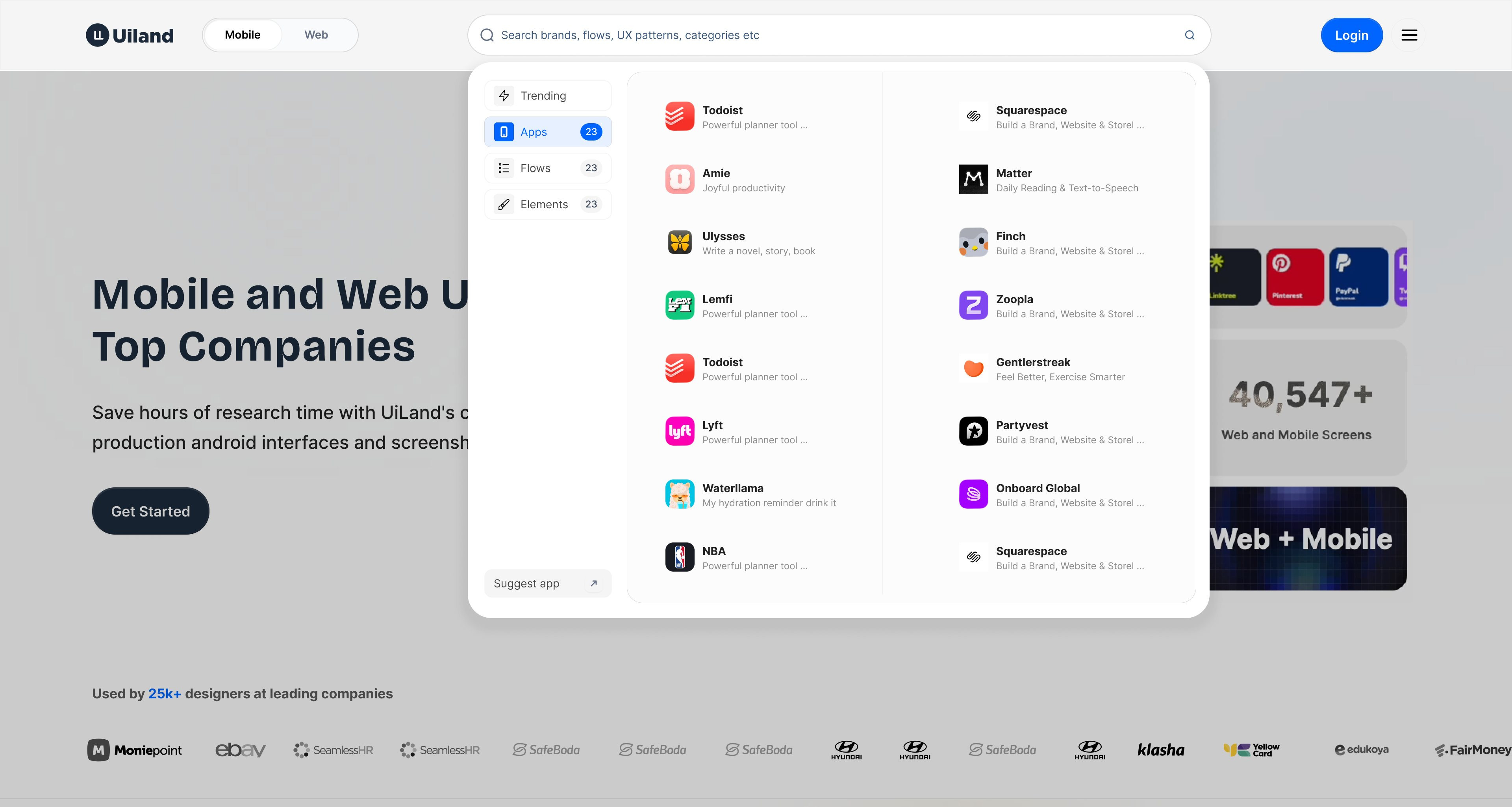
Apps selected: every product in the index, two columns, each with what it is.
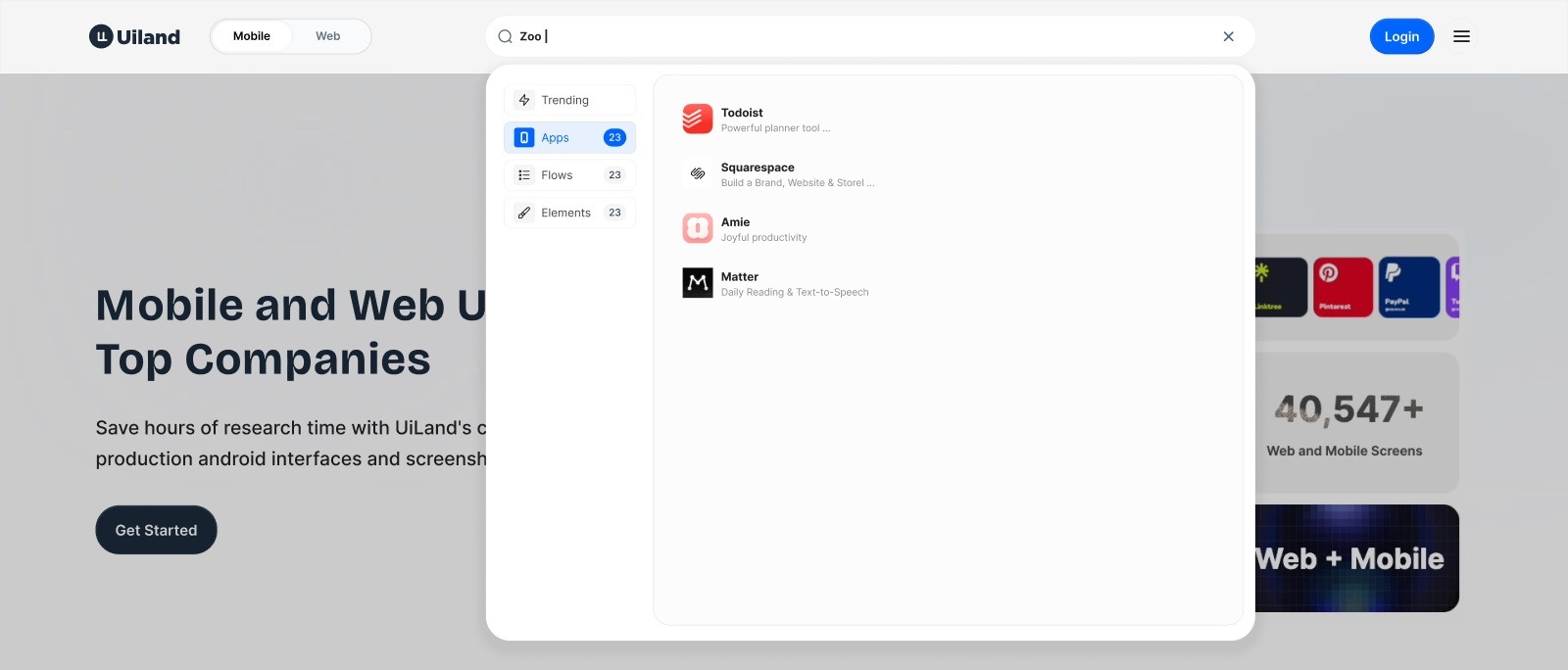
The same query narrowed with Apps selected in the rail.
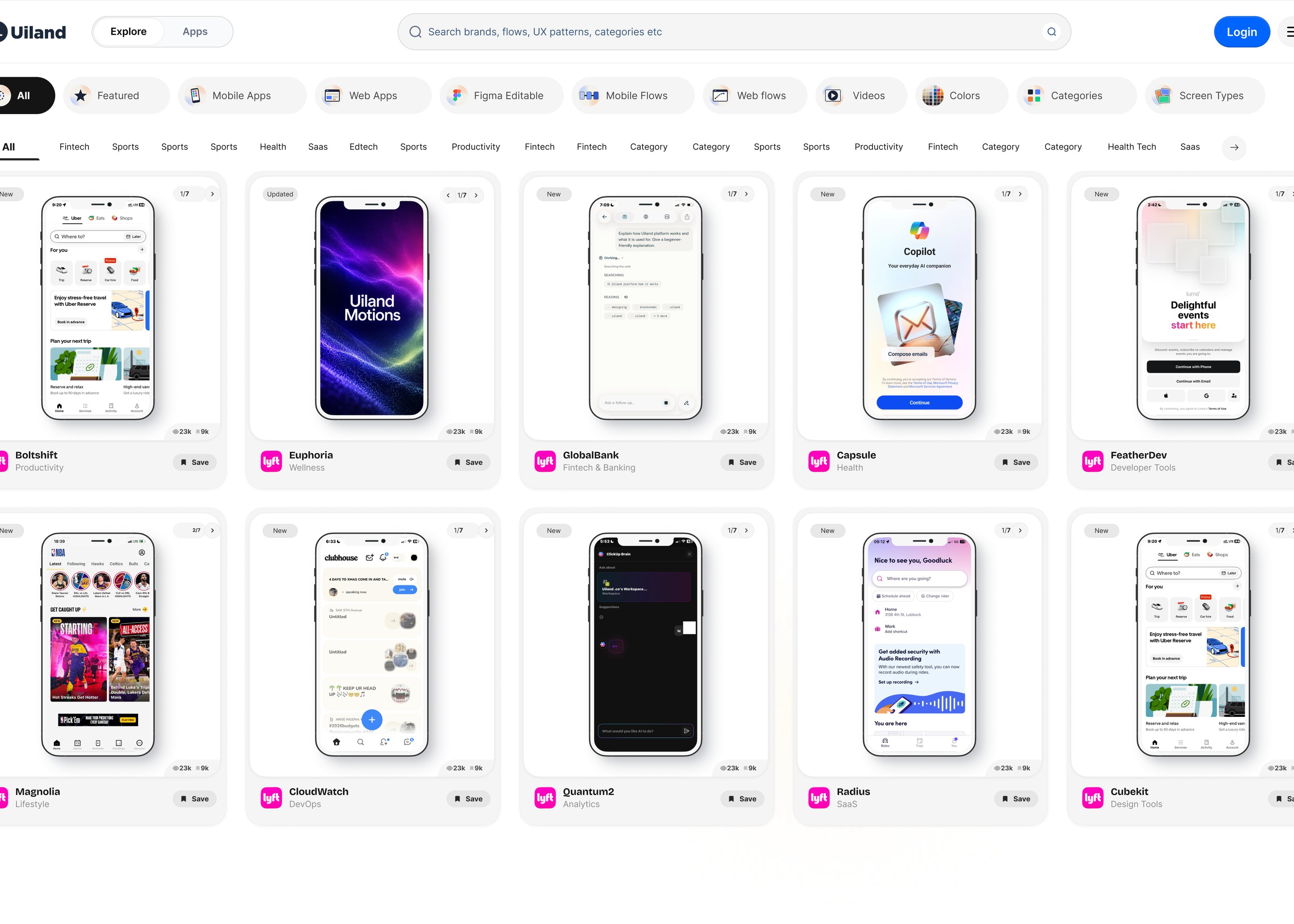
Browsing every app in the index, by category and screen type.
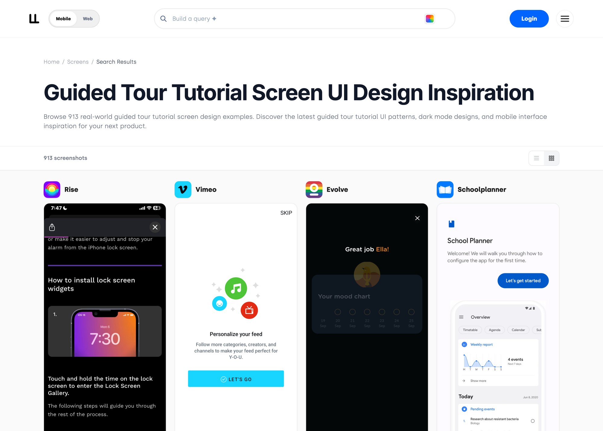
Browsing by screen type: every guided-tour screen in the index, in one view.
Analytics GA · Hotjar Feedback users · the team Decide what needs attention Ship IA · search · SEO watch the same measures again
How a change gets decided: the numbers and the feedback point at something, we pick one thing, ship it, and watch the same measures again.

This has shaped the discovery experience, information architecture, SEO and the features we’ve added over time.

Some visual references

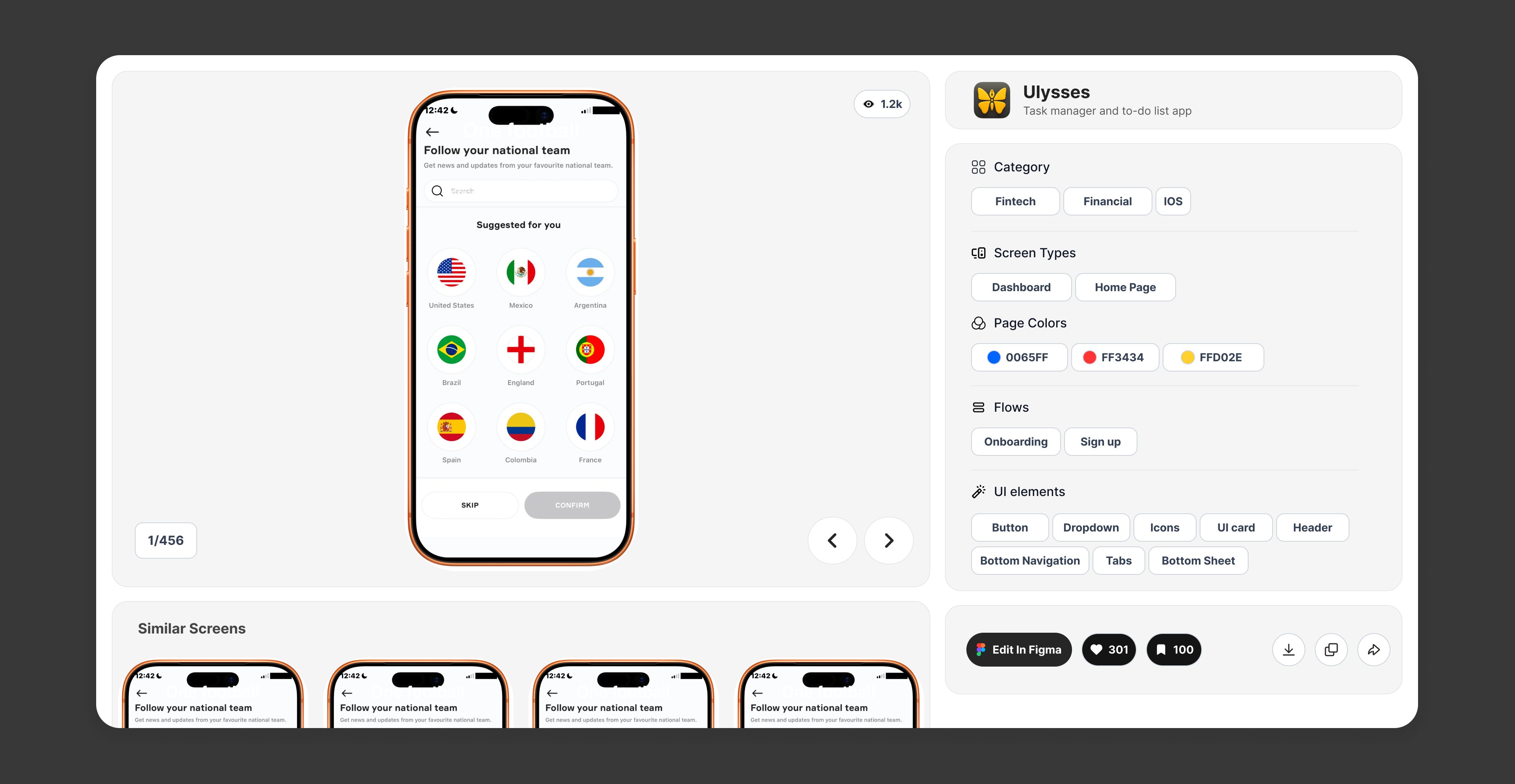
One screen opened up. The screen on the left with 1 of 456 and its similar screens underneath; on the right everything it is tagged with (category, screen types, the palette it uses, the flows it belongs to, and every UI element on it), then Edit in Figma.
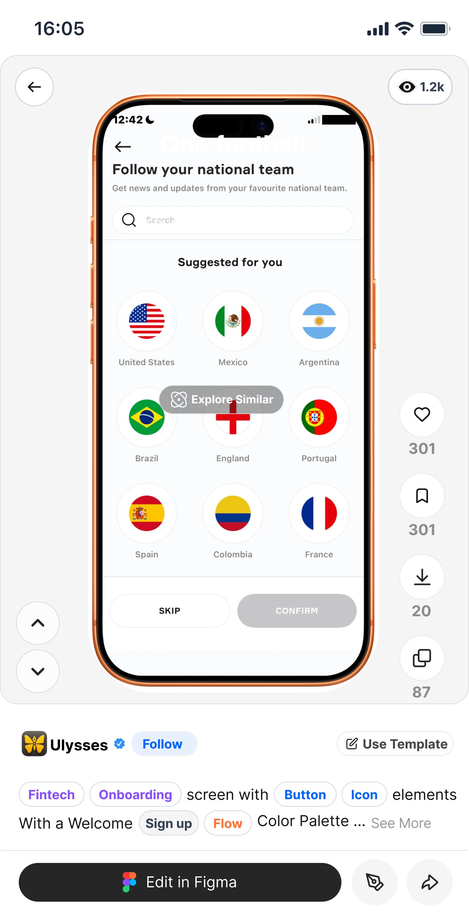
The screen detail on a phone: Explore Similar over the screen, the engagement rail beside it, and the tagging written out as a sentence.
Explore Similar
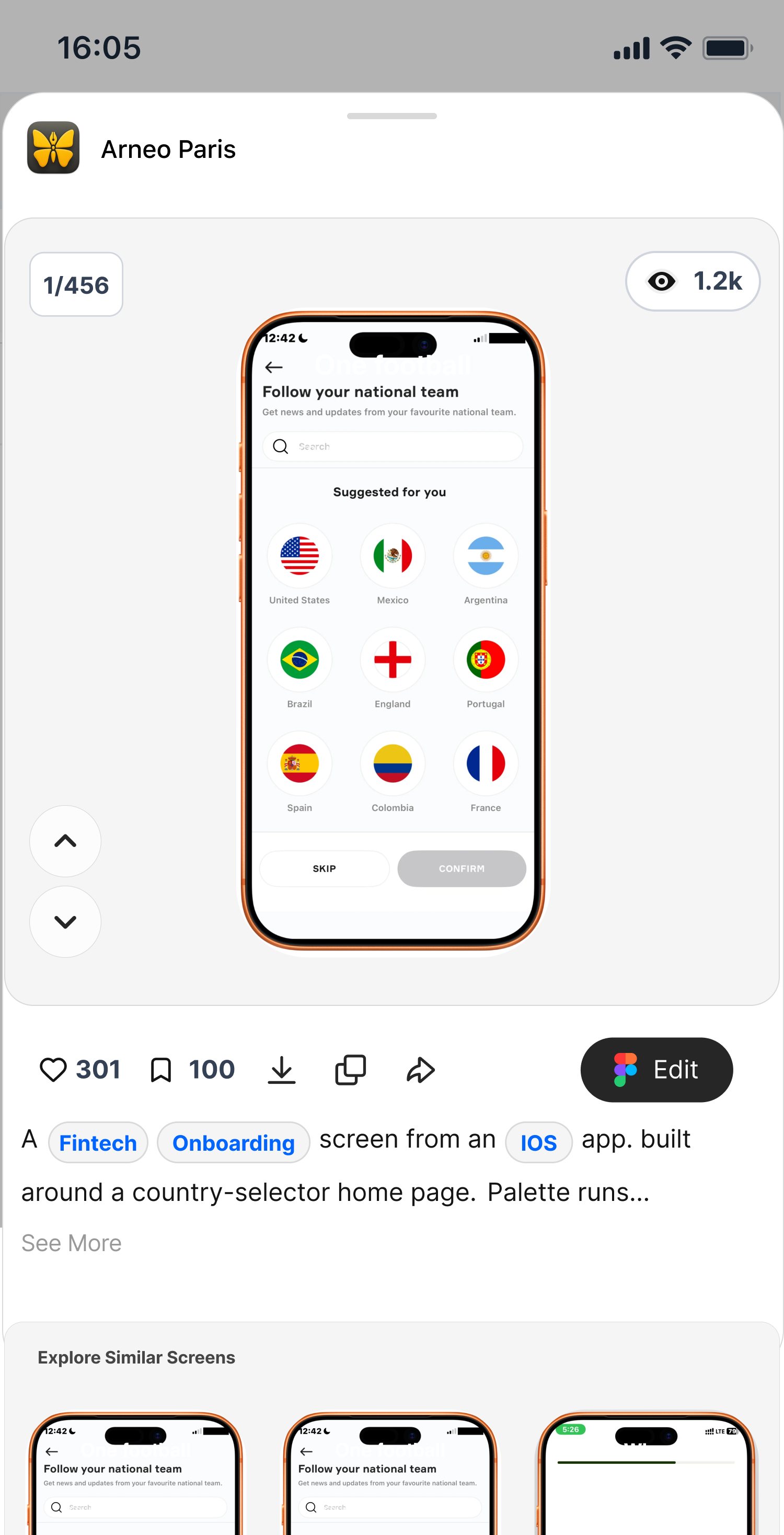
And as a sheet: the product, the 1-of-456 counter, likes, saves, downloads and copies, Edit in Figma, then Explore Similar Screens underneath.
The detail sheet
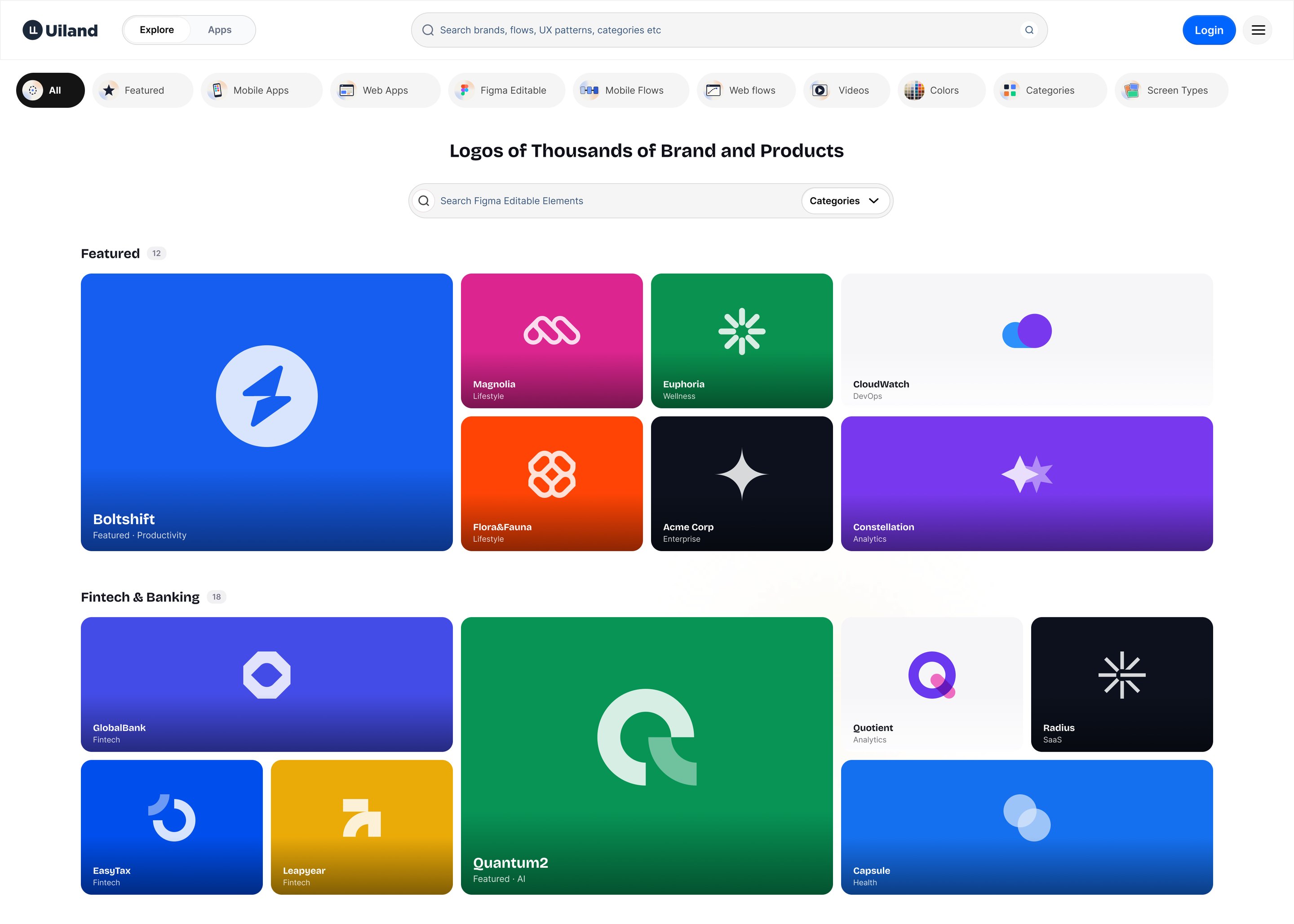
The logo library, grouped by category.
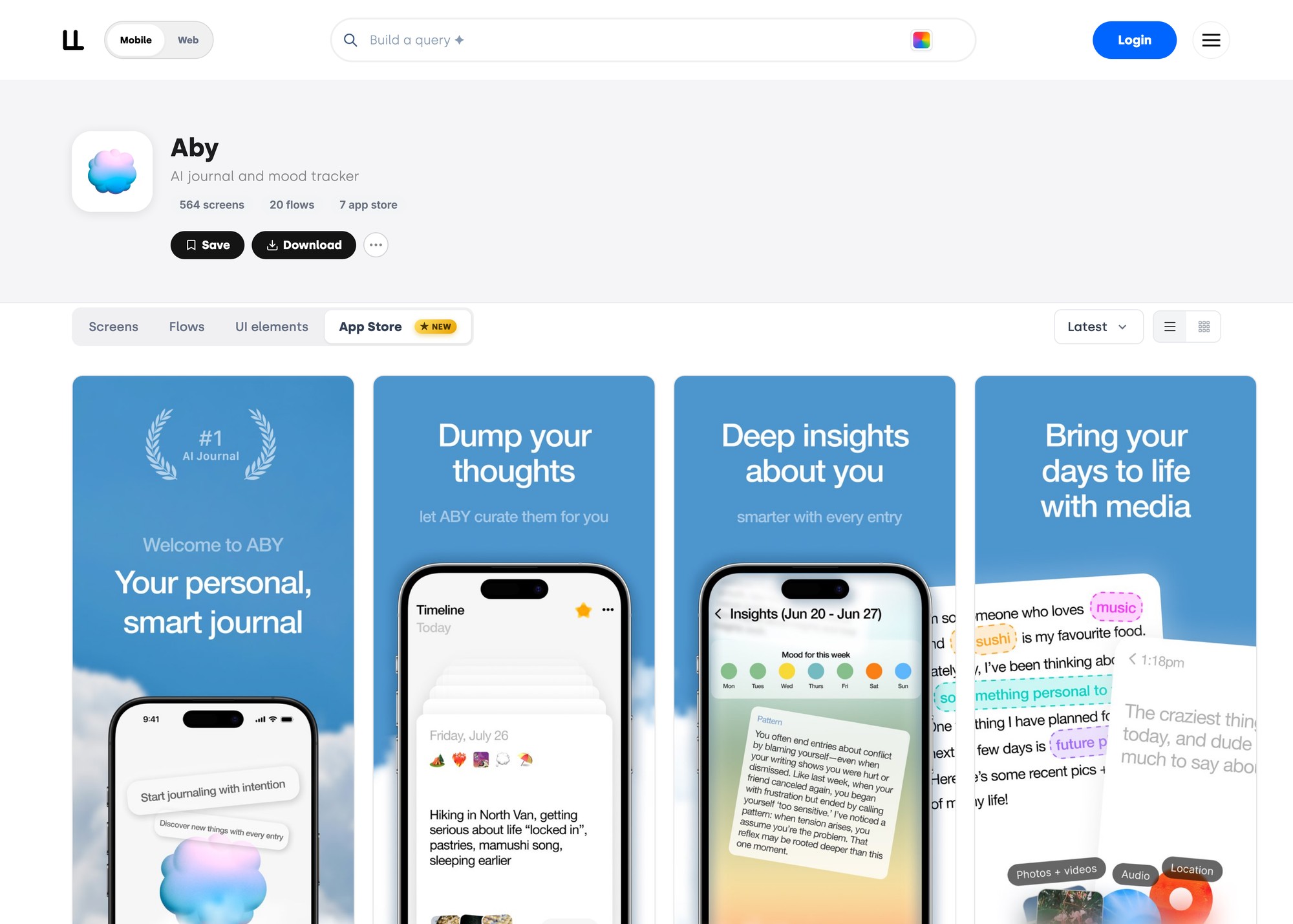
A ready-made app store screenshot set, panel by panel.
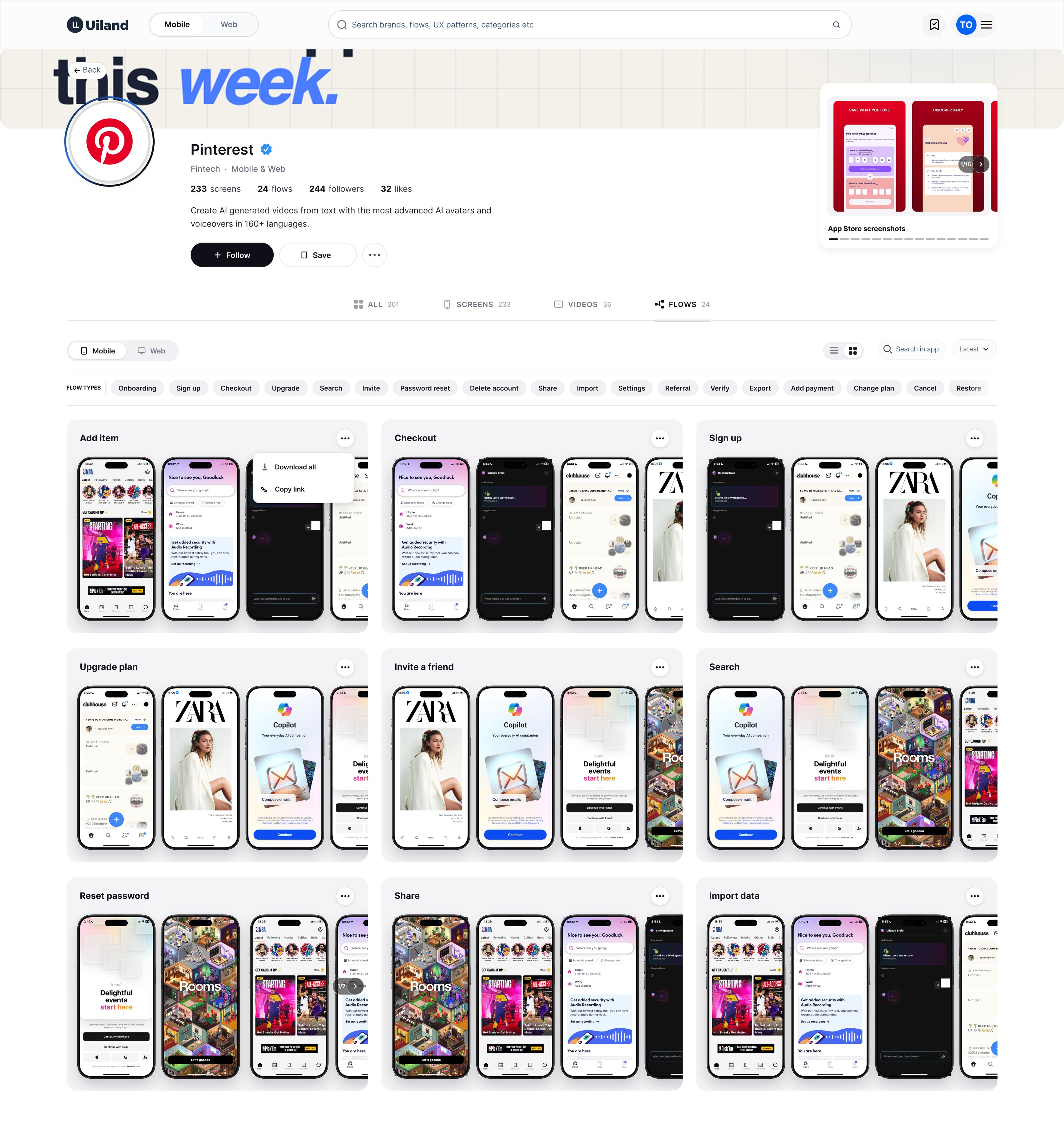
One product’s whole profile: Pinterest with 233 screens, 24 flows, 244 followers, and every flow it ships listed by name (Add item, Checkout, Sign up, Upgrade plan, Invite a friend, Search, Reset password, Share, Import data), each one a strip you can step through, with Download all and Copy link on any of them.
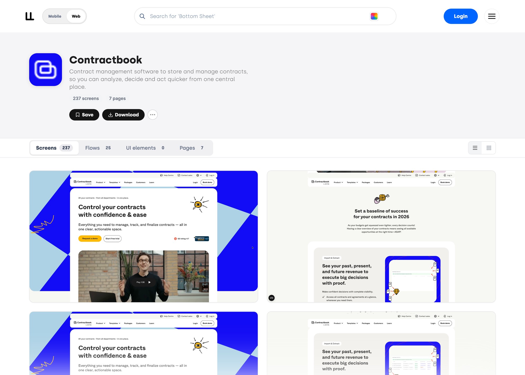
One product opened up: every page of its website, captured and tagged.

Where it is now

1,000+
web and mobile apps documented
100K+
visits
$20K+
in revenue
2023
founded

What began as a small collection has grown into 1,000+ products, 100K+ visits and thousands of dollars in revenue.

We have returning designers and paying subscribers, and the platform has been able to fund its own growth without sponsors.

UIland has given me the opportunity to work across the full product: co-founding it, owning design, working directly with engineers, using real usage data to understand user pain points, and continuously iterating to improve the overall experience.

Reown Africa

05/05

Building Reown

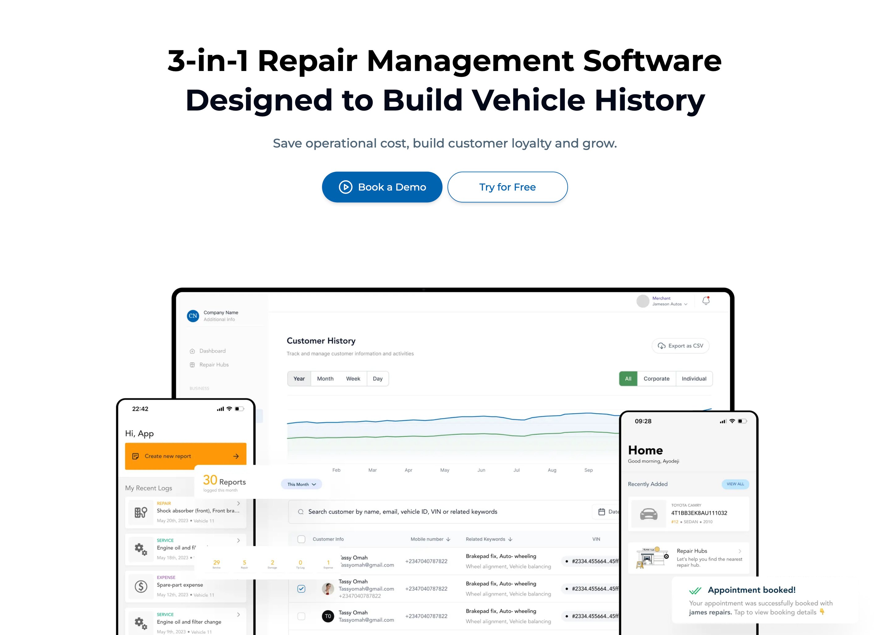
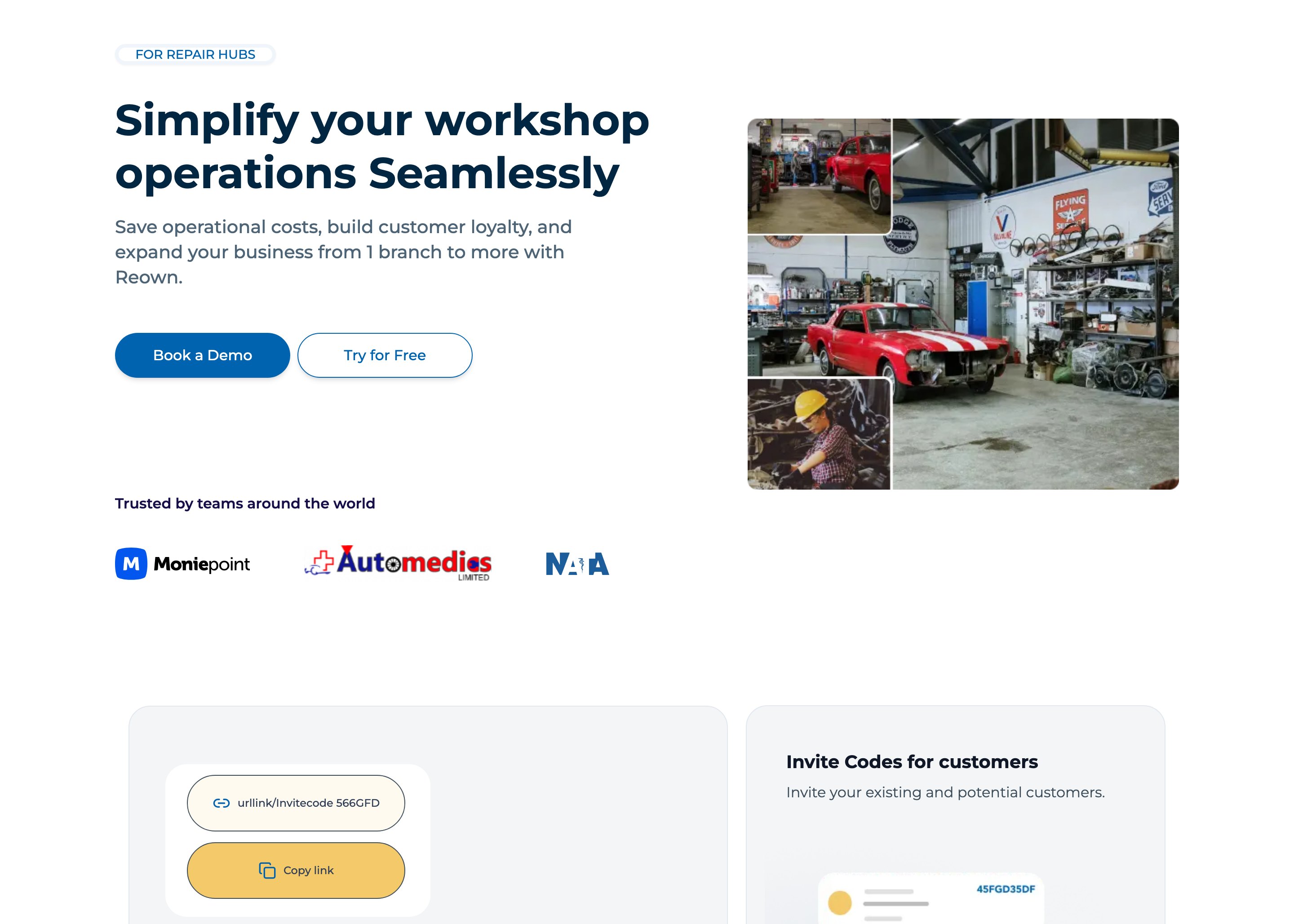
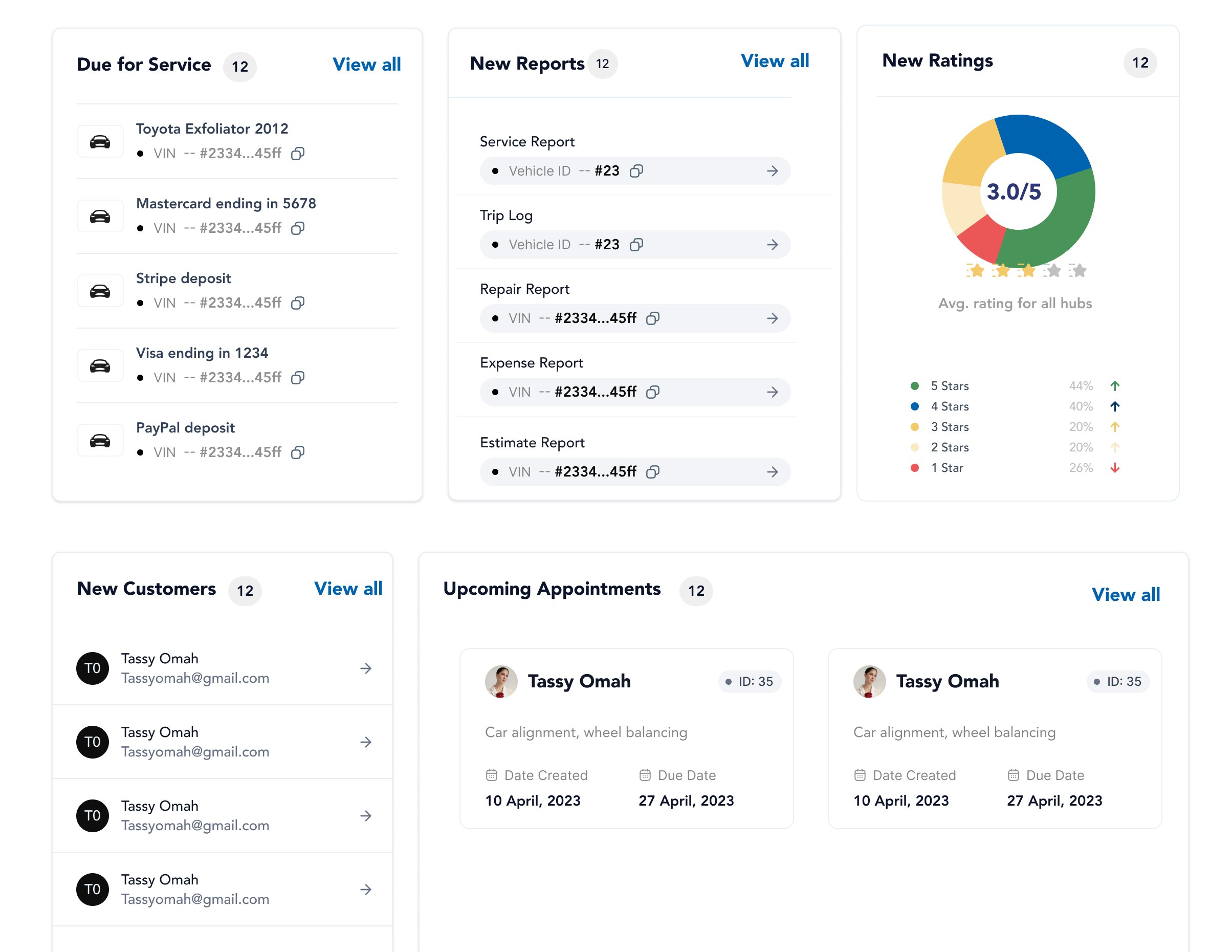
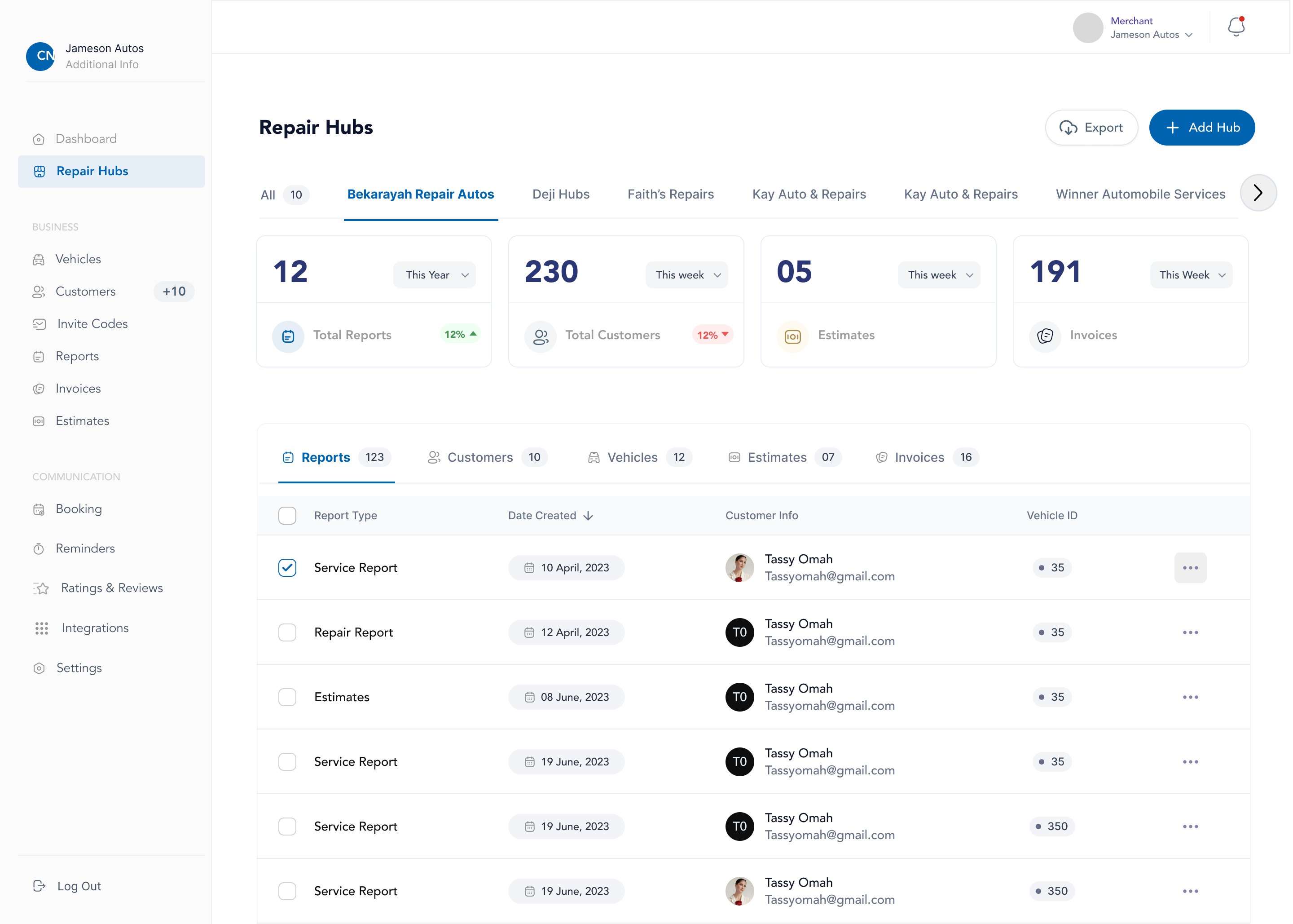
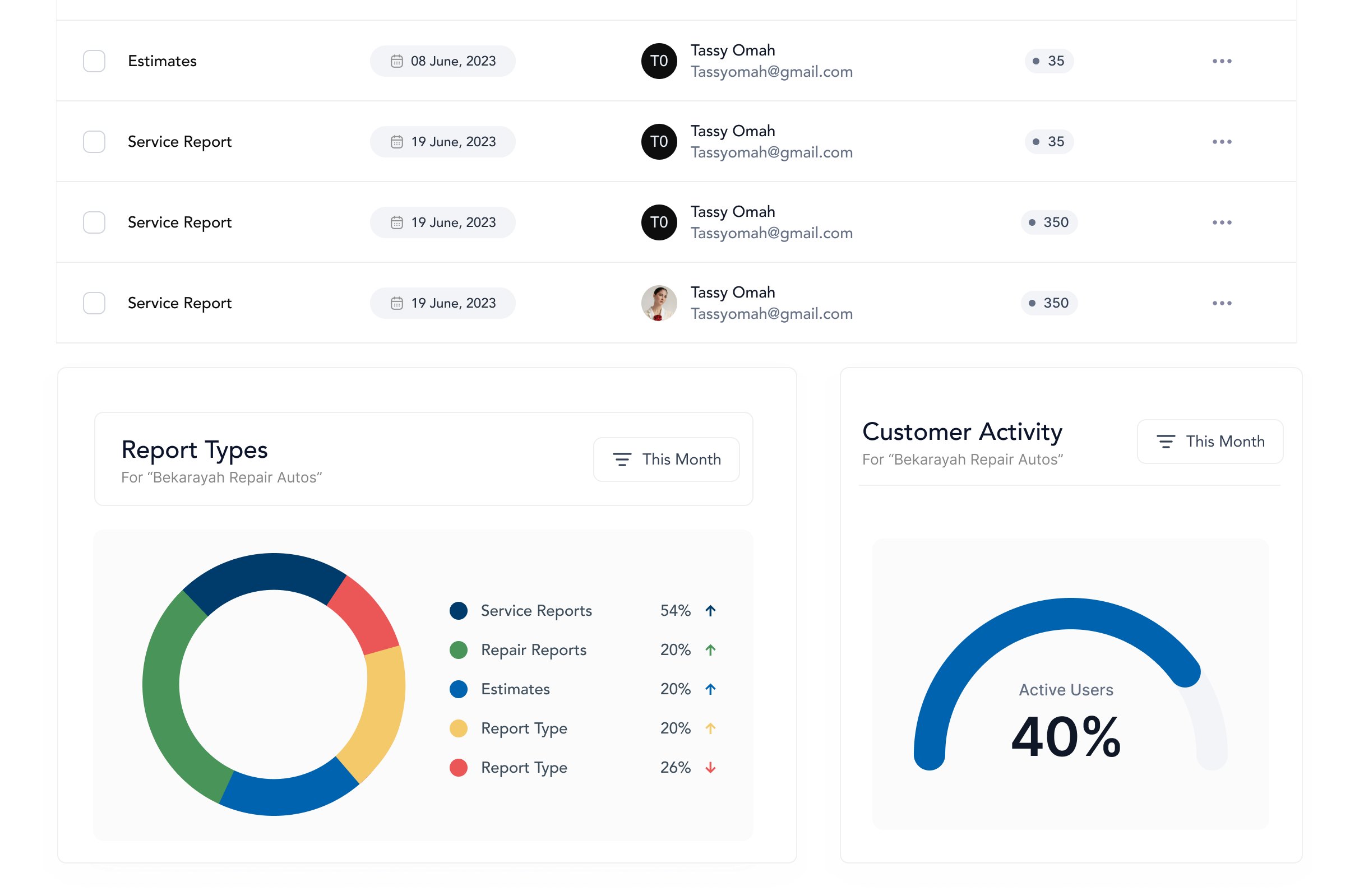
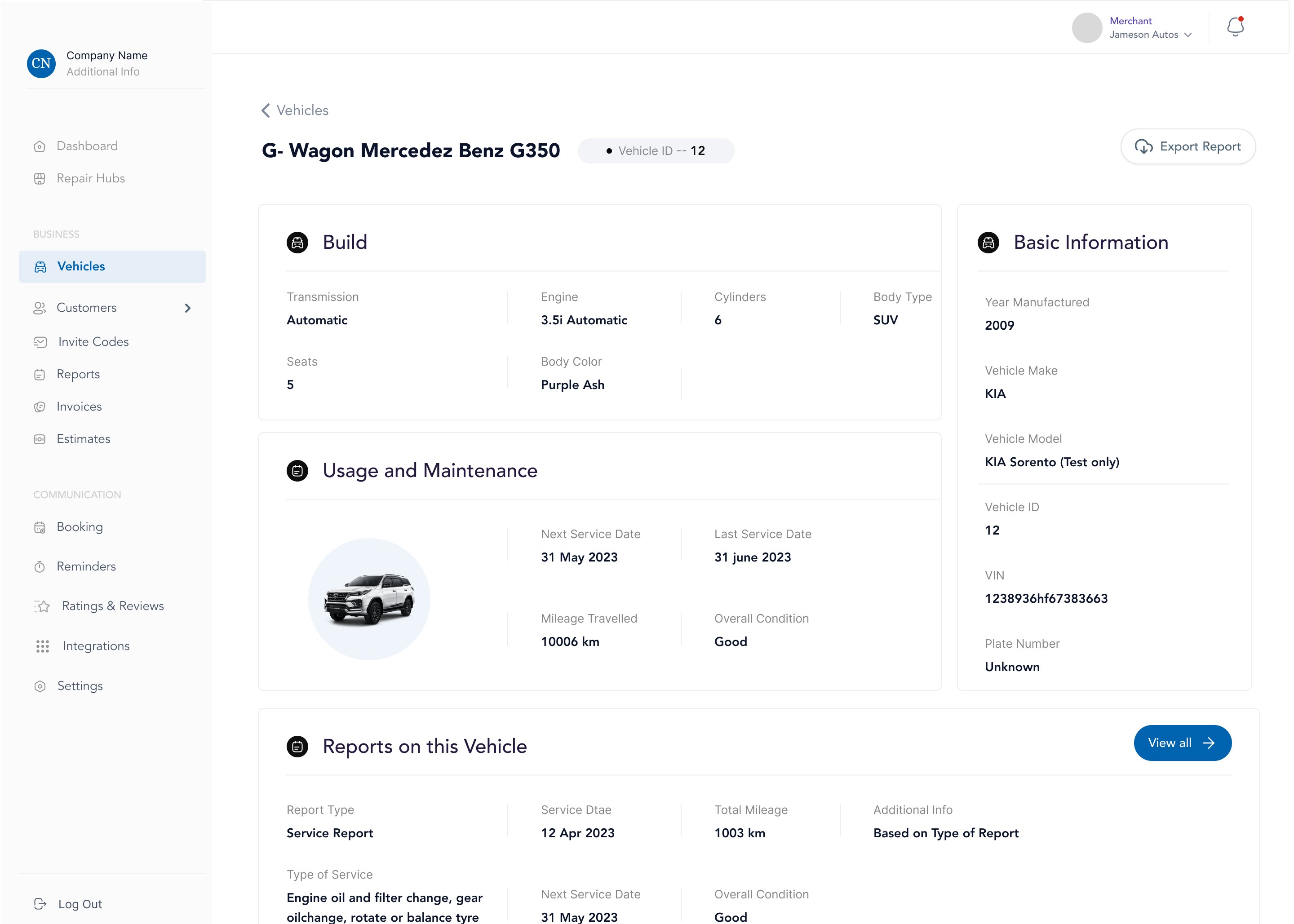
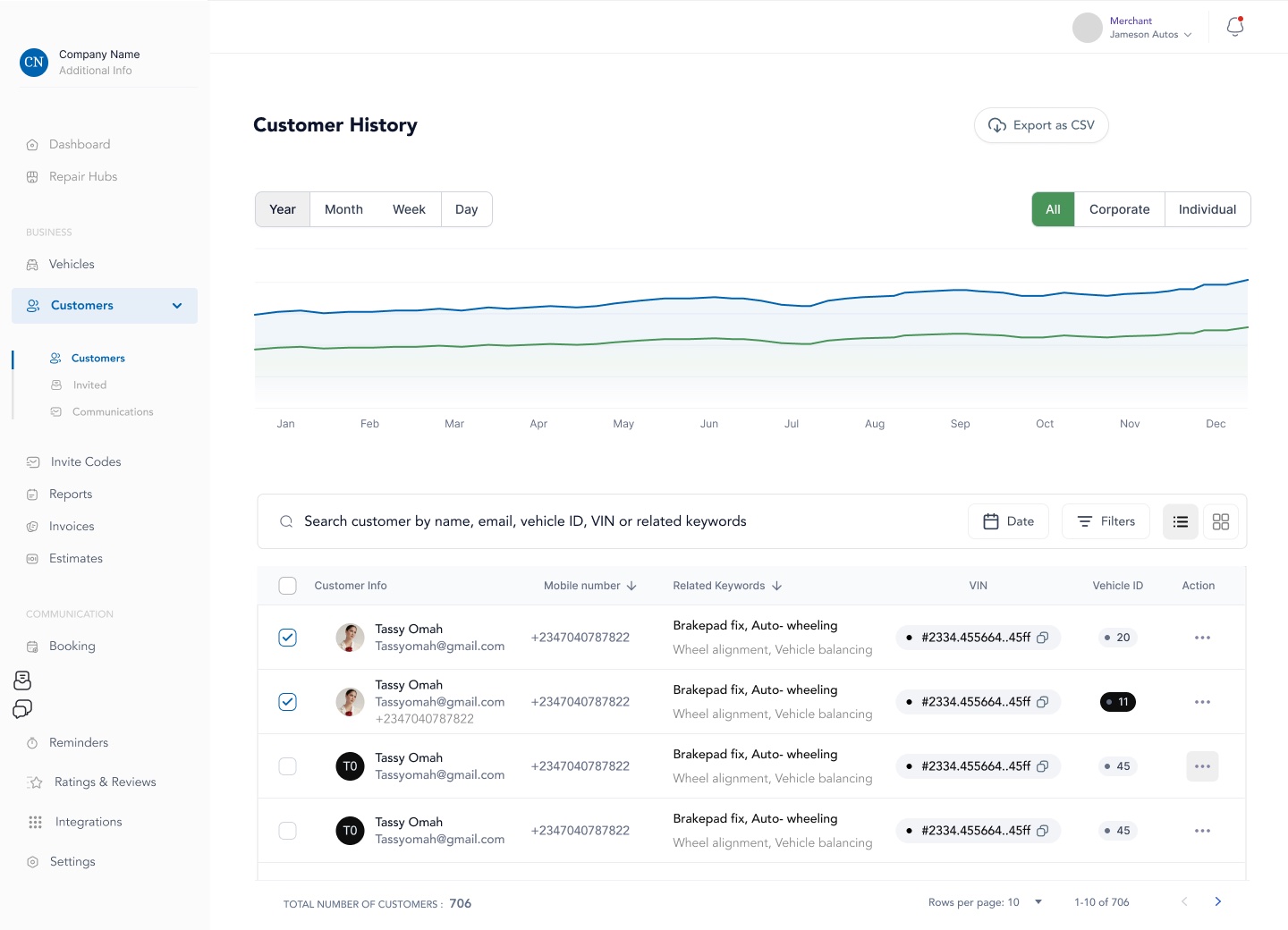
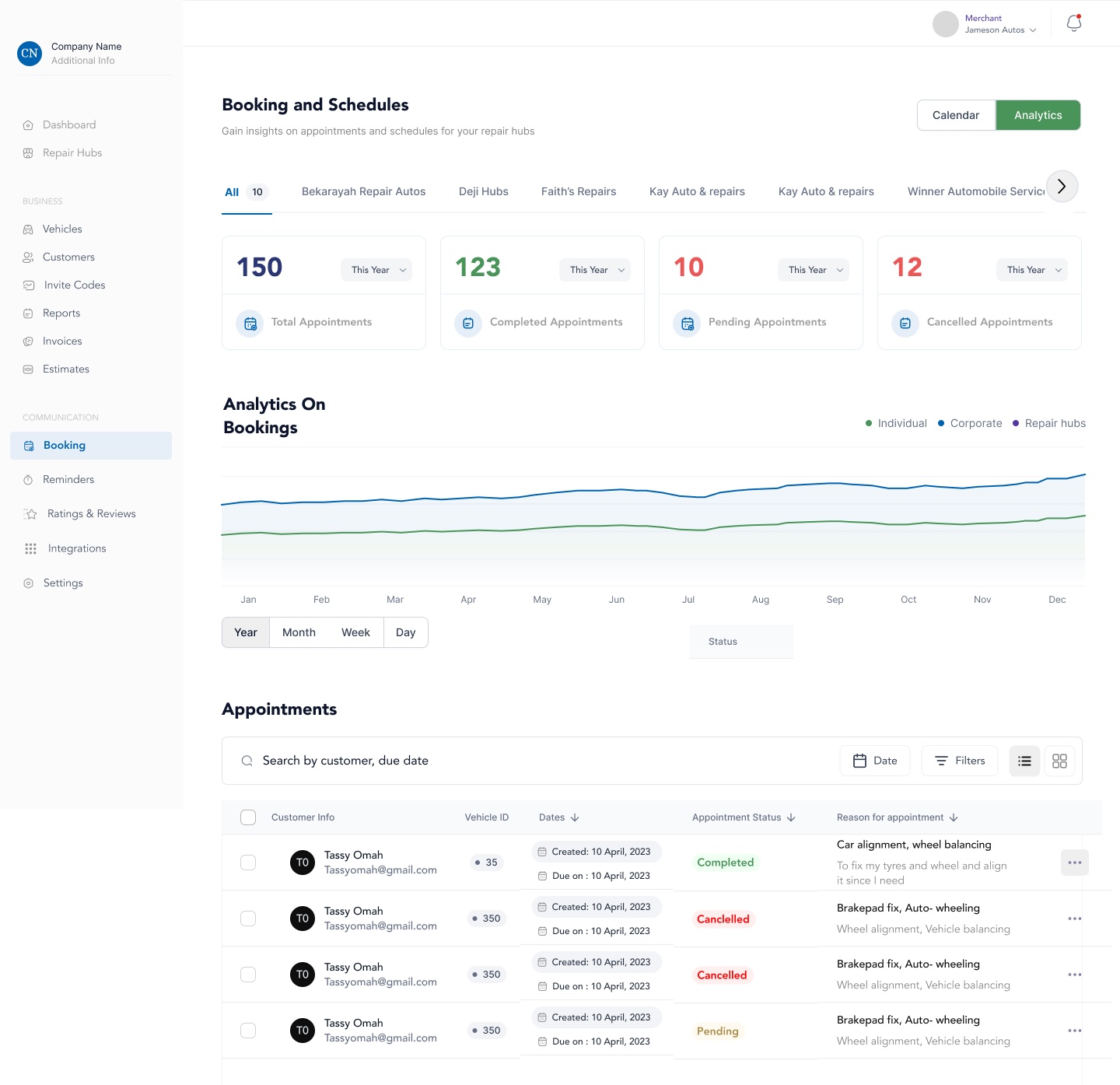
Reown is building a digital platform around the automotive repair experience, connecting customers, partners and repair hubs through one system.

I worked with the Reown team as a product design consultant for about a year, contributing to several parts of the product. Some of the work involved improving existing experiences, while other parts were designed from the ground up.

I worked closely with the founder, Ayodeji, the product manager and engineering team throughout the engagement, moving between product decisions, design and implementation as features were being shipped. We had regular reviews to work through requirements, explore different approaches and adjust designs as the product evolved.

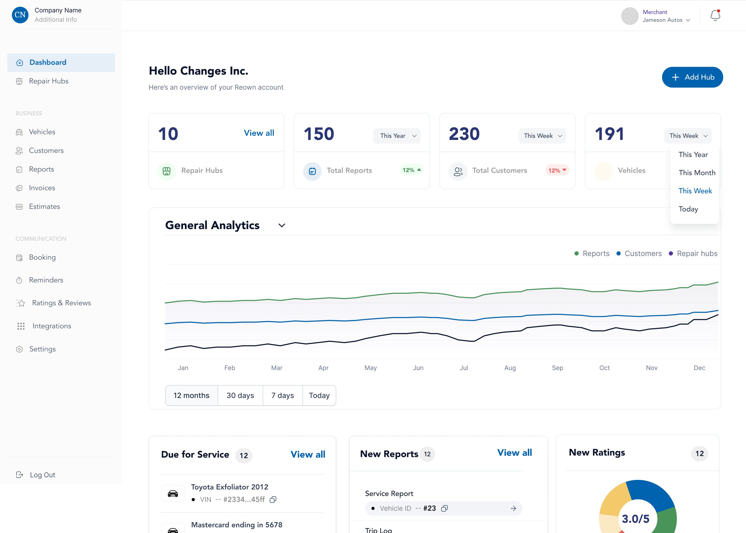
My work covered the customer experience, affiliate and partner platform, and repair hub reporting tools, including both new experiences and improvements to existing products.

Technician logs the repair → It becomes the car’s history → The owner reads it → A reminder brings them back

Below is a breakdown of the different parts of Reown I worked on.

Still putting this one together

Reown is live. I’m just a little behind on writing it up, but I’d be glad to walk you through it in the meantime.